Modern and sophisticated web design for architect/designer
¿Quieres ganar un trabajo como este?
Este cliente recibió 133 diseños web de 26 diseñadores. Eligieron este diseño web de Cameron-pwh como el diseño ganador.
Únete gratis Encuentra trabajos de diseño- Garantía
-
 A$450
A$450
-
 133 diseños
-
 26 diseñadores
Resumen de Diseño Web
Code Zed is a Building Design & Drafting studio based in Nedlands Western Australia, providing a high quality and complete client service from concept design through Council planning approvals and building licenses to construction drawings for kitchens and bathrooms, extensions, additions, renovations and new homes.
Code Zed is looking for a new qwerty design that *is different from a normal* 2/3 column website. The website design must be very arty, clean and catchy. This design needs to be very different and must not look like a downloadable template.
The design must be able to display a lot of photos for the different projects.
The design must comply with W3C standards (i.e. use of fonts) and must be delivered to us in A PSD layered format.
Here are a couple of example website designs that exemplify what I am after:
1) http://www.jcba.com.au/
2) http://www.richardkirkarchitect.com/en/
3) http://baltinas.com/
I particularly like numbers 1 and 2. The third, Baltinas, jumps around a little between pages as it is actually several companies. I prefer the page design to remain steady if possible.
I like the very clever nature of number 1 (JCBA). It captures the interest, although slightly gimmicky, however I think it doesn't overpower. Its modern, and visual.
I like the clean elegant design of number 2 (Kirk), it simply delivers everything necessary in a clear intelligent manner, its attractive, menu is clever simple to use and attractive.
I would be very happy to have either of these websites.
here is another one:
4) http://www.hjarchitect.com.au/
Although this is similarly elegant, it appears quite dated. I don't like the thumbnails that you click on in the gallery, its quite clumsy. It looks minimalist, and IS minimalist, doesn't look like there is much option to expand other than changing the pictures.
If you look at my own website:
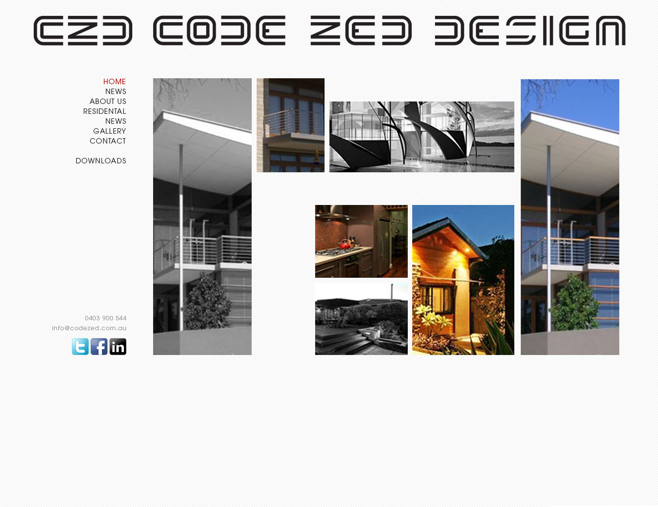
http://www.codezed.com.au
I designed and built it myself without any skills or experience. I had to use a generic photo album generator which was worse than useless, the point I am trying to make is I tried to make the menu system a little unusual, I tried to keep the pages neat and tidy, and totally used the "black website" method. However I am more inclined to go with the lighter/white pages of (1) and (2) above because they tend to show photos better.
Actualizaciones
Added Wednesday, October 16, 2013
Project Deadline Extended
Reason: designer want to upload
Added Tuesday, November 05, 2013
Objetivo del mercado(s)
Target market is people who are looking to renovate their home
Tipo de industria / entidad
Construction
Mira y siente
Cada control deslizante ilustra las características de la marca del cliente y el estilo que debe comunicar el diseño de tu logotipo.
Elegante
Atrevido
Juguetón
Serio
Tradicional
Moderno
Atractivo
Profesional
Femenino
Masculino
Vistoso
Conservador
Económico
De Alta Gama
Requisitos
Debes tener
- The brief is to design a visual modern, elegant, sophisticated website for a small scale designer/photographer/architect that looks itself like it is designed. Not off the shelf, simple and dated. Basically the design itself has to exemplify me, it has to say "this guy is a designer, and he is good at it".