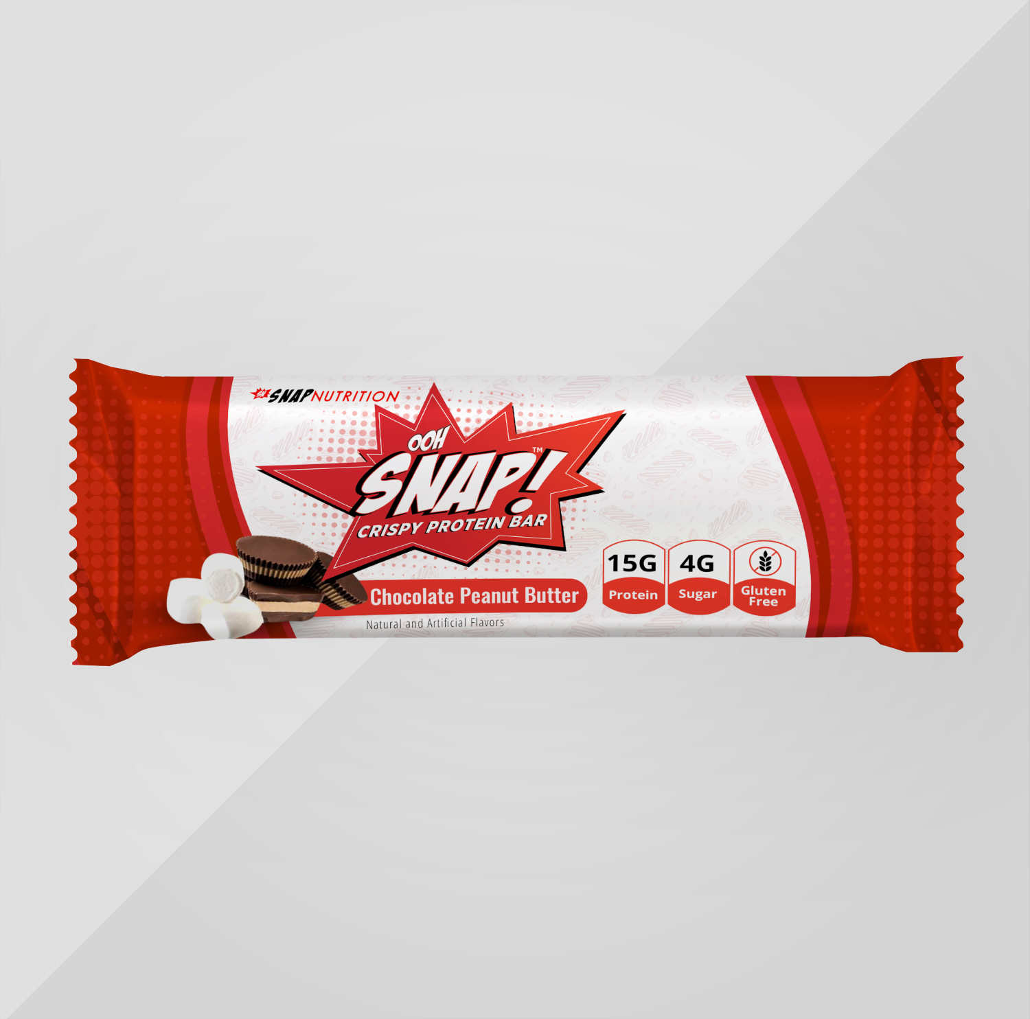
Nutrition company seeking a package re-design of our popular protein bars.

¿Quieres ganar un trabajo como este?
Este cliente recibió 14 diseños de empaque de 6 diseñadores. Eligieron este diseño de empaque de Navisol Creatives como el diseño ganador.
Únete gratis Encuentra trabajos de diseño- Garantía
Resumen de Diseño de Empaque
OOH SNAP! BARS
Company Bio
SNAP! NUTRITION is a nutrition company seeking a package re-design of our popular chocolate peanut butter protein bars.
We have had the same packaging for a couple years and the design does not meet our current standards and looks a bit amatuerish. We are planning to relaunch our protein bars with a more appealing brand image that stands out from the myriad of protein/snack bars in the market.
Target audience
consumers between the ages of 20 and 65. The majority of our clients are health conscious and goal oriented in their approach to snacking. Our customer base is 60% female.
Color Preferences
The packaging color scheme must work with our current logo and be adaptable to our other flavor options. (vanilla marshmallow, caramel pretzel, double chocolate chunk)
Look and Feel
The design should feel fun, modern, vibrant and entice consumers tastebuds to purchase. Like a candy bar!
Attached is the current package design for reference and callouts, etc. (please help!) and logo to use