Logo Modernisation for well established kitchen equipment supplier
¿Quieres ganar un trabajo como este?
Este cliente recibió 118 diseños de logo de 35 diseñadores. Eligieron este diseño de logo de RS_Design como el diseño ganador.
Únete gratis Encuentra trabajos de diseño-
 US$150
-
 118 diseños
-
 35 diseñadores
Resumen de Diseño de Logo
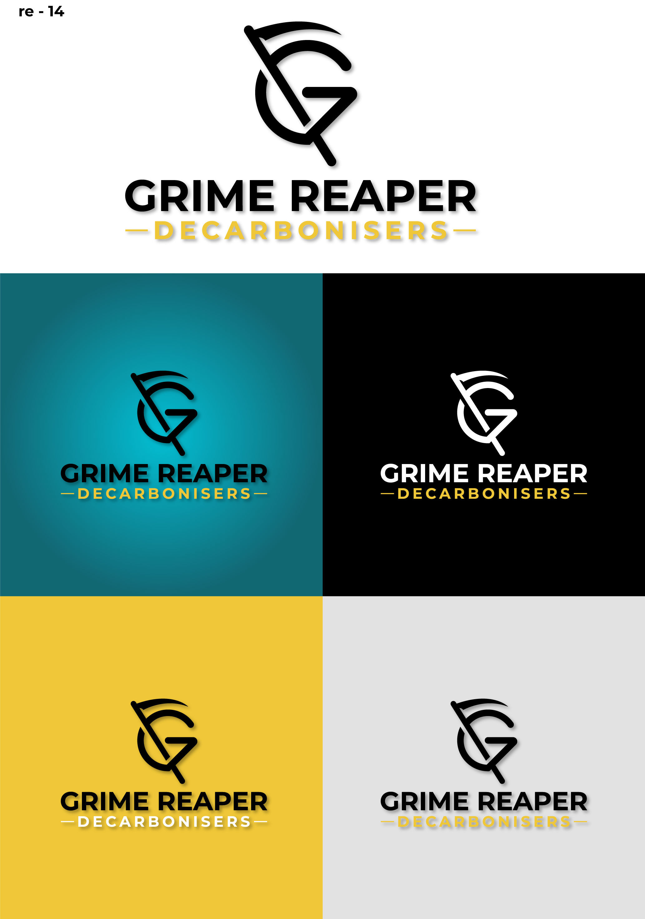
The company is called Grime Reaper and we supply cleaning equipment to commercial kitchens and food producers. The Brand name is fairly well established but the logo needs updating. Obviously the brand name is a pun and while I would like to keep that playfulness, I want it to look serious and professional - no animations or cartoony images - the pun as a logo should be very subtle - i thought the Logo should be a G and an R and i can see that the G could be a cloaked grim reaper (side or front on)and the R a scythe - but subtle!!! the GR is the important part followed by Grime Reaper and then DECARBONISERS underneath. This will be used on websites, all social, Vehicle badging, catering equipment and chemical badging as well as clothing and i'd like it on a mainly blue background (suggested pallete included ) as well as translated across a few other colours, yellow and green maybe but not crayon colours. you can see us at grimereaper.com. I quite like the G that is incuded on the uploaded files - lets see what you can do!
Texto del logo
GR GRIME REAPER DECARBONISERS