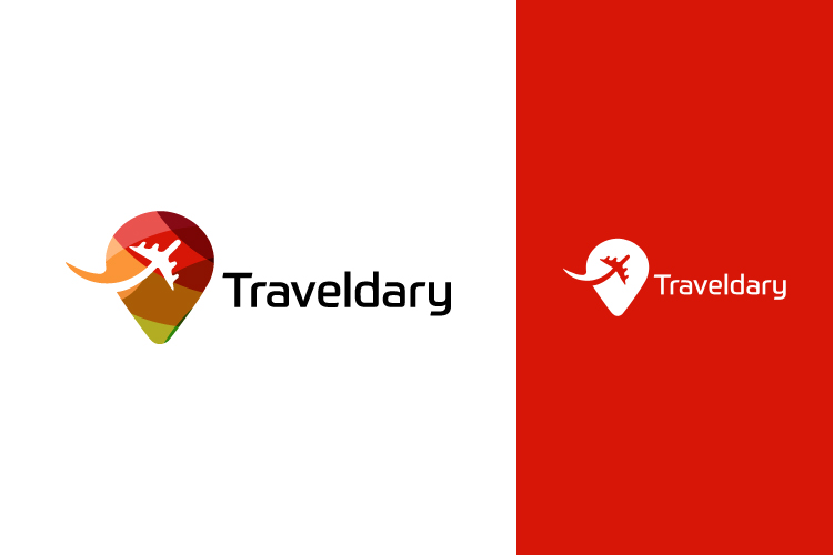
Traveldary Travel Agency

¿Quieres ganar un trabajo como este?
Este cliente recibió 69 diseños de logo de 23 diseñadores. Eligieron este diseño de logo de D4Designer como el diseño ganador.
Únete gratis Encuentra trabajos de diseño- Garantía
Resumen de Diseño de Logo
Hi everyone,
I need a Logo for a new online Travel Agency called „Traveldary“. This logo should have some sort of color giving you a happy, open feeling wanting to explore. We are going to focus but not limit to sustainable travelling. The logo needs to be kept slightly minimal since after the general “Traveldary” logo outline is found I will customize the logos for all the segments such as “Traveldary Surf,Golf,Wellness, etc” where the general Traveldary logo remains the same and the name of the sector is added on the right below the logo.
The sector will be more colorful and appealing to the specific customer with color or a graphic so please keep in mind that the general “Traveldary” logo cannot be too heavy in the eye and needs to allow a segment customization.
I will attach you some sample logos where you can get a better idea of what I picture the logo to look. Included is also one Traveldary sample logo which I believe has a good concept but is missing the wow factor. Please also put all the graphics on the left side of the logo instead of above, below, etc.
Thank you very much and I am excited to see what you create :)
*UPDATE*
Thank you very much for all the great logo ideas I have already recieved! Unfortunately I have not found the right logo yet so I thought it might be good to give everyone some feedback on what I liked the most about the designs I have seen so far.
Icon: A globe and continents look most appealing to me. I came across the idea of having a globe with a bite (like apple) on the upper left corner (at about 8-9 o''clock) with a ship, a car, and an airplane (preferably no paper planes) coming out of the bite. Anyone want to give a try, I would be very excited to see a sample.
Font: I have noticed that the basic fonts look the best to me especially when they are slightly bold.
Colors: The red/brown colors as given by D4Design as well as the very colorful icons like the ones in my top designs look great since they dont seem to commerical.
It would be very nice if anyone would want to give it another try and hopefully I will find the right logo. Thank you very much for all the participation, I appreciate all your work and effort in this!
Actualizaciones
Project Deadline Extended
Reason: Will make a final decision on Tuesday March 10th.
Added Sunday, March 8, 2015
Objetivo del mercado(s)
All travel related markets national&international
Tipo de industria / entidad
Travel
Texto del logo
Traveldary
Estilos de fuente para usar
Mira y siente
Cada control deslizante ilustra las características de la marca del cliente y el estilo que debe comunicar el diseño de tu logotipo.
Elegante
Atrevido
Juguetón
Serio
Tradicional
Moderno
Atractivo
Profesional
Femenino
Masculino
Vistoso
Conservador
Económico
De Alta Gama
Requisitos
Debes tener
- Some sort of color and a nice font which is easy to read but more then regular
Agradable de tener
- Some kind of graphic/shape on the right of the writing, Plane, Globe
No debería tener
- Something below the writing, Paper airplanes, Birds