Innovative and Individualized approach to Pharmacy Care, less focus on dispensing of Meds
¿Quieres ganar un trabajo como este?
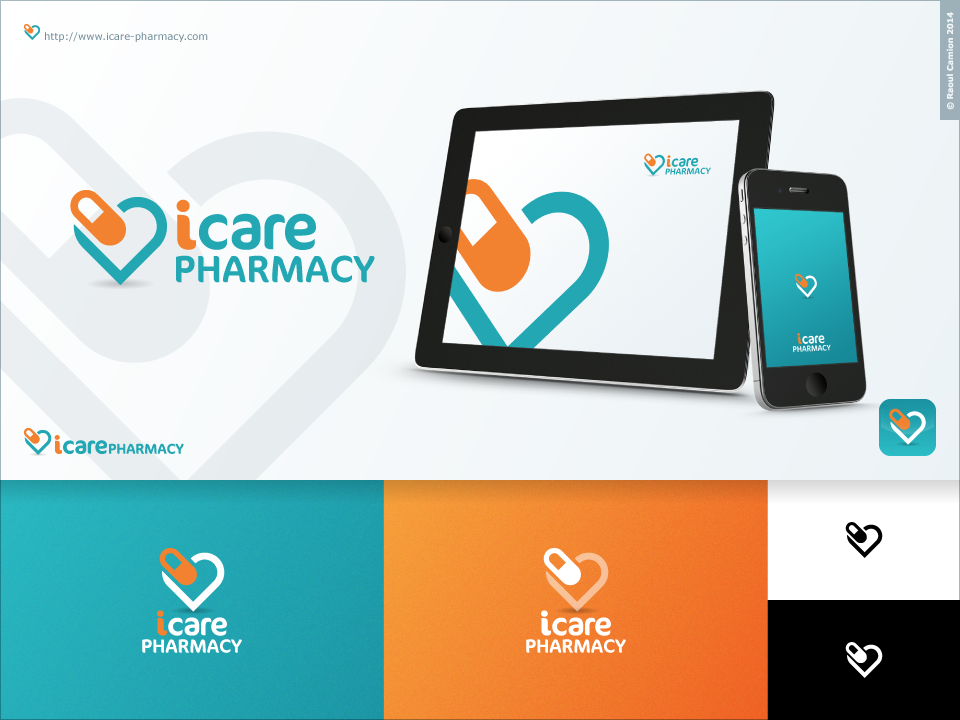
Este cliente recibió 57 diseños de logo de 15 diseñadores. Eligieron este diseño de logo de Raoul Camion como el diseño ganador.
Únete gratis Encuentra trabajos de diseño-
 C$320
C$320
-
 57 diseños
-
 15 diseñadores
Resumen de Diseño de Logo
We need a logo design for our new pharmacy in Alberta, Canada. Now with a new compensation model that allows for pharmacist to prescribe medications and administer injection, we hope to start a practice that will focus on these developments. Aside from the general business of dispensing and checking medications we hope to do in home medication reviews and consultation for patients and physicians and expand in travel consultations and flu injections. The "i" in iCare will stand for " individualized care" , "innovative therapy" and "independently owned".
The main colors will be teal/blue and orange as the accent color. A graphic in the background is We really like the colors used by the company Moroccanoil Hair Products in their design
http://www.moroccanoil.com/usa/h_us_en/products/
and would like to incorporate similar colors. We are not opposed to other color combinations that the designer would like to suggest. The design needs to be simple and modern to reflect the new approach we are incorporating into our business. We would like the "i" to be in lower case and to stand out in the design. It would be fine to have some sort of graphic in the background
Objetivo del mercado(s)
Middle age to Elderly Patients
Tipo de industria / entidad
Pharmacy
Texto del logo
iCare Pharmacy
Estilos de logo de interés
Logo abstracto
Conceptual / simbólico (texto opcional)
Estilos de fuente para usar
Mira y siente
Cada control deslizante ilustra las características de la marca del cliente y el estilo que debe comunicar el diseño de tu logotipo.
Elegante
Atrevido
Juguetón
Serio
Tradicional
Moderno
Atractivo
Profesional
Femenino
Masculino
Vistoso
Conservador
Económico
De Alta Gama
Requisitos
Debes tener
- "I" should be in lowercase. Try to incorporate more traditional elements into a modern design.. A mortal and pestle..
Agradable de tener
- Id like a graphic above or beside the name. I like how this one is circular and has ring of orange around the top of it as the accent colour.. Perhaps if we could figure out some other type of graphic instead of a DNA strand in the middle
- http://www.tinkytyler.org/logo-template/81895-graphicriver-bio-research-logo-template-5162401.html
- Ideally if we could incorporate a heart into design that would be a plus. We would like it to be something abstract also such as this one
- http://www.tinkytyler.org/logo-template/111475-graphicriver-foundation-logotype-6490365.html
No debería tener
- We do not want a traditional logo such as most pharmacies.. so no times roman fonts.