

 Refresh
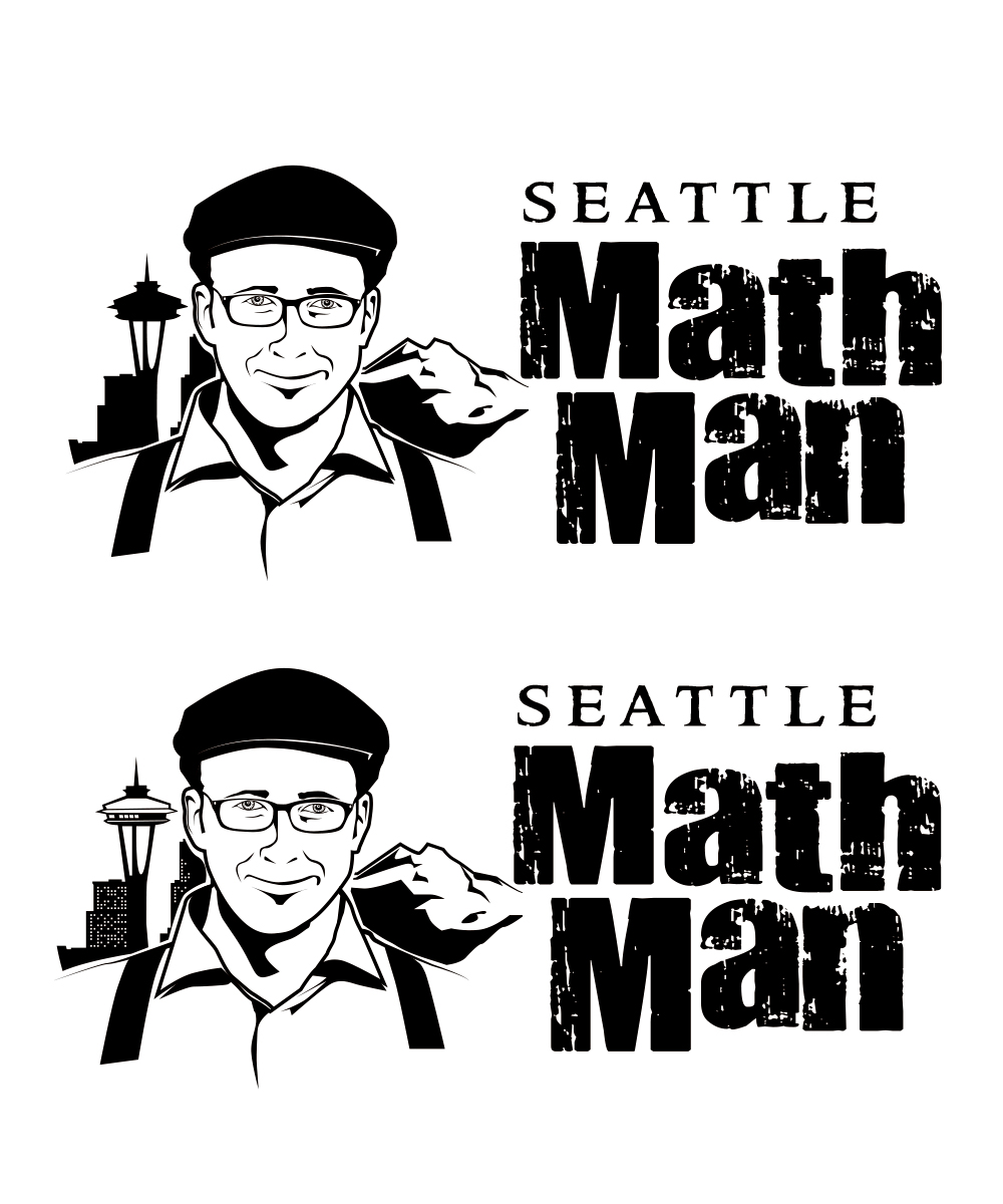
Seattle Math Man logo
¿Quieres ganar un trabajo como este?
Este cliente recibió 56 diseños de logo de 17 diseñadores. Eligieron este diseño de logo de StudioD™ como el diseño ganador.
Únete gratis Encuentra trabajos de diseño
- Garantía
-
 US$360
-
 56 diseños
-
 17 diseñadores
Resumen de Diseño de Logo
Hello -
I'm looking for a logo for my new 1-on-1 tutoring business that will be focused on High School Mathematics. I'm hoping for something that can be reproduced using a single color. I'd like one side (Either LEFT or RIGHT) of the logo to be a stylized image of myself (I've uploaded a photo for you to work with....write me if you want to see others). The other side (Either RIGHT or LEFT) I'd like the words "Seattle Math Man". The "Seattle" can be considerably smaller than the "Math Man". I've been imagining that the font used for the "Math Man" is Strong, and Bold, and that the final look of the words gives the impression that there's been a physical process involved in printing them (sorry, I'm missing the design vocab here, but I'm hoping that the text can look "distressed" or "aged" a bit). Thanks Much!
- Sorry for sloppy language around this point in the initial brief - but I'm looking right now for a SINGLE LOGO that has both the Image and the Words as a part of it.....I've been imagining that the two PARTS of the logo could be "pulled apart" for future use [that is: that they're not TOO entwined] but I'm up for whatever.
- Also: I'm handy with Photoshop.....I'm not looking for something being done to the photo with a single filter through PShop, instead, I'm hoping that the image of the FACE gives some sense of having been done by hand.
Thanks!!

Actualizaciones
Hello Everyone -
I'm hoping to SHIFT FOCUS, and have people work just on the question of FONTS for the words "Seattle" and "Math Man".....I have uploaded a new file that has the illustration that I'm thinking of using. The new file also gives a good idea of the relative WEIGHT and SIZE and PLACEMENT of the words, but I'm not wild about either of the fonts.....I think the "SEATTLE" is maybe a little to Fancy/Elegant, and the "Math Man" I'd like to have more RIGHT ANGLES, but also, more of a WORN, or DISTRESSED LOOK to the letters, as opposed to just Solid, Flat Black on the inside of the letters. Please note that there is both a 1st and 2nd prize that I've committed for......you could take one of those just for solving the FONT question. Thanks much!!
Added Sunday, March 17, 2013
My apologies for letting this DesignCrowd Project slip through the cracks.
Big Thanks to everyone who submitted a design.
Again, Sorry for not wrapping up this project more promptly.
Best of luck with all of your future work!
-Seattle Math Man
Added Thursday, April 18, 2013
Tipo de industria / entidad
Tutoring
Texto del logo
Seattle Math Man
Mira y siente
Cada control deslizante ilustra las características de la marca del cliente y el estilo que debe comunicar el diseño de tu logotipo.


