

 Refresh
Logo Redesign to Match New Company Name - Aptilio
¿Quieres ganar un trabajo como este?
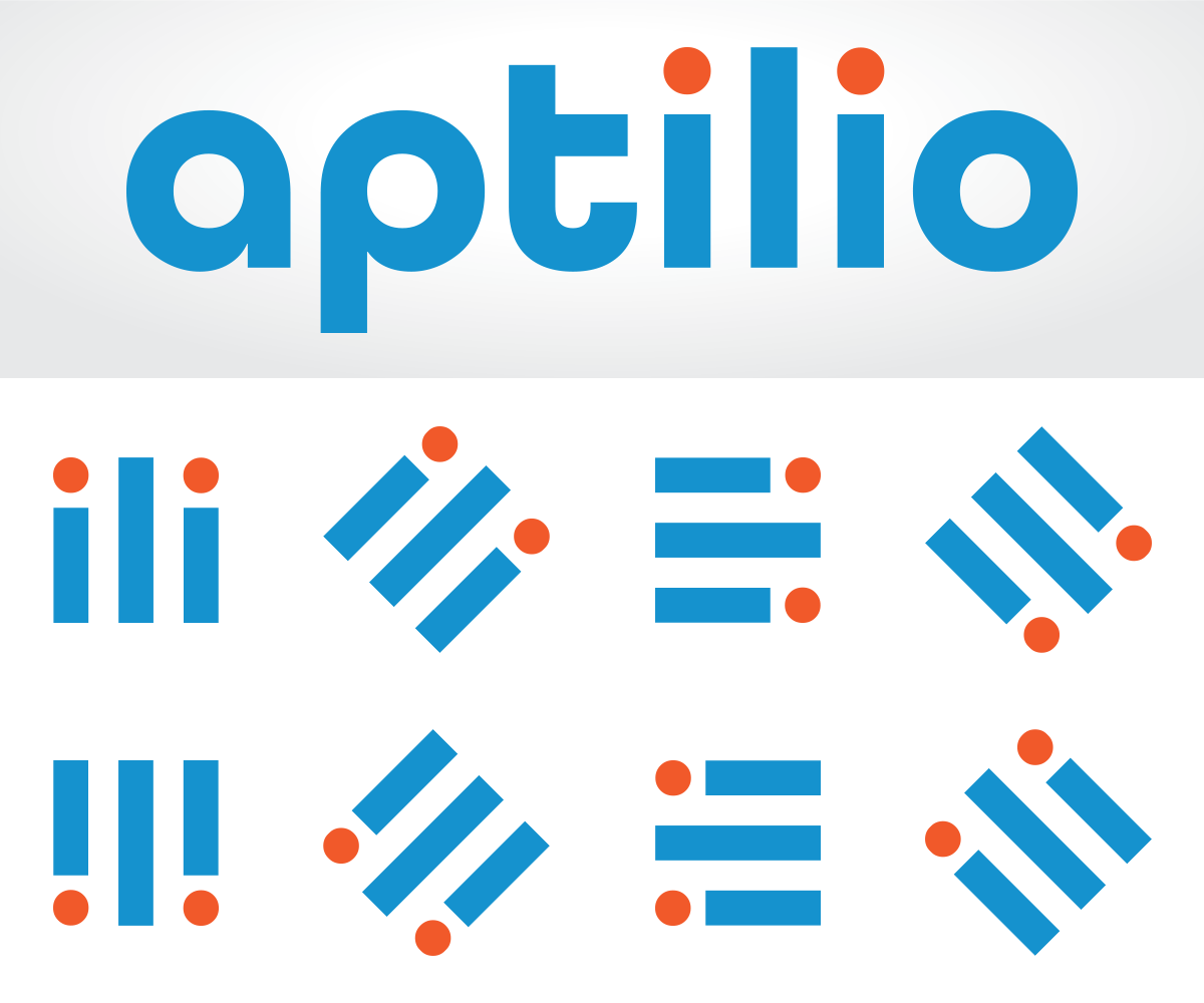
Este cliente recibió 117 diseños de logo de 43 diseñadores. Eligieron este diseño de logo de z a n a como el diseño ganador.
Únete gratis Encuentra trabajos de diseño
- Garantía
-
 US$320
-
 117 diseños
-
 43 diseñadores
Resumen de Diseño de Logo
We are renaming our company from Myhomepayge to Aptilio. We need a logo that keeps the blue and white color scheme of our existing logo but that integrates the new name. The existing logo uses Helvetica Neue as the "my" and Myriad Pro as the "homepayge" but these need not be used going forward. The logo should include both an icon as well as a logotype name. We are building a mobile app for people who live in apartment buildings to communicate with each other and their property management. The design should reflect a very hi-tech, modern feel. The logo could possibly having something related to real estate (e.g. buildings) but that is not essential.
Objetivo del mercado(s)
We sell our services to property managers of residential real estate in the US. However, the residents who live at the properties may see it as well. It should have both a B2B and B2C appeal.
Tipo de industria / entidad
It Company
Texto del logo
Aptilio or aptilio (the name is not case sensitive - whatever looks better)
Estilos de logo de interés
Logo pictórico / combinado
Un objeto del mundo real (texto opcional)



Logo de marca de nombre
Logotipo basado en palabra o nombre (solo texto)


Estilos de fuente para usar

Colores
Colores seleccionados por el cliente para ser utilizados en el diseño del logotipo:
Mira y siente
Cada control deslizante ilustra las características de la marca del cliente y el estilo que debe comunicar el diseño de tu logotipo.
Elegante
Atrevido
Juguetón
Serio
Tradicional
Moderno
Atractivo
Profesional
Femenino
Masculino
Vistoso
Conservador
Económico
De Alta Gama
Requisitos
Debes tener
- You must retain the existing blue and white color scheme. The logo should also have both a graphic and a text block. The existing logo uses the image of a door as the graphic and the word "myhomepayge" as the text block. The logo should lay out nicely both as a rectangle and as a square. In the past, we have used the door icon alone to fill a square and the door and name to fill the rectangle.
Agradable de tener
- Something that relates the logo to the concept of real estate. It should also have a strong technology influence. The name of the company has two key meanings. "Apt" is short for "apartment". When you say "Aptilio" you hear something that sounds like "app" & "tilio". We like the idea that our product is an "app" that gets installed rather than being a website.
No debería tener
- The logo should not have any other words besides "Aptilio" or "aptilio".