

 Refresh
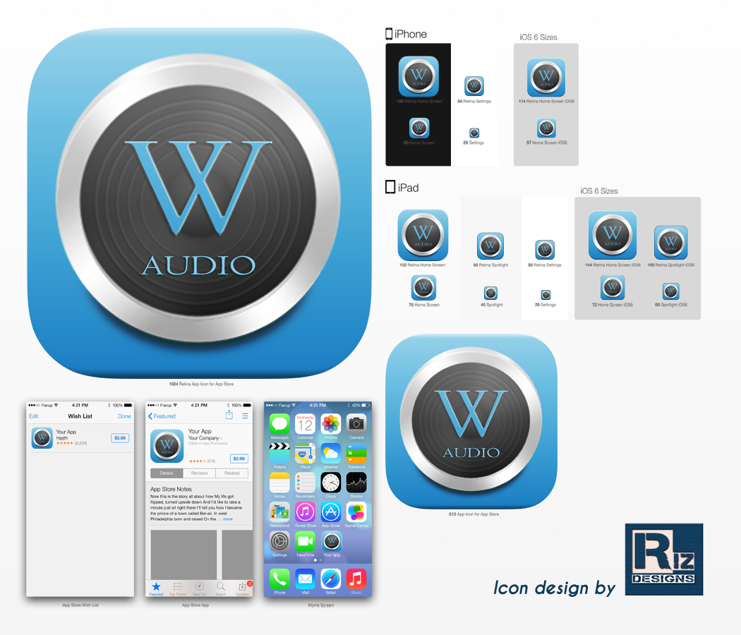
Icon for wikipedia audio reader and guide
Ganador
¿Quieres ganar un trabajo como este?
Este cliente recibió 64 diseños de ícono de 17 diseñadores. Eligieron este diseño con ícono de koolriz86 como el diseño ganador.
Únete gratis Encuentra trabajos de diseño
- Garantía
-
 US$130
-
 64 diseños
-
 17 diseñadores
Resumen de Diseño Con Ícono
I'm developing iOS mobile application that allows to listen to wikipedia articles using siri text-to-speech. It is primarily intended for people who are on the move: walking or driving, and want to know what's around them by listening to wikipedia articles.
At the same time, It allows to search articles by titles.
Objetivo del mercado(s)
Tourists, Audio listeners, Wikipedia fans
Tipo de industria / entidad
Audio
Estilos de fuente para usar
Gustan otros estilos de fuente:
- same as wikipedia logo to the extend copyright allows
Colores
Colores seleccionados por el cliente para ser utilizados en el diseño del logotipo:
34a6d7
Mira y siente
Cada control deslizante ilustra las características de la marca del cliente y el estilo que debe comunicar el diseño de tu logotipo.
Elegante
Atrevido
Juguetón
Serio
Tradicional
Moderno
Atractivo
Profesional
Femenino
Masculino
Vistoso
Conservador
Económico
De Alta Gama
Requisitos
Debes tener
- The icon should be fairly simple. I want it to refer to or somehow resemble one of the wikipedia logos to the extend copyright allows.
- The result should be a collection of PNG files satisfying these apple guidlines for "app icon" and "app icon for the app store":
- https://developer.apple.com/library/ios/documentation/UserExperience/Conceptual/MobileHIG/IconMatrix.html
Agradable de tener
- Please use this blue color RGB(0,156,255). It is used in the app buttons (see attached screenshots) and would make sense to appear as a theme in the icon as well.
- The attached design idea is blue W symbol, styled like wikipedia logo with headphones. I also thought to add legs to the W or use the globe instead of the W. Feel free to work on these ideas or experiment with your own designs.
- Another idea is somehow relate to dancing silhouettes in the old iPod ads (https://www.google.com/search?q=ipod+ad+silhouette), but not sure how this can work with the small icon size.
No debería tener
- Do not use more than 3 primary colors (shades are fine)
- Avoid lots of small objects in the picture.
Archivos
Descargar todos los archivos - 0,4 MBJPG
app icon design idea Wednesday, 25 March 2015 01:06:50

miércoles, 25 de marzo de 2015
PNG
app screen1 Wednesday, 25 March 2015 01:06:48

miércoles, 25 de marzo de 2015
PNG
app screen2 Wednesday, 25 March 2015 01:06:51

miércoles, 25 de marzo de 2015
Pagos
1er lugar
US$130