Logo Design for a sustainability-oriented trading company where East Meets West
¿Quieres ganar un trabajo como este?
Este cliente recibió 61 diseños de logo de 15 diseñadores. Eligieron este diseño de logo de Esolbiz como el diseño ganador.
Únete gratis Encuentra trabajos de diseño-
 S$200
S$200
-
 61 diseños
-
 15 diseñadores
Resumen de Diseño de Logo
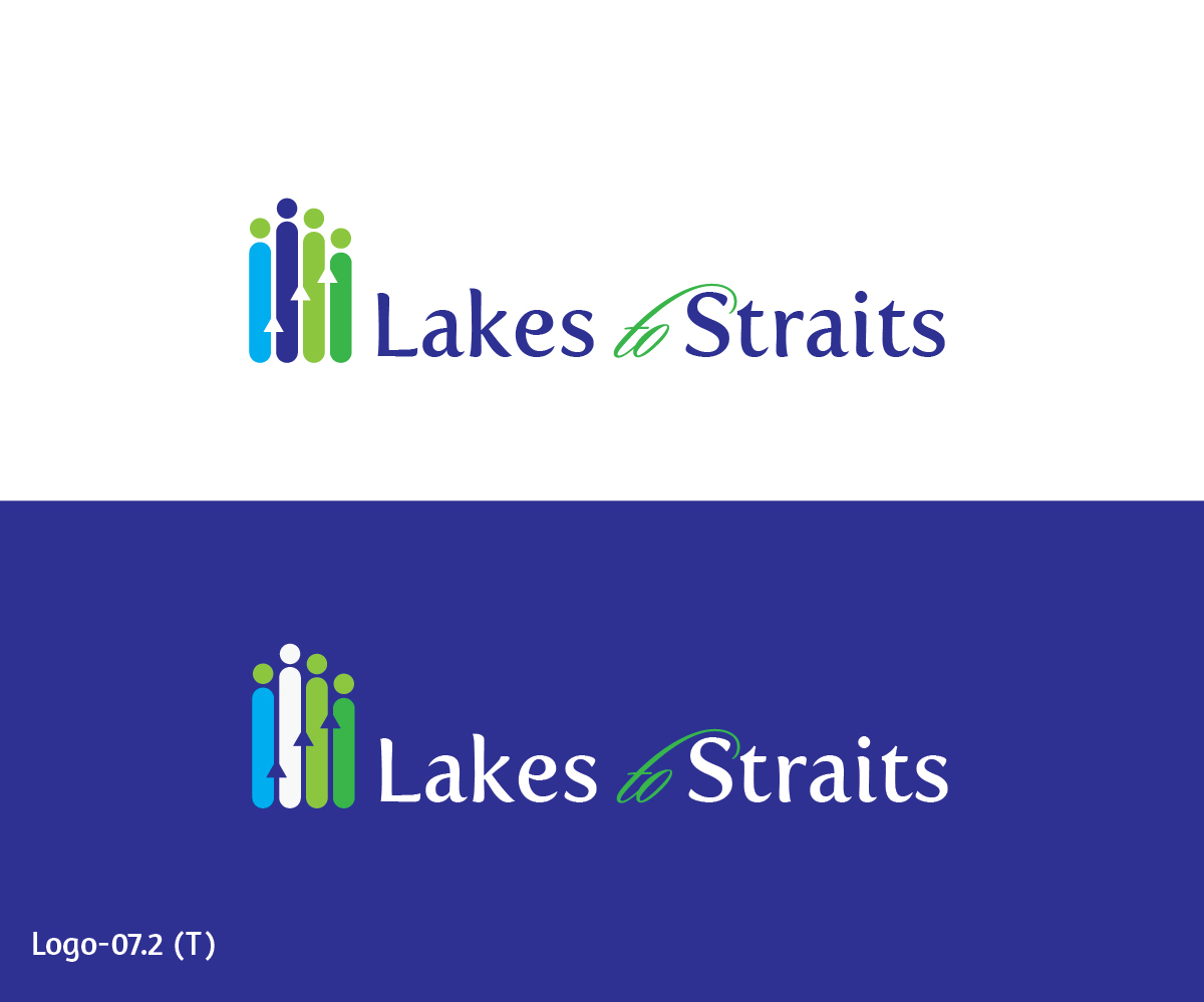
We are a trading company that was borne out of a desire to improve the economic development in places we call home. Our company name, Lakes to Straits, represents the flow of goods from the Great Lakes (U.S.A.) region to the Straits of Singapore, i.e., Asia. It also reflects the founder’s personal journey and Asian and Western background. We are looking for a logo that symbolizes these statements without being complicated. We would like to incorporate the color blue or possibly green, symbolizing the sustainability aspect of our goals. However, we are open to other colors.
Objetivo del mercado(s)
B-2-B: retailers, bars, and restaurants that cater to the following end customers (as well as these customers themselves):
Millenials and Gen X; those who value authenticity; those who are looking for a "story"; adventurous eaters/drinkers; foodies; the well-traveled; the well-educated; the well-to-do
Tipo de industria / entidad
It Company
Texto del logo
Lakes to Straits
Estilos de logo de interés
Logo pictórico / combinado
Un objeto del mundo real (texto opcional)
Logo abstracto
Conceptual / simbólico (texto opcional)
Logo de marca de nombre
Logotipo basado en palabra o nombre (solo texto)
Logo con siglas
Acrónimo o logo tipográfico (solo texto)
Estilos de fuente para usar
Gustan otros estilos de fuente:
- Open to others but not Decorative
Mira y siente
Cada control deslizante ilustra las características de la marca del cliente y el estilo que debe comunicar el diseño de tu logotipo.
Elegante
Atrevido
Juguetón
Serio
Tradicional
Moderno
Atractivo
Profesional
Femenino
Masculino
Vistoso
Conservador
Económico
De Alta Gama
Requisitos
Debes tener
- Powerful, effective, and credible
Agradable de tener
- "L2S" alternative logo
No debería tener
- Too many colours - ideally we want to limit logo to 2 colours, or 3 colours if one is black (it can be 2 colours with one black as well)