Farmer's Stand - A farmer's market on the web
¿Quieres ganar un trabajo como este?
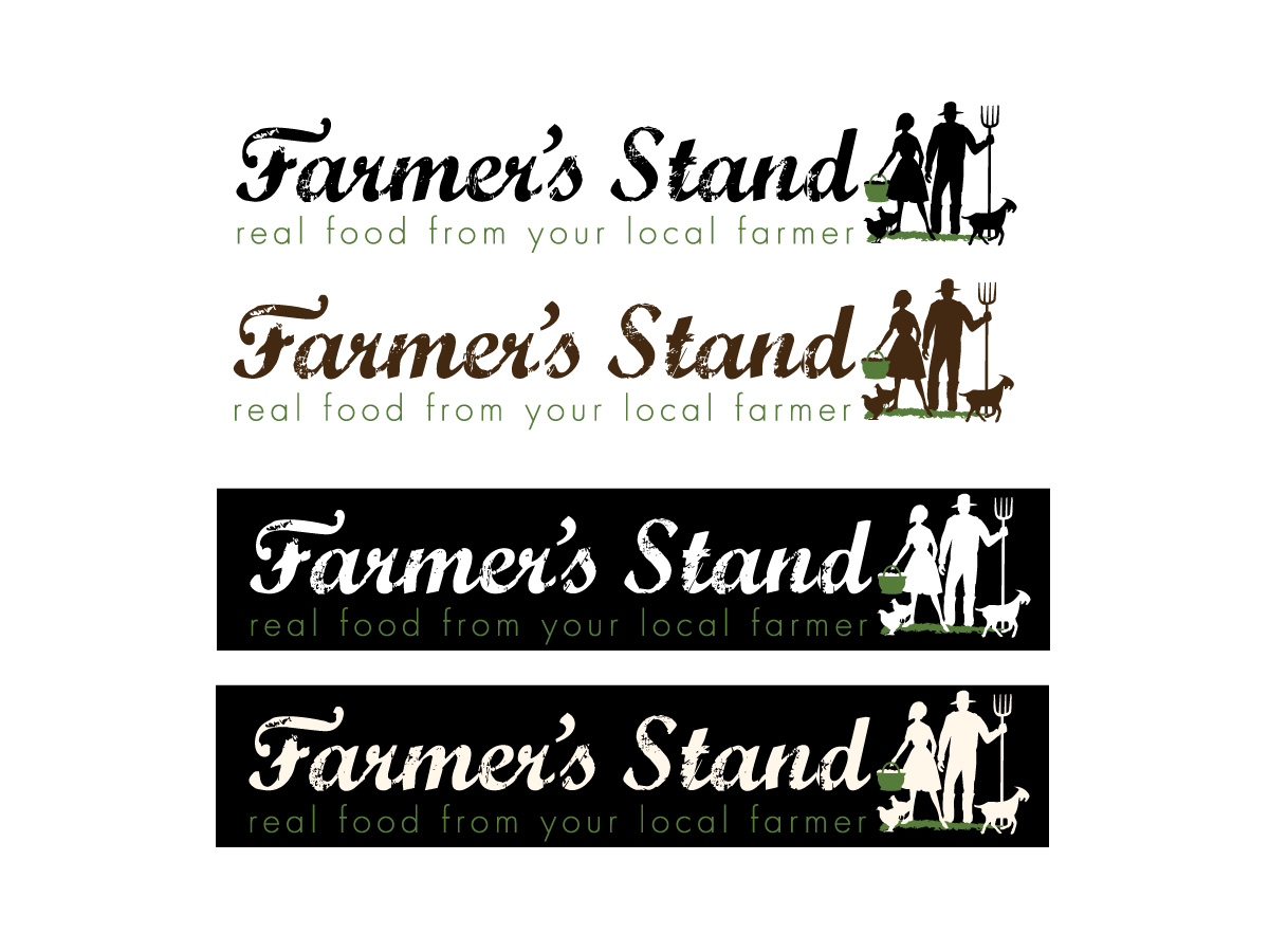
Este cliente recibió 64 diseños de logo de 23 diseñadores. Eligieron este diseño de logo de Patricia Baliviera como el diseño ganador.
Únete gratis Encuentra trabajos de diseño- Garantía
-
 US$180
-
 64 diseños
-
 23 diseñadores
Resumen de Diseño de Logo
Hello and welcome to our project.
We need a logo design for our website that is essentially an online farmers' market.
The design we have in mind is basically horizontal and is both 'organic' and represents web 2.0 at the same time (if that's even possible).
The company name embodies two meanings at once. Farmer's Stand represents the traditional farmers' market (see link: http://qwi.ki/if5I9Z). It also represents the local farmers and food artisans 'stand' for their community, lifestyle, expertise and family.
To get an idea of who this logo will represent, please take a look at the farmer photos about half way down this blog: http://bit.ly/jRf2RT (note, these are not my photos so please don't use them). Additionally, there's a bunch of interesting design ideas at this link: http://bit.ly/kDoDlH
We've uploaded the basic text idea of what we're looking for. However, we'd like to give designers creative flexibility and are willing to consider all designs.
Objetivo del mercado(s)
Our target market are eaters who want to purchase fresh locally grown and produced food opposed to low quality food trucked in from a far away locations (link: http://qwi.ki/ehQUby).
Tipo de industria / entidad
It Company
Texto del logo
Farmer's Stand - real food from your local farmer
Estilos de logo de interés
Logo pictórico / combinado
Un objeto del mundo real (texto opcional)
Logo de marca de nombre
Logotipo basado en palabra o nombre (solo texto)
Mira y siente
Cada control deslizante ilustra las características de la marca del cliente y el estilo que debe comunicar el diseño de tu logotipo.
Elegante
Atrevido
Juguetón
Serio
Tradicional
Moderno
Atractivo
Profesional
Femenino
Masculino
Vistoso
Conservador
Económico
De Alta Gama
Requisitos
Debes tener
- Must have the name of the company (large) 'Farmer's Stand' and the company motto (small) 'real food from your local farmer' at at equal horizontal distance below the company name. See the attached file for our basic thoughts.
Farmer's Stand (large)
Real food from your local farmer (small)
Agradable de tener
- Unique stylized text for 'Farmer's Stand' portion of the logo. These companies have logos that we like. We especially like the fonts that are some-what ‘worn’ – not sure what it’s called but something similar would possibly look nice for the ‘Farmer’s Stand’ part of the logo.
http://www.doortodoororganics.com/
http://doorstepdairy.com/
http://www.farmersmarketonline.ca/
http://www.freshdirect.com
http://www.gilttaste.com/
http://www.localdirt.com/
http://www.abelandcole.co.uk/
http://www.earthfare.com/
http://www.realtimefarms.com/
http://www.localfoodisbetter.com/
No debería tener
- No color backgrounds or borders - this logo background must be translucent for a variety of uses including our website, business cards, documents, various backgrounds, etc. Thanks.