ispytoys
¿Quieres ganar un trabajo como este?
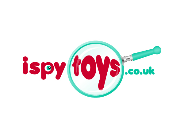
Este cliente recibió 76 diseños de logo de 22 diseñadores. Eligieron este diseño de logo de Hoopoe como el diseño ganador.
Únete gratis Encuentra trabajos de diseño-
 £150
£150
-
 76 diseños
-
 22 diseñadores
Resumen de Diseño de Logo
The output of this brief is to design a visual logo identity for the dotcom ispytoys.co.uk. This is a new company selling toys with a focus on quality and fun. We are a limited, company who source our toys from established quality wholesalers. We believe in getting quality toys and providing real value for money, rather than cheap toys that won't survive boisterous children. We believe in playtime and want to give parents, grandparents and family friends access to toys that will be loved and cherished. Our range extends to outdoor toys, train sets, construction toys, pull along toys through to toys designed to progress young childrens development. Our focus is on toys for babies through to ten year olds with no gender bias - its all about playtime. Our ethos in design of our site will be simple and use white space which we are not afraid of as we want our products to have the space they need. In our digital logo we want colour and personality, potentially inspired by colours often used in childrens toys, however the logo will need to be transferable into a mono format for potential future use in print. Our tone needs to be modern, simple but with a cheeky personality that makes our brand feel accessible.
Actualizaciones
Thanks to those who have already submitted designs, They’ve made me realise that perhaps I got the brief a bit wrong.
So apologies to everyone who’s already submitted or is in the process of doing so, but:-
1. I obviously got the Bold Elegant slider wrong – I really want an original, fun logo, where the words “ispytoys” stand out.
2. I’d prefer the extension (.co.uk) to be very small.
3. With hindsight I would prefer the words to not be multi coloured; i.e. prob no more than 2 different colours.
4. Wondered about the possibility of using a magnifying glass to emphasise perhaps the word toys ?????
5. And lastly I’m not too sure that I want a single toy, well at least not too prominent, if that makes sense, and I certainly don’t want loads of toys in it.
The actual website itself is going to be very clean, clear and uncluttered, with one header bar, no side bars, 1 main picture and 4 smaller pictures acting as age group links. I’m thinking of using the colour of the logo font for the top menu words, as a means of linking everything together. Thanks Mandy
Added Tuesday, June 07, 2011
Objetivo del mercado(s)
Family audience looking for something a little bit unique, gifting for children is our main source of business and the main trigger for purchase is childrens birthdays.
Tipo de industria / entidad
Construction
Texto del logo
ispytoys.co.uk
Estilos de logo de interés
Logo pictórico / combinado
Un objeto del mundo real (texto opcional)
Logo con personaje
Logo con ilustración o personaje
Logo de marca de nombre
Logotipo basado en palabra o nombre (solo texto)
Mira y siente
Cada control deslizante ilustra las características de la marca del cliente y el estilo que debe comunicar el diseño de tu logotipo.
Elegante
Atrevido
Juguetón
Serio
Tradicional
Moderno
Atractivo
Profesional
Femenino
Masculino
Vistoso
Conservador
Económico
De Alta Gama
Requisitos
Debes tener
- Brand name, url, simple and recognisable.
We would require an unlimited number of small amends such as colour pallete amends, font - but appreciate fundamental changes to the core design are within the terms of service ( up to 2)
Agradable de tener
- Inspired by toys - we love the way Pixar use the baby lamp to populate the i in their brand name and while we clearly cannot replicate that it demonstrates how the product can be baked into the logo to quickly communicate what we sell and help make our brand name salient.
No debería tener
- A corporate feel