Preenly: Graphic elements & webpage layout
¿Quieres ganar un trabajo como este?
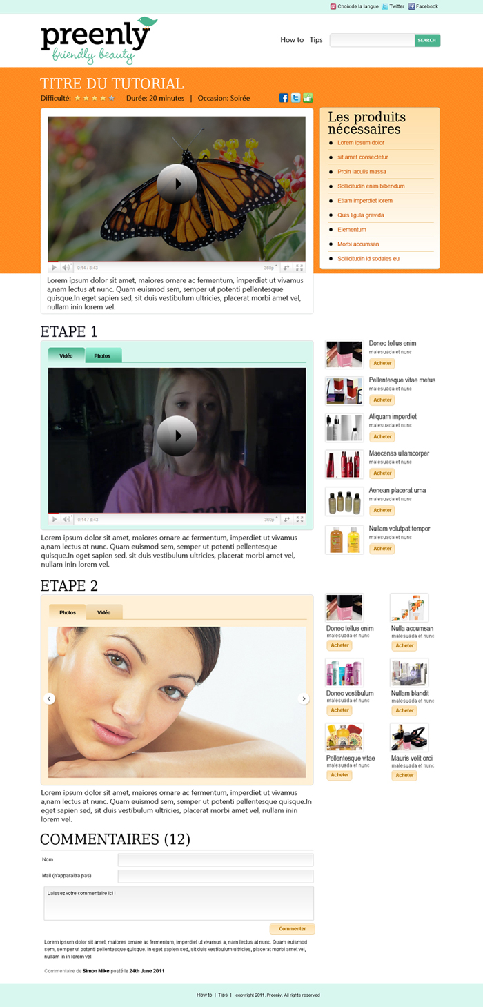
Este cliente recibió 20 diseños web de 10 diseñadores. Eligieron este diseño web de James como el diseño ganador.
Únete gratis Encuentra trabajos de diseño- Garantía
-
 €525
€525
-
 20 diseños
-
 10 diseñadores
Resumen de Diseño Web
Hi there! We’re building a site called Preenly.com—it will be a community site for beauty product reviews, product recommendations and beauty tutorials. We've already got a logo, thanks to another DesignCrowd project. This project on DesignCrowd involves the following web design work:
1) Propose the overall graphic design elements of our site (according to our guidelines, which are in the attached file)
-Color Palette
-Fonts
-Icon set(s)
2) Using the overall graphic design elements in step 1 and our storyboard (attached), develop a webpage layout for the "How-to" page of our site. The "How-to" pages will be an editorial format, where our beauty journalist will show a video (and photos) of step-by-step beauty tutorials.
Please take a look at the attached files for a detailed brief and the logo! Thanks and we're looking forward to working with you!
Objetivo del mercado(s)
Preenly is for a French, English, and American audience of women between the ages of 16 and 30, who buy and use beauty products regularly.
Tipo de industria / entidad
Graphic Design
Mira y siente
Cada control deslizante ilustra las características de la marca del cliente y el estilo que debe comunicar el diseño de tu logotipo.
Elegante
Atrevido
Juguetón
Serio
Tradicional
Moderno
Atractivo
Profesional
Femenino
Masculino
Vistoso
Conservador
Económico
De Alta Gama
Requisitos
Debes tener
- 1) A global set of graphic standards for the website Preenly.com:
• A color palette
• Fonts
• An icon set (or sets)
• A menu
• Other graphic elements like button styles
2) A webpage layout (non-coded) for the How-To page template
(See storyboard, attached separately)
This webpage layout is for the main editorial format on Preenly—step by step beauty tutorials. The individual on-page elements are in the storyboard, but overall we’d like it to look clean, friendly, and to encourage community participation and sharing on social networks.
Agradable de tener
- • A look and feel that is fresh, clean and modern
• Proximity: Establishes a close proximity with the user. (We want them to get the same feeling they get when talking beauty tips with their close friends).
• Neutrality: A sincere and neutral look and feel that doesn’t suggest a preference for any particular or elite type of beauty (but it can still be fun!)
• The graphic design is relevant to the beauty sector as a whole. (We could be talking about lipstick, a hairbrush or a man’s cologne)
• The graphic design alludes to the beauty industry (discreetly, not overtly!)
No debería tener
- We've already got a logo, so you shouldn't suggest a new one!
We really want to avoid designs that are too traditionally "beauty" or too girly and feminine. Please no pink, no flowers, etc! :)