Squirtgun logo—punk band looking for a bold new logo/symbol design.
¿Quieres ganar un trabajo como este?
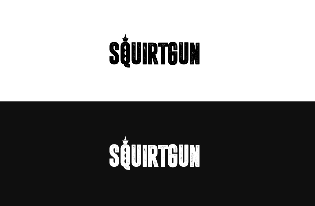
Este cliente recibió 239 diseños de logo de 100 diseñadores. Eligieron este diseño de logo de GLDesigns como el diseño ganador.
Únete gratis Encuentra trabajos de diseño- Garantía
-
 US$250
-
 239 diseños
-
 100 diseñadores
Resumen de Diseño de Logo
To have a new Squirtgun logo to rebrand the band image from cartoony to bold, avoiding too direct a reference to water pistols themselves, and distancing the name from a playful, childlike image.
Squirtgun is an established pop-punk band founded in 1994 best known for its song “Social,” which was the opening song to the film “Mallrats,” and for being part of the mid-90’s roster of Lookout Records, the label best known for launching Green Day and being at the center of the pop-punk explosion of the period.
Squirtgun is hoping to re-work a logo for the band, which could also aid in rebranding its image. A few years ago, Squirtgun decided to pay homage to one of its band heroes which was a huge early influence. We had a logo done based on the Naked Raygun logo. We liked it so much, we decided we needed one of our own that captured the strength and spirit shown by that logo—without our logo being a ripoff of the original, as was our homage.
We lean toward thick, bold letters and clean lines, and want to completely avoid cartoony imagery, splashes or the appearance of full-on squirt guns within the logo. The artistic hint or suggestions of a toy gun is preferred, much as can be seen in the Naked Raygun logo.
They did it in two forms, one with the whole name on one line, the other with Naked above and Raygun above, but it's the same basic thing. The former is better for running across as a title on an album, the latter for taking up a nice block on a tshirt.
Another idea of an ideal logo, in our view, is the new one Anti-Flag started using for their new album. We love the fact that it includes a symbol that can be also used by itself as a band logo, or for the front of the kick drum.
We have played with pointing it in different directions (we feel that it pointing down is too similar). Perhaps doing a similar thing with different design techniques would be just as effective without being a complete steal...
One thought we have was that we could use something similar to (but somehow different than) the descending rays of the Raygun R, encircle them with a thick line, turn it sideways pointing to the left, and use it or adapt it as the letter G.
Such a letter could almost function as a both a G in the logo script, but also function as an independent symbol at the same time.
Another idea we came up with a rudimentary idea (just playing with Photoshop amateurishly) using the top part of the T as a water tank on the left and the rays of the Naked Raygun R as the barrel.
We don't think it's horrible, and while it comes off a bit less ripoff-like, it’s still perhaps too direct a lift from Naked Raygun with the rays. Also, perhaps the tank part of the super soaker on the left side of the T is too big, or the letters could be even fatter.
Another logo which captures some our target feel is the new Svetlanas logo. It’s a bit further from our goal than the Naked Raygun or Anti-Flag logos, but goes along with their Soviet Constructivist aesthetic,
and the circle logo that accompanies it is very nice as a stand-alone symbol for the band (and would look great on a kick drum).
We have also have always liked the Jawbreaker logo. Jawbreaker often accompanied with a historic logo from the 1800's called the 4F. We prefer cleaner lines for ours, along the lines of what Anti-Flag logo, because the logo can always be “dirtied up” for use in different contexts.
1. We’d like big, bold lines, thick letters.
2. Nothing cartoon-ish or too child-like in mood (and we prefer to avoid anything from that looks TOO literally like a squirtgun).
3. We’d also love an accompanying (or incorporated) stand-alone symbol that could work for a kick drum head.
4. If there’s a way to incorporate some of the spirit of the Naked Raygun logo without being a ripoff, that would be wonderful!
Our goal is to have a final decision by October 15, as we’d like to use this new logo for our shirts and banner at Fest16 in Florida at the end of the month.
Thanks so much for your time, and we look forward to seeing some great design ideas!
Tipo de industria / entidad
Entertainment Industry
Texto del logo
Squirtgun
Estilos de logo de interés
Logo pictórico / combinado
Un objeto del mundo real (texto opcional)
Logo de marca de nombre
Logotipo basado en palabra o nombre (solo texto)
Estilos de fuente para usar
Mira y siente
Cada control deslizante ilustra las características de la marca del cliente y el estilo que debe comunicar el diseño de tu logotipo.
Elegante
Atrevido
Juguetón
Serio
Tradicional
Moderno
Atractivo
Profesional
Femenino
Masculino
Vistoso
Conservador
Económico
De Alta Gama
Requisitos
Debes tener
- The name Squirtgun in large bold, letters. An accompanying or included symbol which could stand on its own as a band logo for the face of the kick drum or on a button.
Agradable de tener
- A very abstract or vague reference to a squirt gun or toy gun.
No debería tener
- LNo splashes, cartoon-style imagery, or ornate fonts or lettering.