Logo Design Project for an Author
¿Quieres ganar un trabajo como este?
Este cliente recibió 77 diseños de logo de 20 diseñadores. Eligieron este diseño de logo de Hatem como el diseño ganador.
Únete gratis Encuentra trabajos de diseño- Garantía
-
 A$200
A$200
-
 77 diseños
-
 20 diseñadores
Resumen de Diseño de Logo
This is for my client who needs a logo.
He is a Science Fiction author and this will be part of his entire branding.
The requirements are just his name in capitals in a nice science fiction type font.
A version that looks good on a black background and one that looks good on white.
I think probably use the same font from the book cover of his last book that I uploaded in the files. That thin nice science fiction type font. However, I am open to other possibilities if they look good and very Science Fiction like.
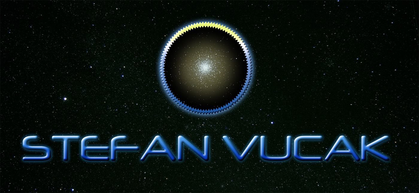
We need it to come with a circle icon that will be used on all his books and branding.
He has described the circle symbol to look like this:
- Thick yellow circle
- Jagged inside/outside edges (saw toothed)
- Black interior filled with stars (globular cluster)
He also quite likes this logo:
http://dribbble.com/shots/921344-New-Logo?list=searches
Make the icon modern, professional and very science fiction.
Objetivo del mercado(s)
sci-fi readers, thriller/drama readers
Tipo de industria / entidad
Interior
Texto del logo
STEFAN VUCAK
Estilos de logo de interés
Logo pictórico / combinado
Un objeto del mundo real (texto opcional)
Logo abstracto
Conceptual / simbólico (texto opcional)
Mira y siente
Cada control deslizante ilustra las características de la marca del cliente y el estilo que debe comunicar el diseño de tu logotipo.
Elegante
Atrevido
Juguetón
Serio
Tradicional
Moderno
Atractivo
Profesional
Femenino
Masculino
Vistoso
Conservador
Económico
De Alta Gama
Requisitos
Debes tener
- Circle symbol that looks like this:
- Thick yellow circle
- Jagged inside/outside edges (saw toothed)
- Black interior filled with stars (globular cluster)
Science Fiction type font for the words STEFAN VUCAK below the icon.
A version on a dark background perhaps on stars and a version on white. So two colour palettes.
Agradable de tener
- On a cool star background to present back to the client would be nice.
See the link that I showed in the description, maybe present it on something like that..
No debería tener
- No fluro colours, must be very minimal.
No old style fonts like times new roman etc.