UK wide student accommodation finder
¿Quieres ganar un trabajo como este?
Este cliente recibió 38 diseños de logo de 14 diseñadores. Eligieron este diseño de logo de REX como el diseño ganador.
Únete gratis Encuentra trabajos de diseño-
 £130
£130
-
 38 diseños
-
 14 diseñadores
Resumen de Diseño de Logo
UK wide website that is split and will be marketed by each region.
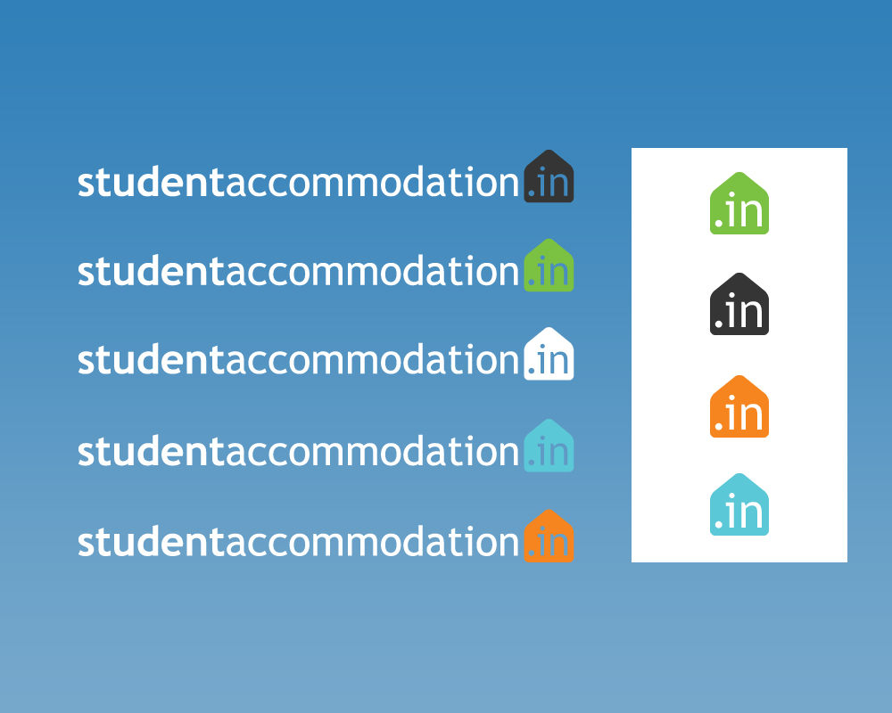
Domain: studentAccommodation.in
However, the URLs that will be marketed will be specific to each region: www.studentAccommodation.in/Newcastle, www.studentAccommodation.in/Sheffield etc...
I have a development version of the website available at http://test.studentproperty.in/newcastle
(Please note that the website is still in development and access to that site may be interrupted/ buggy- i have attached a screen shot of the site as well)
The development site mentioned above should give you an idea of the chosen colour scheme, and the clean design we have gone for.
The logo should highlight the .in ccTLD.
If designing a lettermark logo, use the characters '.in'
The font used on the website is a mixture (because of licensing) of American Typewriter and King (another typewriter esque font). HOWEVER, I am open to suggestions for a new font. DO NOT RESTRICT YOURSELF TO JUST THESE FONTS
Actualizaciones
Thanks to everyone for their submissions.
Added Tuesday, June 21, 2011
Tipo de industria / entidad
Accommodation
Texto del logo
studentAccommodation.in
Estilos de logo de interés
Logo con emblema
Logo contenido dentro una forma / figura
Logo abstracto
Conceptual / simbólico (texto opcional)
Logo de marca de nombre
Logotipo basado en palabra o nombre (solo texto)
Logo con siglas
Acrónimo o logo tipográfico (solo texto)
Mira y siente
Cada control deslizante ilustra las características de la marca del cliente y el estilo que debe comunicar el diseño de tu logotipo.
Elegante
Atrevido
Juguetón
Serio
Tradicional
Moderno
Atractivo
Profesional
Femenino
Masculino
Vistoso
Conservador
Económico
De Alta Gama
Requisitos
Debes tener
- Must mention the .in ccTLD
www.studentAccommodation is the only other text I would like in the logo (however you may choose to leave it out)
Must be clean and simple, with few colours so as to fit into the design (as examplified at http://test.studentproperty.in/newcastle)
must scale well. The logo will be used as a favicon on the site, right up to being printed on large decals and posters.
Agradable de tener
- UPDATED- I have been doodling (hopelessley) and I came upon the concept of a house made out of the letters 'in' (see file 2)
the door is the arch of the n,
the chimney is the dot of the i,
the roof is made by arching the top of the two letters
I AM NOT SAYING STICK TO THIS DESIGN- but it would be nice if a couple of people could attempt to make this look good.
By all means, you guys are the designers. If you have another idea, i would love to see it!
No debería tener
- any more text than www.studentaccommodation.in (although it is not necessary to use all of that text