Translation company needs a playful logo design
¿Quieres ganar un trabajo como este?
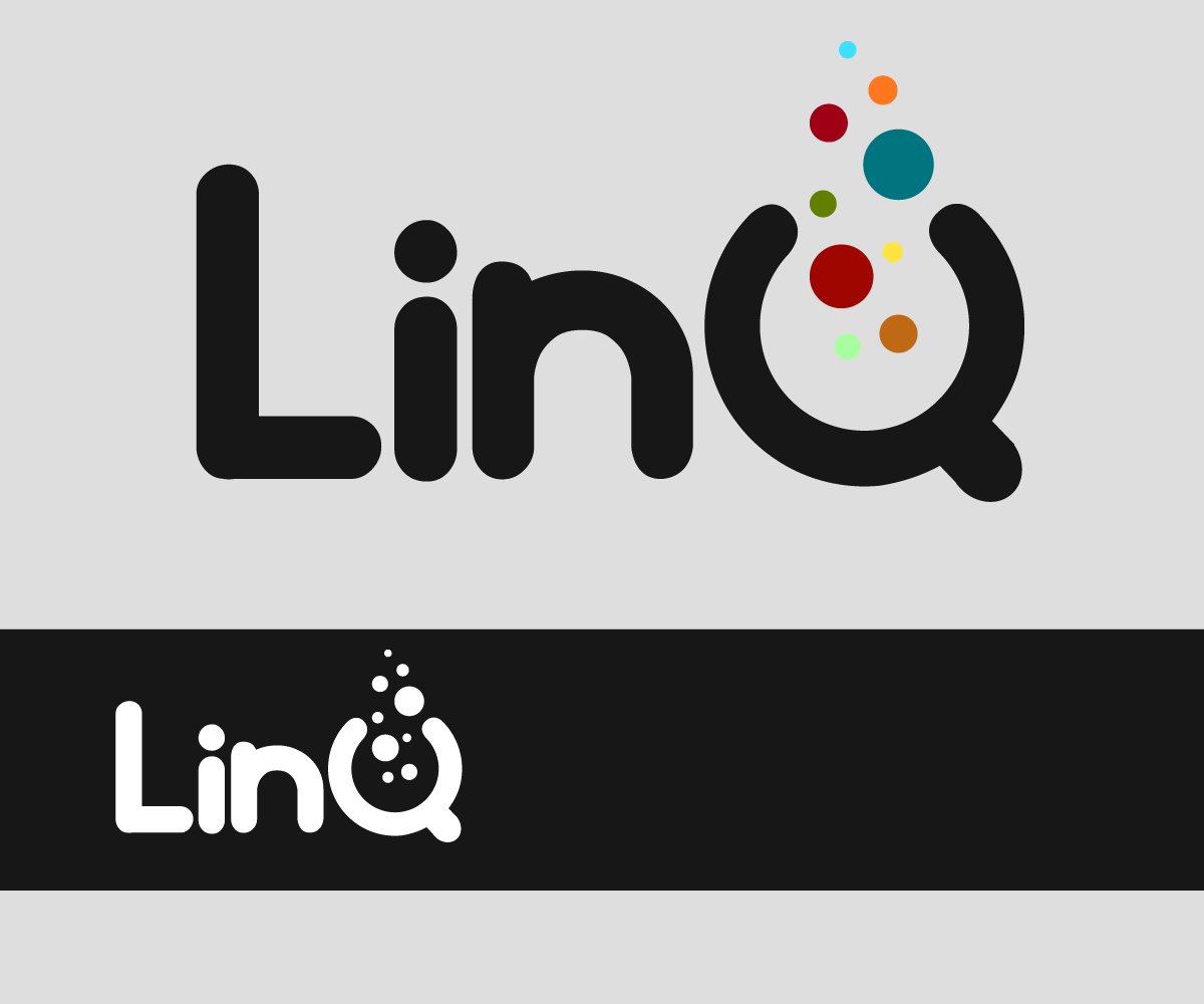
Este cliente recibió 79 diseños de logo de 31 diseñadores. Eligieron este diseño de logo de jacbach graphics como el diseño ganador.
Únete gratis Encuentra trabajos de diseño-
 €250
€250
-
 79 diseños
-
 31 diseñadores
Resumen de Diseño de Logo
We are a new translation company from Krakow, Poland. Our name is LinQ. We call it "linguistic intelligence"
Our Vision/mission:
We do not just test translators before allocating to our projects, but train them and give them real market skills, - because our clients (world leading companies in technical, pharmaceutical industries etc) are very quality demanding.
This is why we call ourselves "LinQ" meaning "linguistic intelligence".
At the same time, we'd like our brand to be rather playful and friendly to the clients and especially to our translators, because education should be fun!
Brand personality:
- necessity not luxury
- economical not expensive
- rather light than serious
- in the middle between formal and casual
- modern, not classic
- innovative and ground breaking, not heritage
- rather hi-tech industrial than homemade
- simple, not complex
- colorful, not black-and-white
- in the middle of subdued and bright
- rather masculine than feminine
- In the middle of quiet and loud
- rather discreet, not aggressive
Our tone and language:
- fun but not childish
- positive
- clever but not silly
- expert but not bossy
- confident but not cocky.
To whom we are speaking:
Our clients are corporate buyers who need their content to be translated. Type of content: legal, medical, technical and other special texts, it means safety-critical texts where human life may be at risk in case of error.
We are also speaking to our partners (freelance translators) and we want to establish loyal, friendly and mutually fruitful long-term relationships with them.
We are thinking about blue, grey, black and/or white colors on the logo.
We are open to your ideas. We see it as primarily text logo (however you may have a good idea of objects (not necessary). These objects may be associated with intelligence (lamp bulb, brain, gear or whatever - your ideas?). We also see our logo rather playful. Please see some attached examples (Gengo, Duolingo). We like rather rounded, smooth fonts, without sharp angles.. But not handwriting or too curly..
Objetivo del mercado(s)
To whom we are speaking:
Our clients are corporate buyers who need their content to be translated. Type of content: legal, medical, technical and other special texts, it means safety-critical texts where human life may be at risk in case of error.
We are also speaking to our partners (freelance translators) and we want to establish special family-like relationships with them. So, we wish to look friendly and playful (though not silly or unserious)
Tipo de industria / entidad
It Company
Texto del logo
LinQ
Estilos de logo de interés
Logo con personaje
Logo con ilustración o personaje
Logo de marca de nombre
Logotipo basado en palabra o nombre (solo texto)
Logo con siglas
Acrónimo o logo tipográfico (solo texto)
Estilos de fuente para usar
Gustan otros estilos de fuente:
- rounded fonts
Colores
Colores seleccionados por el cliente para ser utilizados en el diseño del logotipo:
Mira y siente
Cada control deslizante ilustra las características de la marca del cliente y el estilo que debe comunicar el diseño de tu logotipo.
Elegante
Atrevido
Juguetón
Serio
Tradicional
Moderno
Atractivo
Profesional
Femenino
Masculino
Vistoso
Conservador
Económico
De Alta Gama
Requisitos
Agradable de tener
- We are thinking about blue, grey, black and/or white colors on the logo.
- We are open to your ideas. We see it as primarily text logo (however you may have a good idea of objects (not necessary). These objects may be associated with intelligence (lamp bulb, brain, gear or whatever - your ideas?). We also see our logo rather playful. Please see some attached examples (Gengo, Duolingo). We like rather rounded, smooth fonts, without sharp angles.. But not handwriting, or too curly.. Bright, colorful (blue, white, grey, black preferred)
No debería tener
- Sharp angles or too curly font/no handwriting; do not use black and grey colors only