web design for a feature film comedy: She, the monster
¿Quieres ganar un trabajo como este?
Este cliente recibió 28 diseños web de 4 diseñadores. Eligieron este diseño web de Desire Design Solutions como el diseño ganador.
Únete gratis Encuentra trabajos de diseño-
 €750
€750
-
 28 diseños
-
 4 diseñadores
Resumen de Diseño Web
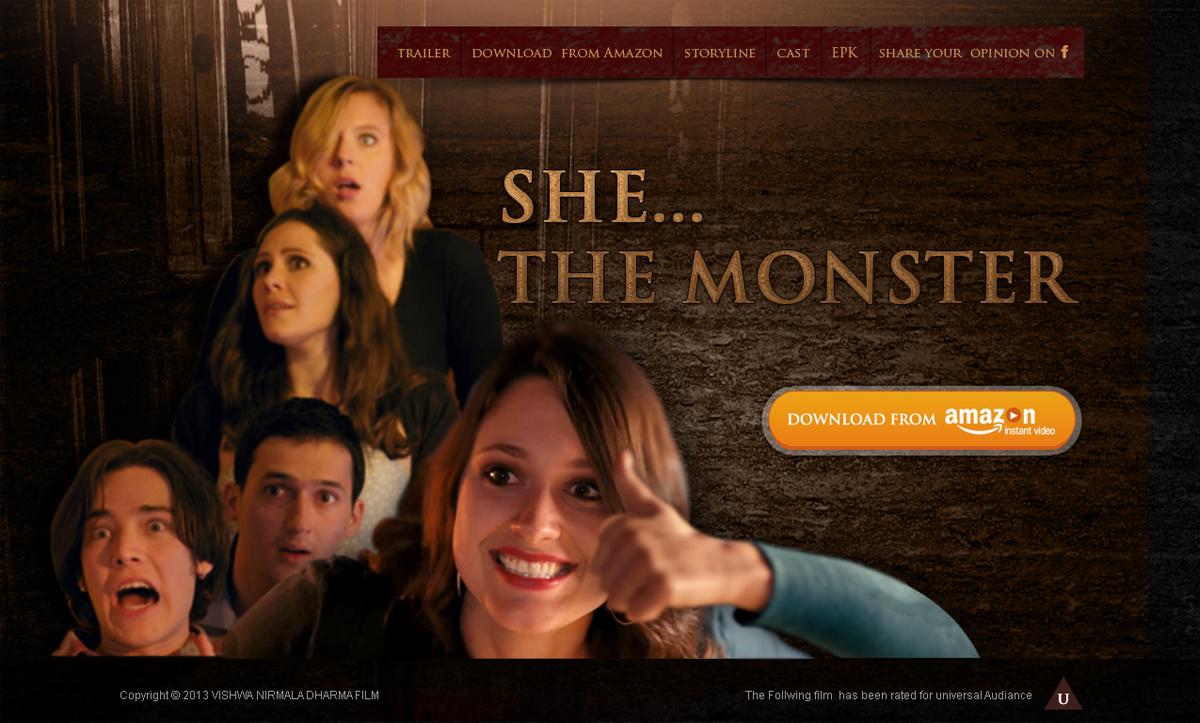
The web design is for a feature film: a comedy: “She, the monster” , about an extremely stupid young woman who runs her own hotel. She is so silly the guests are running away. Her fiancé feeds her with incredible lies about his own adventures and she believes him. A group of four young friends, who come to stay in her hotel, try to make her see he is lying to her. But that is easier said than done. Is there a limit to her stupidity? Not really!
The web design should be based on the stock footage provided. The uploaded footage is of low res and the winner will be supplied with high res Tiffs to complete the design. The design should be very rich. The web page will be the first contact the potential viewers will have with the film, since the film will be on Amazon Instant Video ( for downloads only), and will be advertised mostly through Google. The image on the web site should therefore be very strong, drawing attention.
1. General design should be one image for the whole screen and not split in smaller parts, like some film sites have. Examples : good: The Great Gatsby ( http://thegreatgatsby.warnerbros.com/ or the Croods : http://www.thecroodsmovie.com/ ; those that are not by my liking : The Big wedding (https://www.thebigweddingmovie.com/) or Peeples : http://peeplesmovie.com/ (split in two)
2. Yu must use the photo AT1.jpg for the image. You may use, if you feel appropriate , the hand on the image AT2.jpg and insert it into the AT1.jpg, but it shouldn’t cover her face.
3. What user will first see, when entering the page, will be the web design you create, and then this will be covered with the trailer video – like for example on the site : “the Croods”. Since sometimes it takes a long time for the video to upload, the viewer, while waiting will have time to observe your design. Therefore the design should have a lot of details: for example on the site for ” Oz the great and powerful” (http://disney.go.com/thewizard/) , there are many details, like flowers, the design of on the cups ( I’m not talking about 3D). Also on the site for Oblivion : (http://www.oblivionmovie.com/splashpage/index.php) there are many details on the buildings,.. A site that I don’t like for example is for “This is 40” ( http://www.thisis40.co.uk/) - left side has no detail, right has just a photo) , also for Ted (http://www.tedisreal.com/) it doesn’t have much detail, just green color and Ted ( the teddy bear on the sides )
4. The web design should include the main page, a drop down menu and a sub-page. The main page will have on the horizontal bar these 6 icons ( trailer, download from Amazon, storyline, cast, EPK ( electronic press kit) , share your opinion on F (facebook)). Drop down menu will be for storyline ( viewer will be able to choose between storyline, characters and production stills), for actors ( a small photo of an actor and a name ( for 5 actors)) . Sub-pages will be for the trailer, for Download from Amazon ( on the sub page there will be explained you can download for rent for $3.99 or download to own for $13.99 and link to Amazon Instant video), for storyline ( text and photos of characters with their names ), for cast ( each actor will have their own sub-page with a short curriculum vitae and many photos), for EPK ( with a short story line description for press and photos that can be used by press). Sub- pages should be suitable for either little content ( for example just for: “you may download the film from Amazon Instant video. Download for rent is just $3.99 , download to own is $13.99”) without it looking empty, or have 10 or more photos of the main actress on it, for example).
5. The main page must have the film title: She The Monster ( in two lines) or She, the monster included
6. You may design an intricate pattern in which the main photo dissolves into or you may use the other footage from the film or use your own stack footage or do something else , (whatever you find appropriate :-)))
7. The font used on the video and on the film for the title is trojan pro
8. film rating is : Universal
The film was shot in Italy in old town Bobbio and in an old mansion. You can see the trailer at :
TRAILER : SHE, THE MONSTER
http://vimeo.com/61899753
Password:
zz108fgt6
Objetivo del mercado(s)
The film is mostly for audiance between 13 and 21, a lot of older people prefer R (restricted) rated comedies. Film is very inocent in it's jokes, although it's full of them.
Tipo de industria / entidad
Hotel
Mira y siente
Cada control deslizante ilustra las características de la marca del cliente y el estilo que debe comunicar el diseño de tu logotipo.
Elegante
Atrevido
Juguetón
Serio
Tradicional
Moderno
Atractivo
Profesional
Femenino
Masculino
Vistoso
Conservador
Económico
De Alta Gama
Requisitos
Debes tener
- Must use the AT1.jpg, must have the title : She the monster
Agradable de tener
- details, intricate design