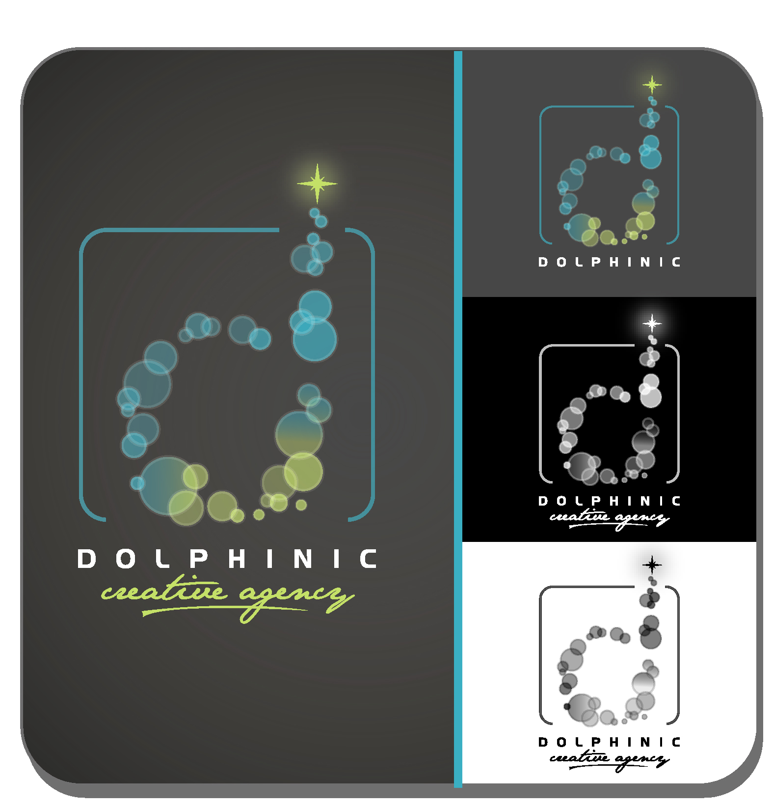
Dolphinic

¿Quieres ganar un trabajo como este?
Este cliente recibió 109 diseños de logo de 32 diseñadores. Eligieron este diseño de logo de Jace Design como el diseño ganador.
Únete gratis Encuentra trabajos de diseño- Garantía
Resumen de Diseño de Logo
Dolphinic is a new start-up creative agency with a bunch of crazy, yet very bright and intelligent + creative minded talent (from public relations, advertising, online and event marketing) who know no limitations in coming up with promotional ideas for clients. The name Dolphinic is derived from the bright, intelligence, strong, happy and care-free dolphins. We add the "-ic" to give the agency a momentum, something that we can say to our clients, "It's a Dolphinic idea! That's why it works much better!" We leave it to everyone of you to decide if you wanna use the text "Dolphinic" in the logo. We are very open-minded!
Actualizaciones
I have said nice to have a logo with 2 colors but please don't let this limit your imagination. I'm open for multiple color if you feel ok. Thanks!
A lot of designs submitted are too preoccupied by the 'dolphin' image / icon. If you can just think of the same brief but without dolphin, I think this may create the open space needed for out-of-the box designs.
Just for a while, think of Dolphinic as just a brand representing 'talented creative people with crazy ideas that work!". Do any from the dolphin image. I don't necessarily need the dolphin image nor the text. The simplier the better.
Out-of-the-box and a lot more lateral thinking needed please.
Objetivo del mercado(s)
Multinamtional brands who wants to see unusual and unconventional creative people. Most likely are the brand managers, marketing directors, chief marketing officers and top management. We also like to attract talents from the advertising, PR, marketing, brand management and event marketing professionals who are tired of the big 4As.
Texto del logo
Dolphinic (but actually not a must in the logo)
Requisitos
Debes tener
- There is not Must Have
Agradable de tener
- Not more than 2 colors to save printing cost. Please try to have a black & white adaptation as well.
No debería tener
- Again, there is no "should-not-have".