Educational company needs new design catalogue page that compels visitors to enroll courses
¿Quieres ganar un trabajo como este?
Este cliente recibió 30 diseños web de 2 diseñadores. Eligieron este diseño web de pb como el diseño ganador.
Únete gratis Encuentra trabajos de diseño- Garantía
-
 US$400
-
 30 diseños
-
 2 diseñadores
Resumen de Diseño Web
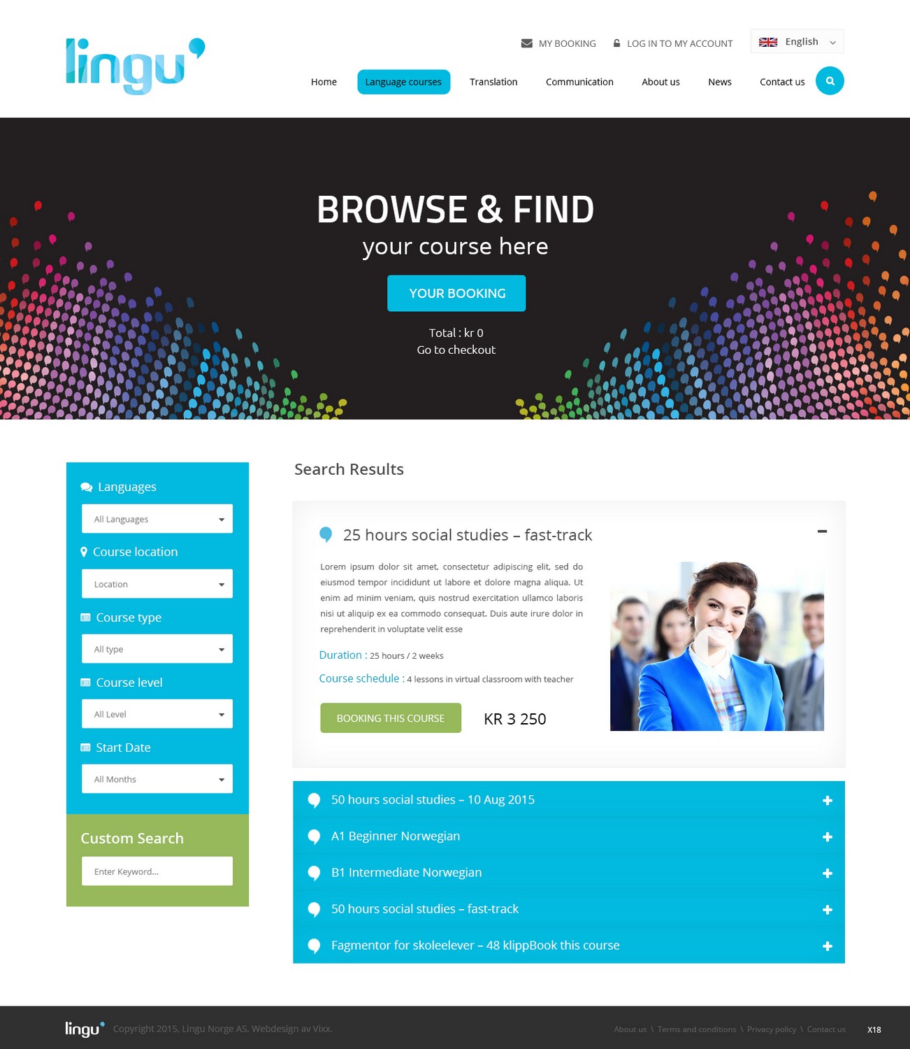
We are an educational company in Norway. Our main business is to create and deliver online courses as well as traditional in-house training services. We provide language and communication training. 60% of our clients are female, and the median age is 30 years.
Our current course booking procedure lists our available courses and lets filter and browse the listings, click to read more or to book now.
We would like a clean, flat design with more use of colors and other design elements. The pages must feel native to the overall website design and must follow the brand guidelines (attached).
This design job includes the following pages (I have also included a reference link to how each of these pages are presented today):
CATALOGUE PAGE
http://lingu.no/en/language-courses
In addition to all the current information pieces, we want the course listing to show color coded tags for location. We have 3 locations: Oslo, Stavanger and Online. We also would like to highlight courses that are on sale.
The current page takes up a lot of space per course listing, and we believe the information could be presented more efficiently.
SINGLE PRODUCT PAGE
https://lingu.no/en/product/50-hours-social-studies-fast-track-2/
https://lingu.no/en/product/a1-beginner-norwegian-6-2/
This page looks not too bad in our opinion. However it could come across better with new design elements and better use of space and colors.
CHECKOUT PAGE
(please click book now on the link above, then Proceed to checkout)
This page has a lot of fields, all of which are necessary. However the new design must make better use of space and colors. The current layout feels overwhelming and there is a lot of fields demanding attention. The page has a steady churn rate due to friction.
So the new design needs to reduce the friction.
Actualizaciones
Project Deadline Extended
Reason: We are still missing a catalogue page design that includes all the elements we wanted such as highlighted items for sale, and a clearly visible label for location.
Furthermore, the project specs also included a product page and a checkout page. We have not seen this yet. Please communicate your intentions on this as well.
Added Monday, July 6, 2015
Tipo de industria / entidad
Business
Codificación
Codificado: se requiere diseño y codificación
Número de páginas requeridas
1 page
Estilos de fuente para usar
Mira y siente
Cada control deslizante ilustra las características de la marca del cliente y el estilo que debe comunicar el diseño de tu logotipo.