Digital Marketing Agency Logo Design
¿Quieres ganar un trabajo como este?
Este cliente recibió 118 diseños de logo de 29 diseñadores. Eligieron este diseño de logo de Fanol Ademi como el diseño ganador.
Únete gratis Encuentra trabajos de diseño-
 US$420
-
 118 diseños
-
 29 diseñadores
Resumen de Diseño de Logo
We are a Seattle-based digital media agency, specializing in planning, execution and analysis of cross-channel digital marketing campaigns. We manage display, video, social, mobile and search campaigns and provide in-depth analysis for high-profile brand advertisers.
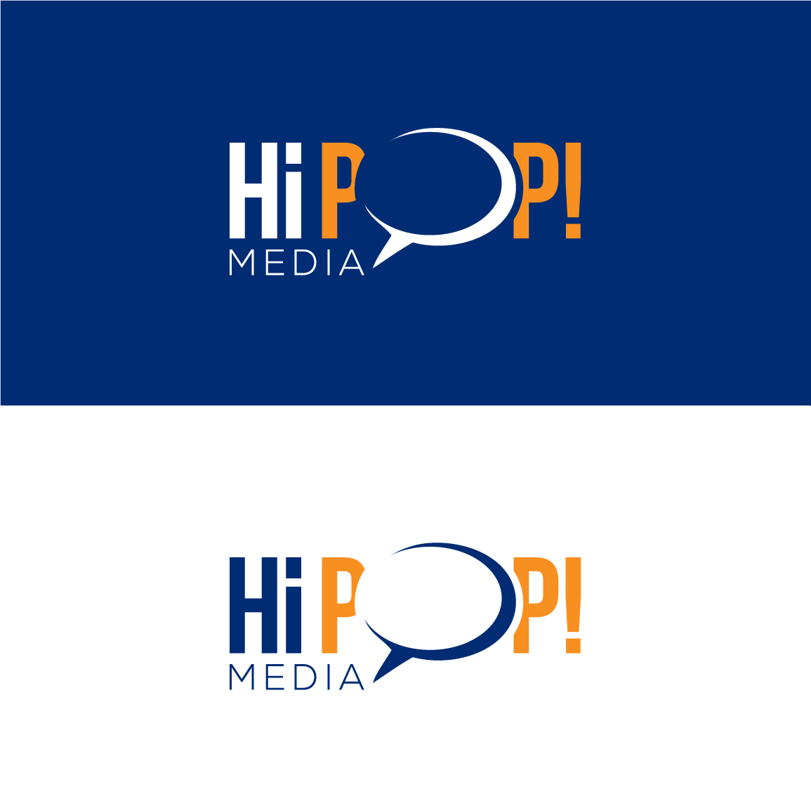
The name Hi Pop! comes from my childhood. I grew up in the 70's and my grandpa had an old dirt floor garage with exposed plank wood walls inside. Spray-painted on the wall in blue paint was "Hi Pop!" When we asked her about it, my Mom didn't recall it but figures she must have done that as a message to her dad (my grandpa) years before. The paint brush style font in our early versions was an homage to that.
Objetivo del mercado(s)
Some of our target clients are premier university business schools, major performing arts groups, professional sports teams - prestigious brands.
Tipo de industria / entidad
Advertising
Texto del logo
Hi Pop! Media
Estilos de logo de interés
Logo con emblema
Logo contenido dentro una forma / figura
Logo pictórico / combinado
Un objeto del mundo real (texto opcional)
Logo de marca de nombre
Logotipo basado en palabra o nombre (solo texto)
Estilos de fuente para usar
Colores
Colores seleccionados por el cliente para ser utilizados en el diseño del logotipo:
Mira y siente
Cada control deslizante ilustra las características de la marca del cliente y el estilo que debe comunicar el diseño de tu logotipo.
Elegante
Atrevido
Juguetón
Serio
Tradicional
Moderno
Atractivo
Profesional
Femenino
Masculino
Vistoso
Conservador
Económico
De Alta Gama
Requisitos
Debes tener
- Our website is in development at test.hipopmedia.com and will have a comic book feel to it based on our early direction with the logo. We like the quote bubble as a symbol of the ongoing conversation we have with our clients and are trying to achieve a cool Lichtenstein/Ben-Day look to our logo.
- All "i's" must be lower case
Agradable de tener
- Characteristics of the attached images we like:
- "Pop!" - Ben Day treatment in the fill of the font
- "Hi Pop! Spacing" - spacing of the words to the bubble
- "HiPOP (Revision) - dual color and brush stroke/comic font
- "LogoBURST" - bold lines and colors
No debería tener
- Our early versions made people think our name was pronounced "hippop" instead of "Hi Pop!" We also had concerns that the word media could not be seen in the exclamation point, so need to make sure it's visible but secondary to "Hi Pop!"
_brief033224.png?AWSAccessKeyId=ASIARQT47ZIUZMMDUSY7&Expires=1783724295&response-content-disposition=attachment%3Bfilename%3D%22HiPOP%28Revision%29%20Friday%2C%2003%20July%202015%2023_32_24.png%22&x-amz-security-token=IQoJb3JpZ2luX2VjENr%2F%2F%2F%2F%2F%2F%2F%2F%2F%2FwEaCXVzLWVhc3QtMSJHMEUCIDm%2BkRgLrOafzvPfOcOoe%2BG36i0wLUnXWO7LmXtoBg4nAiEA6INCZYfdgR1MuG%2FZp6ZWnZllnDpBuhy85SblY09MReMq9AMIo%2F%2F%2F%2F%2F%2F%2F%2F%2F%2F%2FARAAGgwxMDQ0MTUwODcxNDUiDNzqur3s8ucVk2yyKCrIA0o6D1OEXfUh1%2FlqRJOEa4OyRc8e2VH%2FEdoeCtFOd89fJvD6MvmO6KtDIso7KuBE8y1vZA3SIvanpE8vzMUxtWqeUgFzwx3NKXEAwAjuELCkg8YVLXmx4h0ZR6slgvyyL9iB8MzquiFj74rrP5XTbZBU7AC8w7HTmtV16GaU58lA9ka12ZKKjW4wrU8QmtZliYm9kQhKwqdZK4YFR9j62pCFNbUfCVySh8WugpWhTizdfxgo7J1zrKXuuiDTmypR%2F82e5MAVoxKFlfr3pss2N2J%2F9F61YbaEaFq0eJV8Git4dDZfiMtTsPOS8vaNisEhOSMmgWom%2B207EdlZQrLPdGg8v0o3eEW69mUuXM7fo5Bhz2QFGCCOycHXuicPMnMKaFWQs4hHDVE0sHr%2B7ytM7%2B2upf%2BV6wCHmgsaOfErVJmUooTUHTu4SoP5eB4MEq%2F5Rvxt3uX7sB06elebixFfFYP8fnwN1cJPzadr7yAi7TejD8pXuhJc4HusRb373QaybsXSpN8SGyqCeHf8qFtzQnvK4XOzFeZ5%2Bcjmip3m5vXbRaIyMYp6hxRew5%2FaJbPPefGSj7WUWnIKQyjpuo0ng5x53EjYkj72fzDLub%2FSBjqlAbNdF%2BSgMA7%2Fq24u8G6C20dJddFYQfdVAmmMttdspBvtbGEIE29fnok73rhgkEStQoJDh1opjY7V0eVNfjwLWdl5S8kkG%2FGoi9NLfFj7XVnRi%2Bq8DXRI4maiuuy85jJ47O6lcd4%2BbiVa6BlfJ4i8RYQn07FLNOP%2BcgtcgUEkHYyX29nP1oqSsvL8zUZJcic16uJb9gBUIDgCLuFibs1fvXvmUsvpVA%3D%3D&Signature=NUU2HGPN%2F3GiwNtnqvyoZPi3G88%3D)