Cloud based application for stock replenishment
¿Quieres ganar un trabajo como este?
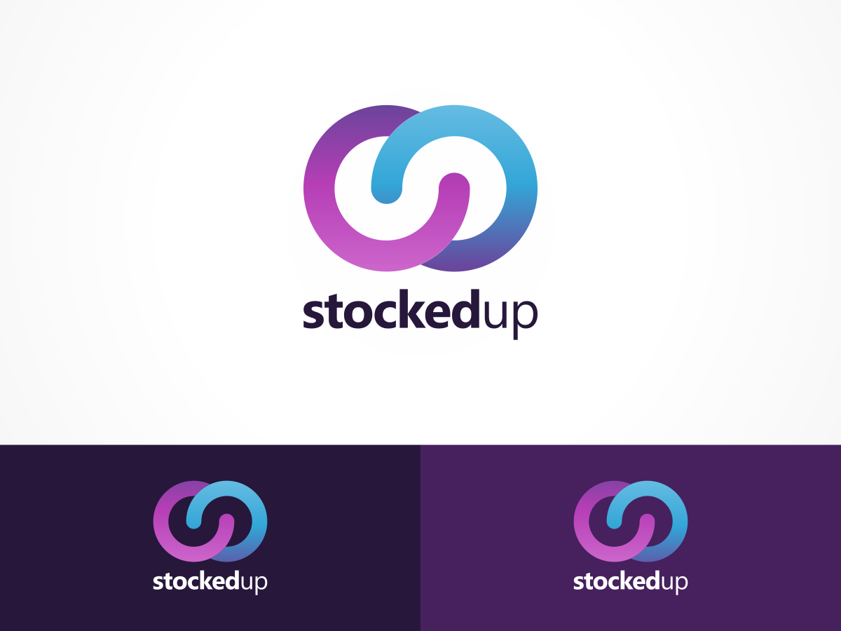
Este cliente recibió 34 diseños de logo de 13 diseñadores. Eligieron este diseño de logo de Undo como el diseño ganador.
Únete gratis Encuentra trabajos de diseño-
 £120
£120
-
 34 diseños
-
 13 diseñadores
Resumen de Diseño de Logo
Design a logo for the application that represpents the catering trade and stocking their larders, freezers and fridges. The logo needs to be fun but not flipant, modern but not too out there.
The application is a cloud based service that allows users to access the system from anywhere on any device. The application will also become a iPhone/iPad application at some point in the near future so ideally rounded square in overall form.
Actualizaciones
Hi this is the last day of the contest, there are a few designers who have stepped up to the plate with great ideas. But as yet there isn't a winner so I would appreciate it if those of you that have positive feedback could have a last look at my comments and see if we can get the perfect design for the application.
Regards
Simon
Added Saturday, July 25, 2015
Project Deadline Extended
Reason: The project needs a few more days to finalise designs!
Added Sunday, July 26, 2015
Objetivo del mercado(s)
Pubs and Restaurants
Tipo de industria / entidad
Catering
Texto del logo
Stocked Up
Estilos de logo de interés
Logo abstracto
Conceptual / simbólico (texto opcional)
Estilos de fuente para usar
Colores
Colores seleccionados por el cliente para ser utilizados en el diseño del logotipo:
Mira y siente
Cada control deslizante ilustra las características de la marca del cliente y el estilo que debe comunicar el diseño de tu logotipo.
Elegante
Atrevido
Juguetón
Serio
Tradicional
Moderno
Atractivo
Profesional
Femenino
Masculino
Vistoso
Conservador
Económico
De Alta Gama
Requisitos
Debes tener
- Focus on the aims of the project not the name of the service.
Agradable de tener
- Humour and some graphical references to what the project is about. Ideally I would like the logo to be abstract and the text can be entirely absent!
No debería tener
- The design should not focus soley on the name of the application. The text needs to minimal and subtle and not the main aspect of the logo. Please don't just plonk an upward arrow on the logo and the name. I could do that with photoshop my self.