

 Refresh
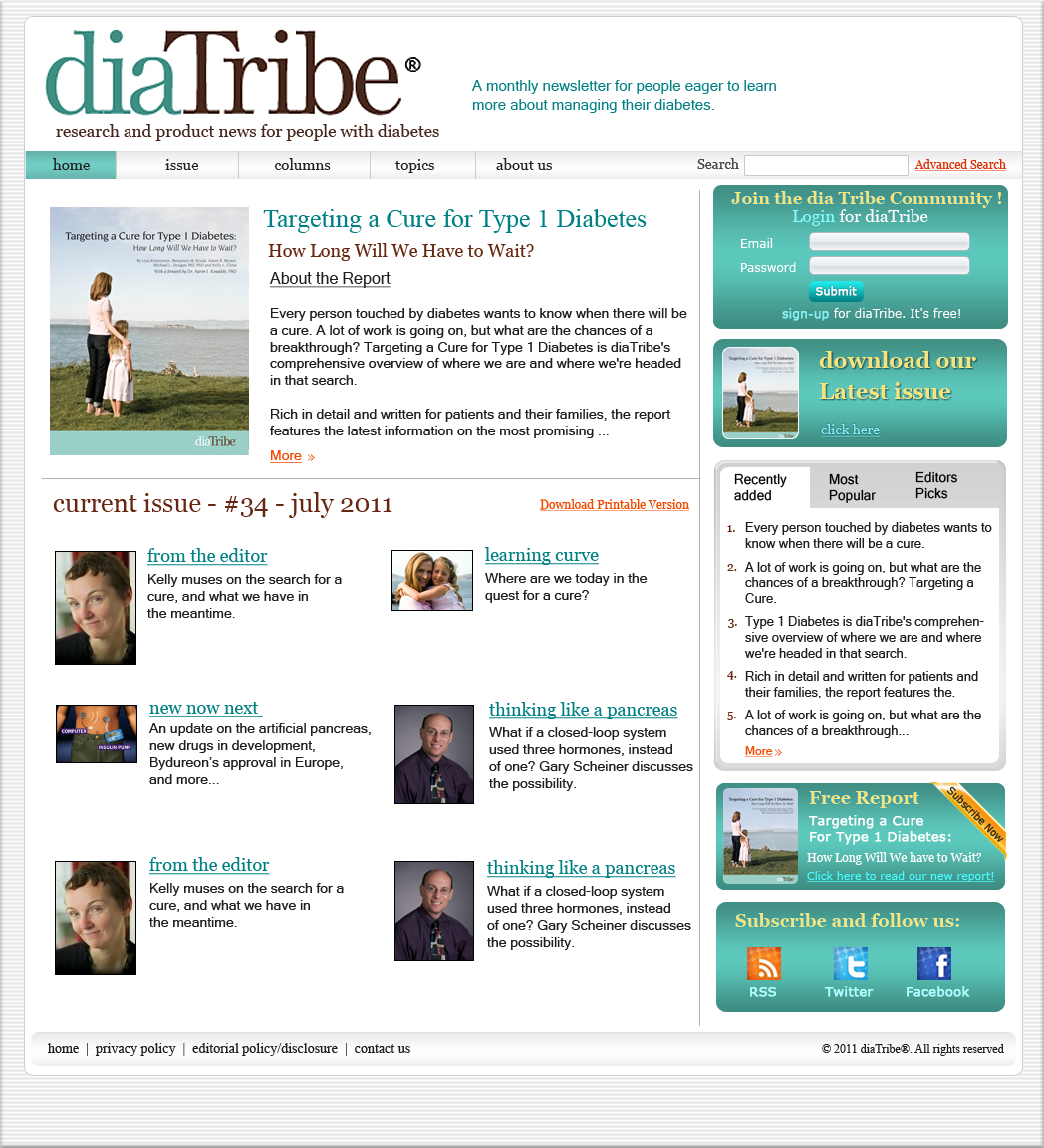
New website for diaTribe
¿Quieres ganar un trabajo como este?
Este cliente recibió 22 diseños web de 7 diseñadores. Eligieron este diseño web de Sunil como el diseño ganador.
Únete gratis Encuentra trabajos de diseño
-
 US$300
-
 22 diseños
-
 7 diseñadores
Resumen de Diseño Web
We are looking to redesign our e-newsletter diaTribe. This a monthly newsletter that publishes the latest research and product news in the diabetes field for people with diabetes. Our current website is here: www.diatribe.us.
The parameters are the new site must incorporate our logo, must use the same colors (variation in shade and adding some colors is fine, but the initial pallet should stay) and must be in 1024 by 768 px. It is crucially important that the font in the new design be easily readable (dark, well spaced). If it could be a layered PSD that would be ideal. We have attached 2 sketches of our own brainstorming for a potential lay-out for the home and a new issue page, but these are very rough and should not in any way limit the true designers out there.
We're envisioning a very polished, sophisticated looking magazine-esque site that presents a lot of information. When we were brainstorming for new site ideas we looked at major monthly publications such as the New Yorker (www.newyorker.com) or Vanity Fair (www.vf.com). Like these sites we would still like to feature much of our newest content on the front page, but in a manner that makes good use of space and feels uncluttered. Information needs to be clearly labeled and easy to find. In terms of the overall tone of the website, we do very much want it to be nice and elegant looking site, and one that is targeting a smart, engaged audience.

Actualizaciones
Project Deadline Extended
Reason: I didn't realize I'd made this due on a Sunday. Please take a couple of extra days everyone.
Added Saturday, July 23, 2011
Project Deadline Extended
Added Tuesday, July 26, 2011
Project Deadline Extended
Added Thursday, July 28, 2011
Project Deadline Extended
Added Friday, July 29, 2011
Tipo de industria / entidad
News
Mira y siente
Cada control deslizante ilustra las características de la marca del cliente y el estilo que debe comunicar el diseño de tu logotipo.
Elegante
Atrevido
Juguetón
Serio
Tradicional
Moderno
Atractivo
Profesional
Femenino
Masculino
Vistoso
Conservador
Económico
De Alta Gama
Requisitos
Debes tener
- The logo. The same color scheme we currently use
Agradable de tener
- We like the idea of having a featured content box, of using hover buttons on top for our various sections, and potentially using a 3 column setup. However, we are not web designers, so the designer can use these suggestions at their discretion.
