Hotel affiliate + city guide website (Orlando)
¿Quieres ganar un trabajo como este?
Este cliente recibió 57 diseños web de 8 diseñadores. Eligieron este diseño web de Sbss como el diseño ganador.
Únete gratis Encuentra trabajos de diseño- Garantía
-
 €400
€400
-
 57 diseños
-
 8 diseñadores
Resumen de Diseño Web
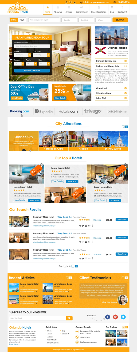
I need a bold, colorful, modern and professional design for a hotel affiliate website. The website will provide visitors with extensive information about how to get the best hotel deals in a specific city (in this case: Orlando, Florida) as well as list a big selection of available hotels. Apart from that, the website will serve as a city guide with all the sights, restaurants, attractions, etc.
From a commercial point of view, it is important that there is a balance between text and visuals. Text, because our main source of visitors comes from search engines and we want to retain visitors who are looking for information before booking their hotel rooms. Visual, because we don't want to lose visitors who are just looking for a quick link to different hotel booking consolidators and make their decision visually. Bear in mind that the design is for a Wordpress site, so don't go overboard in terms of layout. Also, the design must be flexible in such a way that we can use it for other destiantions as well.
Special elements must include
The design must consist of five pages:
- A home page
- An article page. Make sure that images in the article are presented in an attractive way, i.e. with caption.
- A search result page displaying a list of hotels and on the left hand side a column with filtering options)
- A hotel description page (for examples, visit websites like hotels.com and booking.com and select a random hotel)
- A blog page that will become the main page for all the topics and articles of the city guide
Please check the following links to get an idea of the direction we want to take
Hotel Specials
- http://www.hotelspecials.nl/
- http://www.hotelspecials.nl/nl/noord-holland/amsterdam.html
We like this design for its boldness, colors and overall vibrancy and attractiveness. However, it doesn't distract from the text. A nice balance between text and visuals. Looks professional but also has a certain breeziness and playfulness to it as a finishing touch.
Vliegtickets.nl
- http://www.vliegtickets.nl/bestemmingen/europa/spanje/barcelona
We like the idea of using the header space for a booking module, picture and deal of the day.
Also, included is a design I saw in another contest. What draws me to this design most is the combination of the search listing of hotels and the travel information that is presented in the right colum. Another great example of the balance we're looking for.
Attached are also some logos you can use for the element that provides direct links to our partners.
Objetivo del mercado(s)
USA/International
Tipo de industria / entidad
Travel
Número de páginas requeridas
5+ page
Estilos de fuente para usar
Mira y siente
Cada control deslizante ilustra las características de la marca del cliente y el estilo que debe comunicar el diseño de tu logotipo.
Elegante
Atrevido
Juguetón
Serio
Tradicional
Moderno
Atractivo
Profesional
Femenino
Masculino
Vistoso
Conservador
Económico
De Alta Gama
Requisitos
Debes tener
- - A logo
- - A header
- - A top dropdown menu
- - A side menu with icons. These will link to the different categories and articles for the city guide and information about the destination.
- - Advertisement/deal of the day,
- - Element with logos of different hotel brokers. Make sure
- - Element with top three of hotels. Go a little more creative.
- - Element with a graphic that will point visitors to the hotel search list,
- - About 4-6 article intros on the home page
- - Facebook/Twitter/Google+
- - Booking module
- - Footer that must accommodate a large amount of links to partner websites for other destinations
Agradable de tener
- - Creative elements that you think would be great for a travel website. Such as an element or box with tips that will display throughout the site.
- - A booking module in two different sizes. One for in smaller side elements, the other larger and more prominent.
No debería tener
- Nothing pompous, too elegant or kitsch.