

 Refresh
IT Business needs services diagrams turned into infographics
¿Quieres ganar un trabajo como este?
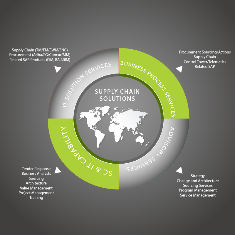
Este cliente recibió 15 diseños de infográficos de 5 diseñadores. Eligieron este diseño infográfico de lovelyMe como el diseño ganador.
Únete gratis Encuentra trabajos de diseño
-
 A$230
A$230
-
 15 diseños
-
 5 diseñadores
Resumen de Diseño Infográfico
We have two diagrams that show our service categories. We'd like the content to be turned into an infographic for each diagram so that they look more modern and professional. The two infographics should have a similar design so that they can be used together. The infographics should use the content supplied in the diagrams and the corporate colours of black, grey and green as per our website www.fourpl.com.au. Attached below is the original diagrams and some infographic designs that we are currently using but we would like something new.
Objetivo del mercado(s)
Big Corporate companies
Tipo de industria / entidad
It Company
Estilos de fuente para usar

Colores
Colores seleccionados por el cliente para ser utilizados en el diseño del logotipo:
Mira y siente
Cada control deslizante ilustra las características de la marca del cliente y el estilo que debe comunicar el diseño de tu logotipo.
Elegante
Atrevido
Juguetón
Serio
Tradicional
Moderno
Atractivo
Profesional
Femenino
Masculino
Vistoso
Conservador
Económico
De Alta Gama
Requisitos
Debes tener
- Content as per the diagrams
- Use corporate colours of green, grey and black
Agradable de tener
- Similar style to the website style: www.fourpl.com.au
- strong lines, modern style.
No debería tener
- nothing airy fairy,

