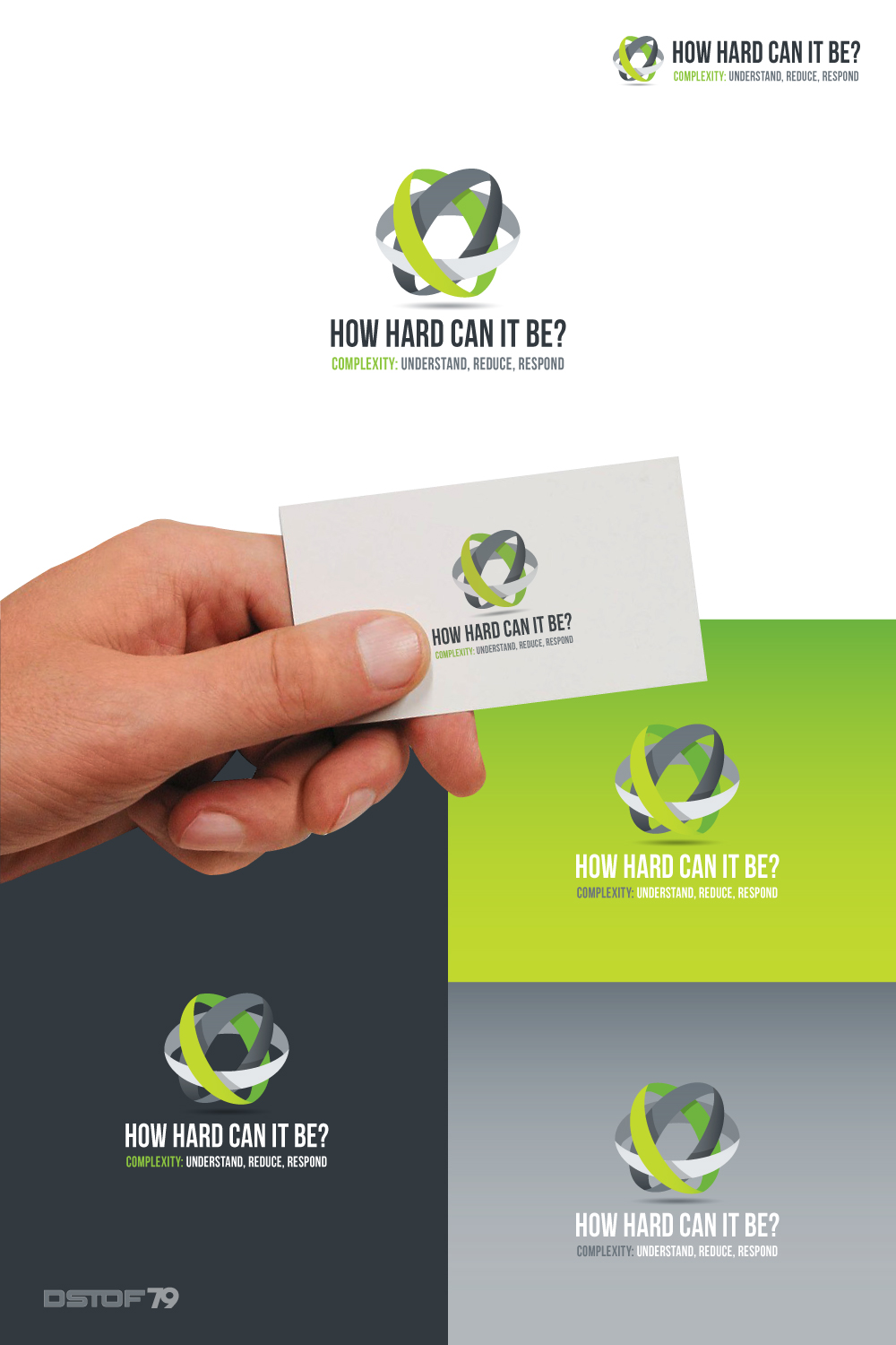
How hard can it be? Managing complexity in projects

¿Quieres ganar un trabajo como este?
Este cliente recibió 34 diseños de logo de 18 diseñadores. Eligieron este diseño de logo de SilverFire como el diseño ganador.
Únete gratis Encuentra trabajos de diseñoResumen de Diseño de Logo
I need a logo for inclusion in presentations and on publications on the topic of 'managing complexity in projects and project organisations.'
I have been studying complexity in projects for many years. Organisations tend to make delivering projects very complex to manage - i.e. proper hard.
We can now describe complexity in terms of 3 elements - structural, socio-political and emergent complexities. This helps understanding.
We work with managers and firms to reduce complexity or even remove some aspects entirely (headings are: remove, reduce, run with).
We can then help them to respond to the residual complexities in better ways (people, process and organisation).
So, how hard can it be?
Objetivo del mercado(s)
Leaders in the business of delivering projects as well as project managers. This is delivered globally and the market it is exposed to ranges from project teams to CEOs and government ministers.
Tipo de industria / entidad
Education
Texto del logo
"How hard can it be?" and "Complexity: understand, reduce, respond"
Estilos de logo de interés
Logo con emblema
Logo contenido dentro una forma / figura
Logo abstracto
Conceptual / simbólico (texto opcional)
Estilos de fuente para usar
Mira y siente
Cada control deslizante ilustra las características de la marca del cliente y el estilo que debe comunicar el diseño de tu logotipo.
Elegante
Atrevido
Juguetón
Serio
Tradicional
Moderno
Atractivo
Profesional
Femenino
Masculino
Vistoso
Conservador
Económico
De Alta Gama
Requisitos
Debes tener
- The framework for understanding, reduction and response are all based on 3s - there are three complexities, 3 reduction strategies and 3 predominant areas for response. So must haves should include this 3x3x3 approach - with complexity (or 'how hard can it be?') at the centre.
Agradable de tener
- Black and lime green as a colour scheme (!) - not essential but this could tie to future company logo.
No debería tener
- I guess too complex a logo would be against the idea of what we are doing.