re-branding logo for legal technology company
¿Quieres ganar un trabajo como este?
Este cliente recibió 8 diseños de logo de 4 diseñadores. Eligieron este diseño de logo de k.apor como el diseño ganador.
Únete gratis Encuentra trabajos de diseño- Garantía
-
 US$200
-
 8 diseños
-
 4 diseñadores
Resumen de Diseño de Logo
We are about to commence a re-branding exercise from "eDiscovery Tools" to "edt" and we need a new logo in the same corporate colours (orange and grey).
See www.ediscoverytools.com for an overview of our company and products.
The reason we are dropping the current name is because our products cover a much broader spectrum than just 'discovery' within the litigation process.
Also, the 'e' has become superfluous because all information is now 'e'lectronic.
Also, the 'discovery' phase in a legal dispute is one of the most costly and frustrating for lawyers and their clients and many are now trying to avoid it altogether because of this.
So, we need to leverage our current brand while evolving into something more general, more broad and less specifically connected with 'discovery' during a legal dispute. Most of our clients currently refer to our product and our company as 'edt' anyway so it makes sense to go in this direction.
We do need to transition carefully.
We will need not only the logo
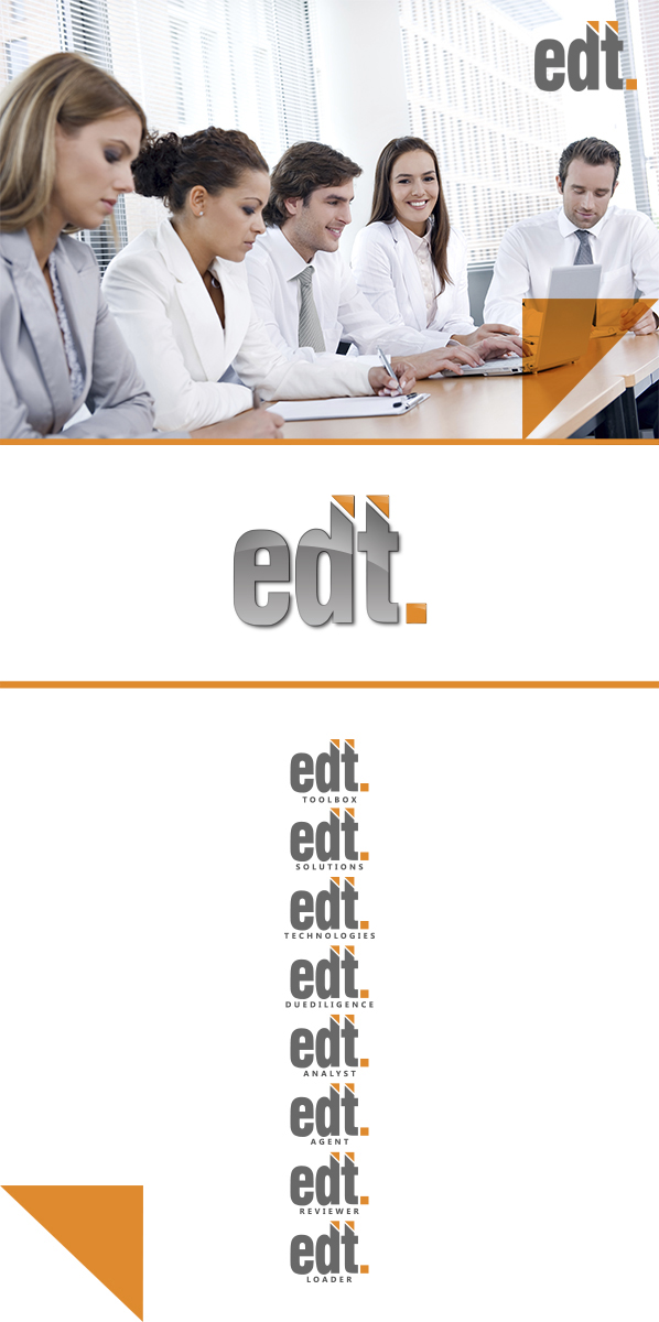
edt.
but we will also need some of the following logo "extensions" that more specifically describe our products or services.
edt.toolbox.
edt.solutions.
edt.technologies.
edt.duediligence.
edt.analyst
edt.reviewer
edt.loader
edt.agent.
What I'm after is actually really really simple. SIMPLE IS GOOD.
for example the letters 'edt' followed by a full stop with the letters in our corporate grey and the dot in orange and'or vice versa.
It's the font selection that is the challenge. I like ariel narrow but a couple of the key people on my team don't. Maybe you could just experiment with a few different fonts. Please take some guidance though from the fonts on our web site. It needs to either be one of those we have already used or something that will look ok alongside them.
So, again, to clarify. The brief is really simple.
Three letters 'e' 'd' and 't'
followed by a full stop.
in our corporate colours (grey and orange) - I'd prefer all the letters to be the same colour I think with the dot the contrasting colour
Once we've got the font and colours looking right then we can add the brand extension words like those listed above. (edt.toolbox. etc)
Oh, and I will need to know the font you've used once we've finalised and selected the design.
If you do want to be a little creative feel free to incorporate a design element e.g. see the orange swirly 'e' on our current ediscovery tools logo on the home page our web site. www.ediscoverytools.com. or whatever.. but please remember it needs to be
SIMPLE
CLEAN
ORANGE & GREY
I just don't want you to waste your time on over engineering this!
The logo piece should be really simple. Hopefully very little time for you. So, I wonder if you would also mind designing business card layout incorporating it once it has been finalised. Hope it's not cheeky to add that piece onto the brief but I'm hoping the three letter acronym logo won't take long for you given the detail I have provided.
Business cards can be 2 sided with logo and url on the front and personal details on the back including:-
person name
cell phone number
email address
Skype name
LinkedIn url
without using the word "phone' or 'cell' or 'mobile' or 'p' before the phone number (it's obvious it's a phone number so we don't need a word or letter in front of it)
without using the word 'email' or 'e' before the email address (it's obvious it's an email address)
So it will be in this format
Joe Bloggs
Founder & CEO
+61 430 987 654
joe@edtsolutions.com
Skype: joebloggs
LinkedIn: joebloggs/linkedin/blah
other information for the back of the card will be
Toll Free Numbers
Australia 1800 000 000
United Kingdom 1800 000 000
USA 1800 000 000
Canada 1800 000 000
New Zealand 1800 000 000
Thank you!
Jo
Actualizaciones
To all those designers who accepted this brief and have their responses underway, I'm sorry I have closed the project but I have found a design that suits us and need to move quickly to implement it. I did set the timeline at 2 days but it came up as 7 when the project was published and I couldn't work out how to change it.
Anyway, thanks for your efforts and good luck with your other projects.
regards
Jo
Added Monday, May 20, 2013
Objetivo del mercado(s)
law firms, accounting firms, corporations
Tipo de industria / entidad
Legal
Texto del logo
edt.
Estilos de logo de interés
Logo abstracto
Conceptual / simbólico (texto opcional)
Logo con siglas
Acrónimo o logo tipográfico (solo texto)
Mira y siente
Cada control deslizante ilustra las características de la marca del cliente y el estilo que debe comunicar el diseño de tu logotipo.