AMCIA Airline Multi Crew Instructor Agency
¿Quieres ganar un trabajo como este?
Este cliente recibió 48 diseños de logo de 12 diseñadores. Eligieron este diseño de logo de Paul Designs como el diseño ganador.
Únete gratis Encuentra trabajos de diseño- Garantía
-
 A$160
A$160
-
 48 diseños
-
 12 diseñadores
Resumen de Diseño de Logo
AMCIA stands for Airline Multi Crew Instructor Agency. AMCIA supplies highly qualified airline pilots to various training organizations to teach new pilots how to work in an airline environment. AMCIA's instructors teach the students techniques and methods to work effectively in a team environment in all operating scenarios.
AMCIA also provides services to companies outside of aviation with team building corporate sessions.
Essentially what I am looking for is a professional brand that depicts people of different backgrounds working together efficiently and in harmony at equal levels. The way an airline operates safely and efficient is by having strict operating procedures that everyone adheres to. Often crews have never met before yet they can still operate safely using these simple principles. I want the brand to signify structure whilst being simple and meaningful.
The name AMCIA must form part of the brand.
Objetivo del mercado(s)
Aviation Training Organizations, Companies looking for team building activities for their staff, Airline Pilots looking for extra work opportunities
Tipo de industria / entidad
Airline
Texto del logo
AMCIA
Estilos de logo de interés
Logo abstracto
Conceptual / simbólico (texto opcional)
Estilos de fuente para usar
Mira y siente
Cada control deslizante ilustra las características de la marca del cliente y el estilo que debe comunicar el diseño de tu logotipo.
Elegante
Atrevido
Juguetón
Serio
Tradicional
Moderno
Atractivo
Profesional
Femenino
Masculino
Vistoso
Conservador
Económico
De Alta Gama
Requisitos
Debes tener
- The name AMCIA in the logo. Please see updated brief in nice to haves
Agradable de tener
- A symbol depicting teamwork and efficiency. In reference to the file I uploaded... This is very rough and not necessarily what I want as a final product, but it does give an indication as to the amount of thought and detail I want in the logo. Overall the logo indicates a "thought box" as seen in cartoons. This says a lot about my company in itself as my instructors teach the students problem solving and prioritizing. The symbols in the top left of the thought box signifies an enclosed area (be it an aircraft or room) with four rectangles in it (which should be varying shades of blue). Blue represents a calm and leveled approach. The rectangles represent 4 different people working together in that area efficiently. The top rectangle would be the darkest shade of blue representing higherarchy. This symbol also looks like a pilots eppaulette signifying the aviation aspect of the company. The "i" in the logo would be a different color to the rest to help make it stand out. "i" central in a sign means information (which is what we are providing) but most importantly "instructors", which is what my company provides.
- The logo has different shades of grey which is not intentional... just a limitation of what I am working with! The dot of the "i" is also intentionally within the a above it intentionally signifying two elements working well together.
- I hope this is of some help and assists to speed up the process
- **** update****
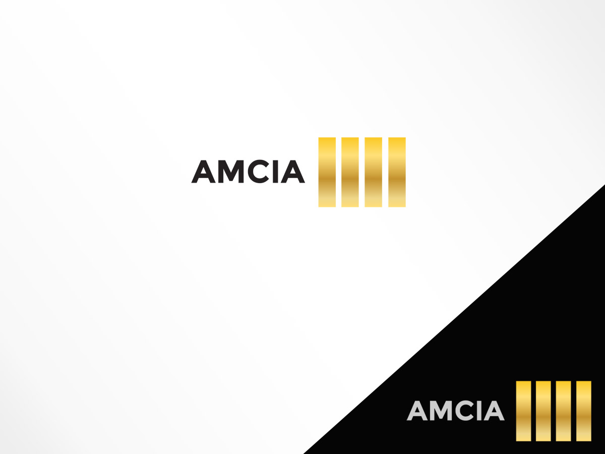
- I have come up with another idea that I think will work better. It is far simpler yet still depicts what I am after. Essentially it takes the form of a pilots four stripe epaulette. The name AMCIA is incorporated into the epaulette as per the attached pics. This design would also work well on business cards and you could use black on white or white on black. For the main logo however I think it would look best to have the braiding of the stripes visible and in gold as per photo. The background could be navy or black. A business card would ultimately look like a pilots epaulette whereas the logo image would have AMCIA with one stripe above and two below. As far as meaning goes, the epaulette is a image of an airline pilot which is the basis for what the company is. The multiple stripes could also be seen as a group working together. Please have a play around with this concept. Still not sure about the font yet but I think the overall concept is original and professional.