

 Refresh
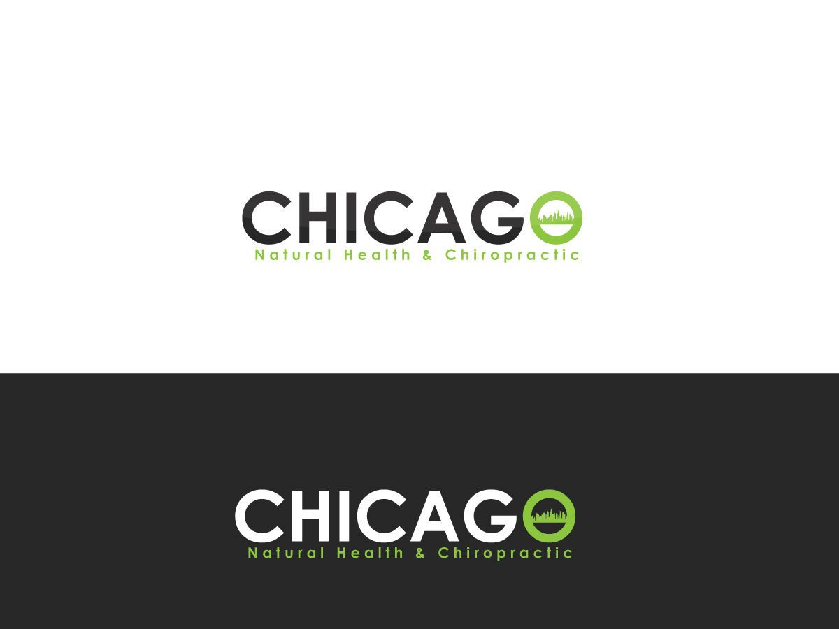
New logo for an integrated wellness and chiropractic practice in Chicago
¿Quieres ganar un trabajo como este?
Este cliente recibió 78 diseños de logo de 24 diseñadores. Eligieron este diseño de logo de Otex como el diseño ganador.
Únete gratis Encuentra trabajos de diseño
- Garantía
-
 US$160
-
 78 diseños
-
 24 diseñadores
Resumen de Diseño de Logo
We need a new company logo for the rebranding of our business from Chicago Institute of Natural Health to Chicago Natural Health and Chiropractic. Current website design, which will be used moving forward: ChicagoINH.com
The business features a variety of physicians and therapists from chiropractic to physical therapy, nutrition, massage, acupuncture and now IV vitamin therapy. We're rebranding an existing practice to be more urban and upscale and inviting. It's important to us for people to feel that our office and staff is inviting and personable, that we take a unique approach to healthcare based on each individual patient's own needs. The practice is focused on a holistic approach to health and wellness, combining both western medicine and eastern medicine (massage/acupuncture) to address the real root of problems and pain.
Objetivo del mercado(s)
Urban professionals - Chicago
Tipo de industria / entidad
Medical
Texto del logo
Chicago Natural Health & Chiropractic
Estilos de logo de interés
Logo pictórico / combinado
Un objeto del mundo real (texto opcional)



Logo abstracto
Conceptual / simbólico (texto opcional)



Logo con personaje
Logo con ilustración o personaje


Estilos de fuente para usar

Mira y siente
Cada control deslizante ilustra las características de la marca del cliente y el estilo que debe comunicar el diseño de tu logotipo.
Elegante
Atrevido
Juguetón
Serio
Tradicional
Moderno
Atractivo
Profesional
Femenino
Masculino
Vistoso
Conservador
Económico
De Alta Gama
Requisitos
Agradable de tener
- It's important it's something universal we can take with us as the business and specialties evolve. The new space features exposed brick, hardwood floors and exam/massage rooms with industrial furniture. We're going for a clean simple look that looks professional. One Medical Group has a similar look to their offices, for reference.
No debería tener
- We would like the logo to not be overly medical or include a spine in any way. It's an integrated health facility that we'd like to grow.
