

 Refresh
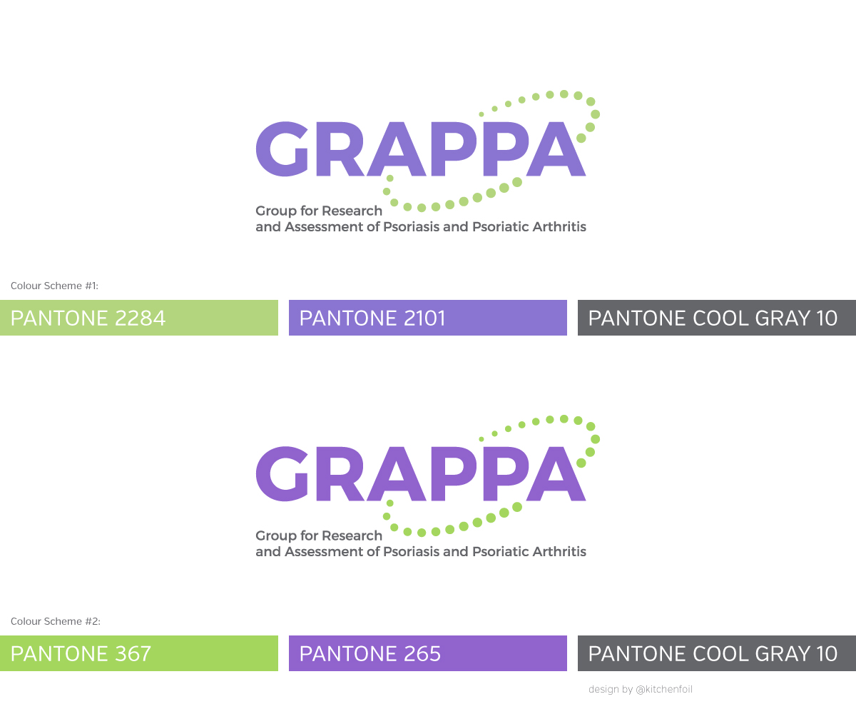
Design a new logo for GRAPPA. Should have the acronym GRAPPA as main element & full name tagline
¿Quieres ganar un trabajo como este?
Este cliente recibió 109 diseños de logo de 40 diseñadores. Eligieron este diseño de logo de Kitchenfoil como el diseño ganador.
Únete gratis Encuentra trabajos de diseño
-
 US$160
-
 109 diseños
-
 40 diseñadores
Resumen de Diseño de Logo
we need a new logo for GRAPPA, Group for Research and Assessment of Psoriasis and Psoriatic Arthritis. We are an international nonprofit association of rheumatologists and dermatologists dedicating to educating medical professionals with regards to psoriatic arthritis, psoriasis and related diseases and have initiated some independent research projects to assess treatment metrics of psoriatic arthritis and related diseases.
Objetivo del mercado(s)
Ourselves, our sponsors which are pharmaceutical companies - but please no test tubes or pills. We are a nonprofit with a volunteer board.
Tipo de industria / entidad
Group
Texto del logo
GRAPPA Group for Research and Asssesment of Psoriasis and Psoriatic Arthritis
Estilos de fuente para usar

Mira y siente
Cada control deslizante ilustra las características de la marca del cliente y el estilo que debe comunicar el diseño de tu logotipo.
Elegante
Atrevido
Juguetón
Serio
Tradicional
Moderno
Atractivo
Profesional
Femenino
Masculino
Vistoso
Conservador
Económico
De Alta Gama
Requisitos
Debes tener
- Dignity without being stuffy. Logo should include acronym, GRAPPA. Not an abstract logo, we are not going to ever be as famous as Nike!
Agradable de tener
- a "mark" of some kind would be nice but just text is OK too - no corny stuff please.
- Current colors are acid green and purple. Some people do not like these colors but I think some continuity from the old logo to the new should be considered. Maybe drop the green down to something more dignified and tone down the purple. Or not. You decide.
No debería tener
- This must not look hokey or corny. Please none of the typical medical symbols, especially not pills. No trendy colors (certain shades of orange are way overused, wouldn't you agree. No acid green.