Need a logo for a fitness program
¿Quieres ganar un trabajo como este?
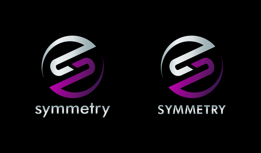
Este cliente recibió 284 diseños de logo de 74 diseñadores. Eligieron este diseño de logo de Gabriel como el diseño ganador.
Únete gratis Encuentra trabajos de diseño- Garantía
-
 US$320
-
 284 diseños
-
 74 diseñadores
Resumen de Diseño de Logo
We are looking for a logo for our fitness program "Symmetry". When i say fitness program, think Insanity, P90x, Zumba, etc... This program is built around the philosophy that an effective regimen must be balanced. It highlights the incorporation of flexibility, strength, cardiovascular endurance and agility. Use of the color purple is desired. While this is about a fitness program it is not absolutely necessary that the design incorporates a person/figure. The target audience for this workout are women, but we are also not interested in an overly feminine design.
While we are not completely opposed to the idea of the logo being just text, we would like to see designs that incorporate an additional (symmetrical of course) design element or shape.
Actualizaciones
Project Deadline Extended Reason: Still looking for the right design. Hoping that an increase in the winning offer will lead to more submissions. Added Monday, October 19, 2015
Project Deadline Extended Reason: We've received some very interesting designs. Some of which have potential. But we still have not found the right one. We're hoping to see a design that's not too busy, looks professional, incorporates our desired color scheme (see brief) and stays true to the idea of symmetry (i.e. a symmetrical design). Based on the teams reactions to designs submitted so far, the ones that have received the more favorable comments have included : sans-serif fonts of medium-slight heavy weight; with slightly rounded edges to the font like Century Gothic or Trebuchet (as opposed to Arial or Helvetica); logos that have incorporated somewhat circular shapes or curves OR logos that are somewhat abstract variations of an S; the icon is either centered above Symmetry or it encompasses the word Symmetry;There's complete flexibility when it comes to using uppercase, lowercase or a mix of cases. Please stay away from using non-symmetrical shapes; Serif fonts; Thin fonts; Colors other than the ones listed in the brief; Looking forward to seeing additional submissions. Added Tuesday, October 27, 2015
Project Deadline Extended Reason: We've received some very interesting designs. Some of which have potential. But we still have not found the right one. We're hoping to see a design that's not too busy, looks professional, incorporates our desired color scheme (see brief) and stays true to the idea of symmetry (i.e. a symmetrical design). Based on the teams reactions to designs submitted so far, the ones that have received the more favorable comments have included : sans-serif fonts of medium-slight heavy weight; with slightly rounded edges to the font like Century Gothic or Trebuchet (as opposed to Arial or Helvetica); logos that have incorporated somewhat circular shapes or curves OR logos that are somewhat abstract variations of an S; the icon is either centered above Symmetry or it encompasses the word Symmetry;There's complete flexibility when it comes to using uppercase, lowercase or a mix of cases. Please stay away from using non-symmetrical shapes; Serif fonts; Thin fonts; Colors other than the ones listed in the brief; Looking forward to seeing additional submissions. Added Tuesday, October 27, 2015
Project Deadline Extended Reason: Although there have been some designs that were interesting, we still have not found the design that really speaks to us. We are several weeks past our desired deadline and are now running out of time. A decision has to be made next week. I can not stress enough that designs that do not adhere to the details requested in the project brief will not be considered. So follow the desired color scheme. Purple is the primary color. White, black or gray are permissible. Use a sans serif font. normal to medium weight. Stay away from italicized, cartoonish, angular, square-ish fonts. I would suggest using all lower or upper case, as opposed to mixed cases. I am completely open to normal or wider than normal spacing between the letters, but I do not like condensed spacing. If you submit a design that includes an icon, it should be symmetrical. If the design includes an icon centered above the text, then I suggest including another version with the icon to the left or right of the text. Feel free to try other placements. While i've requested a design that incorporates an icon and text, I am open to creative ideas that stay true to the essence of the word 'symmetry'. There have been several designs that have included an iconized 'S'. Those have been interesting and received positive feedback. Another approach that has garnered some positive feedback were icons that were somewhat abstract representations of a figure or body. Lastly, designs that were of interlocking lines or shapes have also gotten good ratings when i poll them. Added Friday, November 13, 2015
Objetivo del mercado(s)
24-40 year old women, college educated, professional (but the design should NOT be overtly feminine)
Tipo de industria / entidad
Fitness
Texto del logo
symmetry or SYMMETRY
Estilos de logo de interés
Logo con emblema
Logo contenido dentro una forma / figura
Logo pictórico / combinado
Un objeto del mundo real (texto opcional)
Logo de marca de nombre
Logotipo basado en palabra o nombre (solo texto)
Estilos de fuente para usar
Colores
Colores seleccionados por el cliente para ser utilizados en el diseño del logotipo:
Mira y siente
Cada control deslizante ilustra las características de la marca del cliente y el estilo que debe comunicar el diseño de tu logotipo.
Elegante
Atrevido
Juguetón
Serio
Tradicional
Moderno
Atractivo
Profesional
Femenino
Masculino
Vistoso
Conservador
Económico
De Alta Gama
Requisitos
Debes tener
- Color scheme options:
- Purple / White
- Purple / White / Black
- Purple / White / Gray
- Purple / Gray
- Sans-Serif font. Normal to Medium weight. All lowercase or all uppercase. Nothing angular or boxy. Fonts like Brandon Grotesque, Gotham, Harmonia Sans, Museo Sans or Raleway. Normal to slightly wide spacing is preferred. Nothing with condensed spacing.
No debería tener
- Should not include any words other than "Symmetry". Do not include any other colors. Not interested in designs that include fitness equipment icons. It is a bodyweight only workout, so no barbells, or jump ropes or weights.