Create a piece of Developer Porn
¿Quieres ganar un trabajo como este?
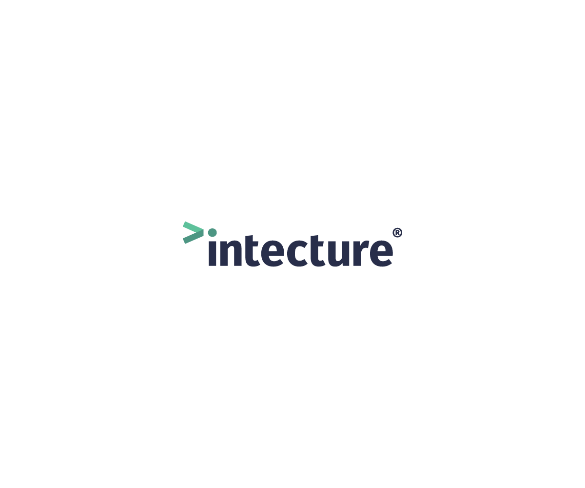
Este cliente recibió 247 diseños de logo de 52 diseñadores. Eligieron este diseño de logo de Tishert como el diseño ganador.
Únete gratis Encuentra trabajos de diseño- Garantía
- Proyecto agrupado 1
-
 £240
£240
-
 247 diseños
-
 52 diseñadores
Resumen de Diseño de Logo
We need a logo for our new product, called Intecture. Intecture is a systems management tool for developers. In other words, you can build lots of servers automatically with a bit of code, instead of configuring them all by hand! See https://intecture.io for more details.
Intecture differentiates itself from the competitors by embracing existing standards, rather than inventing its own. This makes it much more accessible for developers to pick up without needing a lot of non-transferrable skills.
A few likes:
* I like a great font. Fira Sans (https://github.com/mozilla/Fira) is lovely, or something equally minimal.
* I'm a big fan of lower case...and it's "intecture" with an "i", not an "L"!
* I usually lean towards minimal designs that express a single idea well, rather than something busy.
Actualizaciones
G'day guys,
Thank you so much for all the designs that you've submitted so far! I just wanted to update everyone on some of my emerging preferences, having seen a lot of different ideas:
- I don't like globe themed logos. They don't look bad per se, though it's not the right image for my product. When I think of globes I think of communications and marketing. My product is a technical product for technical people. It should look slick and subtle. The brand "intecture" is more important than any logo. Check out Docker, GitHub, VMware, Chef, Puppet or a plethora of other tech brands. The one thing they all have in common is the NAME of the product featured heavily. Developers talk a lot about the technologies they have experience with, thus the name is the thing that is communicated, rather than a logo.
Having said that, a subtle logo is great and can help enhance visual communication, though it's very much secondary to the main brand. Seeing Docker's whale logo reminds me of what it is, but I'll always know Docker as "DOCKER", rather than the blue whale :)
- I like black (or dark grey) logos with a feature colour. Generally I'm not keen on branching out from that as I want the typeface to be pure and not get distracted with lots of colour.
- The best logos aren't trying to do very much. They have a really simple idea and a clear typeface. A subtle play on the dot above the "i", or something that reflects the connectedness of 'things' is ideal. Please do try and prove me wrong by doing something completely different, but for now that's what is jumping out at me.
Cheers,
Pete.
Added Saturday, October 10, 2015
Objetivo del mercado(s)
Software developers
Tipo de industria / entidad
Information Technology
Información de contacto para la tarjeta del negocio
On the front, logo + strap line: "Language agnostic, DSL-free, mercury free systems management for developers"
On the back, the website: "intecture.io"
Texto del logo
intecture
Estilos de logo de interés
Logo abstracto
Conceptual / simbólico (texto opcional)
Logo con personaje
Logo con ilustración o personaje
Logo de marca de nombre
Logotipo basado en palabra o nombre (solo texto)
Logo con siglas
Acrónimo o logo tipográfico (solo texto)
Estilos de fuente para usar
Mira y siente
Cada control deslizante ilustra las características de la marca del cliente y el estilo que debe comunicar el diseño de tu logotipo.
Elegante
Atrevido
Juguetón
Serio
Tradicional
Moderno
Atractivo
Profesional
Femenino
Masculino
Vistoso
Conservador
Económico
De Alta Gama
Pagos
Total
£240
Fecha límite del proyecto
24 oct. 2015 10:52:32 UTCUpgrades del proyecto
Proyecto(s) incluido(s)
- ofreciendo £60 por el diseño de tarjeta de presentación al ganador