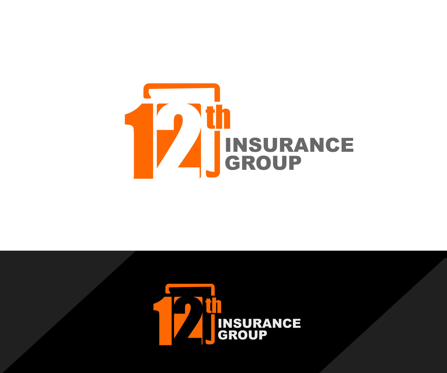
the 12th main logo, the one logo that will differentiate us from the competition
¿Quieres ganar un trabajo como este?
Este cliente recibió 115 diseños de logo de 35 diseñadores. Eligieron este diseño de logo de edong artwork como el diseño ganador.
Únete gratis Encuentra trabajos de diseño- Garantía
-
 US$310
-
 115 diseños
-
 35 diseñadores
Resumen de Diseño de Logo
i need the main logo for my business, the one that's going to be displayed everywhere.. front door, business cards, letter heads, etc.. i engage in the sale of life and health products and have created my d.b.a. as 12th insurance group, don't ask me why i just like how it sounds, attached is sample i've created using really simple tools, the one thing i want to keep intact is the orange background using the same color and the white lettering, i really like the color combination, everything else i'm open for suggestions, thank you..
Objetivo del mercado(s)
the main trade area is located in el paso, tx witch is pretty much made up of 70% latino/hispanic population, and my intent is to target all age groups 20 and up, for the sale of life&health insurance products.
Tipo de industria / entidad
Life Insurance
Texto del logo
12th insurance group
Estilos de logo de interés
Logo de marca de nombre
Logotipo basado en palabra o nombre (solo texto)
Logo con siglas
Acrónimo o logo tipográfico (solo texto)
Estilos de fuente para usar
Gustan otros estilos de fuente:
- the fonts are explained in the "must haves" sections
Mira y siente
Cada control deslizante ilustra las características de la marca del cliente y el estilo que debe comunicar el diseño de tu logotipo.
Elegante
Atrevido
Juguetón
Serio
Tradicional
Moderno
Atractivo
Profesional
Femenino
Masculino
Vistoso
Conservador
Económico
De Alta Gama
Requisitos
Debes tener
- the color must be intact.. i like the contrast between the orange and white.. i have the exact orange i used in a file and can make that available at any time.. obviously the the numbers.. on these i'm open to suggestions as far as fonts.. i used Gill Sans MT Condensed for no 2 & Segoe UI Symbol for no 1.. the letters is up to you.. to be hones i really liked the font used by the 5 gum, i was trying to get as close as the font used in that logo for the "12" is really modern in my opinion.. and definitely have a square aspect to it like the square surrounding the 12.. 10/29 after seeing a few of the designs submitted i definitely know that the logo should be rectangular, meaning having the the words "insurance" to the right of the "12" and "group" underneath" "insurance"..
Agradable de tener
- one i idea i had and again this is just an idea i dont want to make it the whole project have this is kind of create like a cube where the 1 is on one face and the 2 on the other, and have them alternate colors like the 1 be in white with an orange on the background and the 2 be oarange and a white backgound..
No debería tener
- no sure.. i guess i'm open to all suggestions..