Retail & Restaurant co-branding concept logo
¿Quieres ganar un trabajo como este?
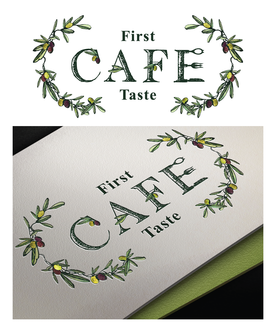
Este cliente recibió 176 diseños de logo de 24 diseñadores. Eligieron este diseño de logo de Elza como el diseño ganador.
Únete gratis Encuentra trabajos de diseño-
 US$160
-
 176 diseños
-
 24 diseñadores
Resumen de Diseño de Logo
We are an Ultra premium Olive Oil and Vinegar Retail store with an established logo that has expanded with a Cafe (restaurant) inside the retail store. The Cafe serves modern International food in a relaxed restored historic building that incorporates the products available for retail. Our tableside service directs the guests to "play" with their food by seasoning and garnishing with the Oils & Vinegars. We would like to see designs that demonstrate a connection between the retail and Cafe but allows the Cafe to stand on it's own with a logo that is more suited for restaurant and not retail.
Actualizaciones
Project Deadline Extended
Reason: Working on some revisions with in the designs submitted
Added Friday, May 20, 2016
Objetivo del mercado(s)
25+, health conscious, eats out regularly, destination oriented
Tipo de industria / entidad
Restaurant
Texto del logo
First Taste Cafe
Estilos de logo de interés
Logo con emblema
Logo contenido dentro una forma / figura
Logo pictórico / combinado
Un objeto del mundo real (texto opcional)
Logo abstracto
Conceptual / simbólico (texto opcional)
Logo con personaje
Logo con ilustración o personaje
Logo con siglas
Acrónimo o logo tipográfico (solo texto)
Estilos de fuente para usar
Gustan otros estilos de fuente:
- ereshkigal
Mira y siente
Cada control deslizante ilustra las características de la marca del cliente y el estilo que debe comunicar el diseño de tu logotipo.
Elegante
Atrevido
Juguetón
Serio
Tradicional
Moderno
Atractivo
Profesional
Femenino
Masculino
Vistoso
Conservador
Económico
De Alta Gama
Requisitos
Debes tener
- See attached sketch and images. An Olive spoon & fork are attached along with two separate ideas for logo. The first one is the Olive spoon that should appear to be engraved with "First Taste" using the font supplied (Ereshkigal) with "Cafe" in the spoon opening. An olive branch for the handle. The second concept is drawn out with olive branches, olives and "first taste" incorporated into the letters. Style should be either a water color, portait or illustrative style. We would like to see both of these interpreted.
Agradable de tener
- something besides an olive that is over used for this concept like an olive oil tasting glass
No debería tener
- The same font used in the Retail logo