Classic and "Catchy" Law Firm Logo Project
¿Quieres ganar un trabajo como este?
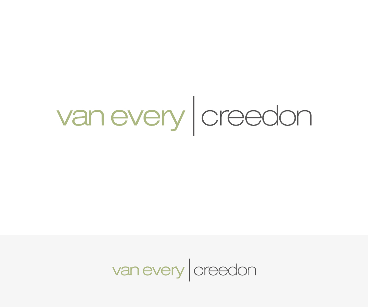
Este cliente recibió 168 diseños de logo de 50 diseñadores. Eligieron este diseño de logo de Formen como el diseño ganador.
Únete gratis Encuentra trabajos de diseño- Garantía
-
 US$160
-
 168 diseños
-
 50 diseñadores
Resumen de Diseño de Logo
Looking to create a new logo for an expanding law firm. Want to have something classic, modern, minimalist but striking.
Van Every is one surname and Creedon is the second surname. Both individuals will have equal ownership in the company and the logo needs to reflect that - although Van Every will be listed first.
Also, want the colors, style to be suitable for an existing website, www.kvelaw.com
with regard to color and style of the existing website while having a classic but modern and notable style, look, feel.
2) We are fine with a couple of different approaches, such as using initials. But less busy is better. My name "Van Every" is pretty long to begin with.
3) We absolutely do not want graphics that include cheezy items such as gavels, scales, books, etc. If it is a creative shape that harmonizes with the names and colors, we would certainly be open to looking at that.
The font style below is nice and may work for one of the last names.
Objetivo del mercado(s)
Businesses. This is a business law firm.
Tipo de industria / entidad
Legal
Texto del logo
Van Every Creedon
Estilos de logo de interés
Logo abstracto
Conceptual / simbólico (texto opcional)
Logo de marca de nombre
Logotipo basado en palabra o nombre (solo texto)
Logo con siglas
Acrónimo o logo tipográfico (solo texto)
Estilos de fuente para usar
Mira y siente
Cada control deslizante ilustra las características de la marca del cliente y el estilo que debe comunicar el diseño de tu logotipo.
Elegante
Atrevido
Juguetón
Serio
Tradicional
Moderno
Atractivo
Profesional
Femenino
Masculino
Vistoso
Conservador
Económico
De Alta Gama
Requisitos
Debes tener
- Color and style that matches current website, please see www.kvelaw.com
- The names "Van Every" and "Creedon" must be the same size. They can have different fonts and colors, but must be the same size font.
- The existing logo will be discontinued.
Agradable de tener
- Something original although we are asking for a classic minimalist design. Something thoughtful and that is easy for potential clients to understand.
- Cannot be so large as it cannot be reproduced on small business cards.
No debería tener
- Legal icons such as gavels, scales, books etc. This should not have a tired and same as everyone else look and feel.
- Cannot be so large as it cannot be reproduced on small business cards.
- Should not use the color Purple