Music Studio Store Front for an international franchise
¿Quieres ganar un trabajo como este?
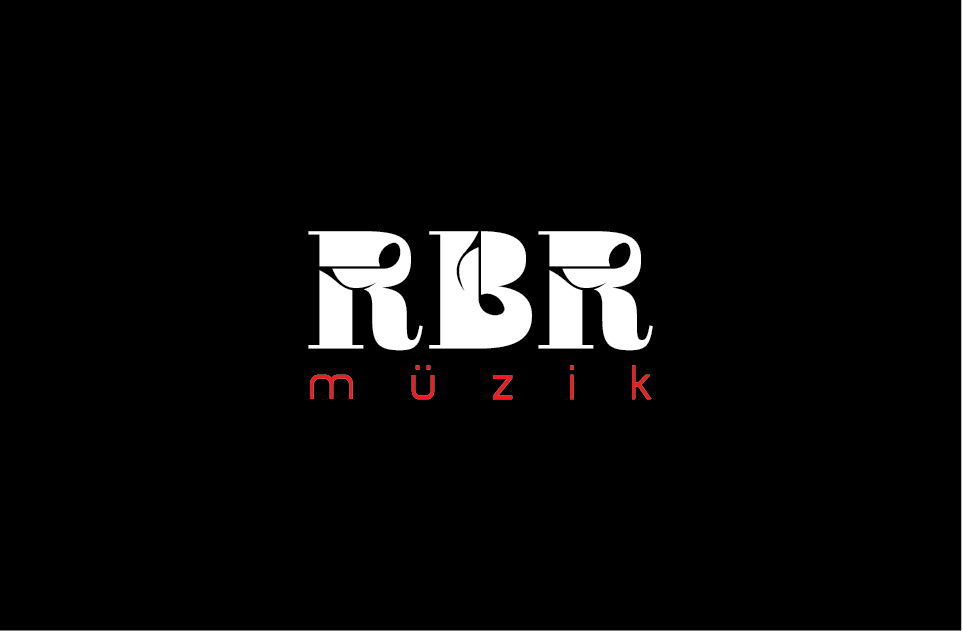
Este cliente recibió 464 diseños de logo de 65 diseñadores. Eligieron este diseño de logo de creativevis como el diseño ganador.
Únete gratis Encuentra trabajos de diseño- Garantía
-
 US$320
-
 464 diseños
-
 65 diseñadores
Resumen de Diseño de Logo
I am starting a music studio franchise for children around the world to learn classical music in a beautiful modern space. The theme colors are black, white and red. Those are the only colors allowed in the logo. My teachers will be wearing black t-shirts with the logo on the front, and I want the shirts to have a hip White House Black Market vibe, not to feel like kid music clip art. I want the brand to say modern, hip but also timeless. A red circle is important somewhere, as it is part of the product. I want there to me an umlat over the u of Muzik, and the RBR to look cool, possibly with 5 lines of a music staff somewhere.
Objetivo del mercado(s)
My target is parents and private Montessori preschools in an upper middle class area.
Tipo de industria / entidad
Store
Texto del logo
RBR Muzik
Estilos de logo de interés
Logo de marca de nombre
Logotipo basado en palabra o nombre (solo texto)
Logo con siglas
Acrónimo o logo tipográfico (solo texto)
Estilos de fuente para usar
Mira y siente
Cada control deslizante ilustra las características de la marca del cliente y el estilo que debe comunicar el diseño de tu logotipo.
Elegante
Atrevido
Juguetón
Serio
Tradicional
Moderno
Atractivo
Profesional
Femenino
Masculino
Vistoso
Conservador
Económico
De Alta Gama
Requisitos
Debes tener
- I really like the umlat (two dots over the u) as I plan on making this an international pre-school music franchise. The word music is spelled with intention as that is German as well as a few other european countries. I want the logo to feel timeless, fresh and classic. The theme colors are black and white as music is black and white. The color red is important, and perhaps would look great in 2 circles over the u in the umlat.
Agradable de tener
- When I picture the store front in a nice strip mall, at first I don't want the people to think children's music academy, but a timeless studio. I like the word studio more than the word academy, as it feels less rigid. When you walk into the store, you will see the receptionist wearing red glasses and a top hat, as the top hat is symbolic for a half rest sign in music. I don't want some cheese hat in the logo, but if it could look sleek, tied with perhaps the 5 lines of the music staff, that will help people think music in a cool way from the street.
No debería tener
- I like simplicity, like White House Black Market, not hippie like, not rock star like. I do not want the vibe of an L.A. rock star music school, so don't post any guitars! Primarily piano and violin, only classical music will be taught. Let someone else be the hipster store training the next American Idol. My brand is making classical music hip.