

 Refresh
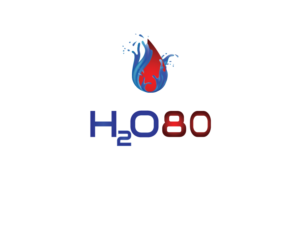
Logo Design Project for a water exploration company called H2O80. Why? because we are 80% water
¿Quieres ganar un trabajo como este?
Este cliente recibió 54 diseños de logo de 24 diseñadores. Eligieron este diseño de logo de Sunisinmymind como el diseño ganador.
Únete gratis Encuentra trabajos de diseño
-
 US$400
-
 54 diseños
-
 24 diseñadores
Resumen de Diseño de Logo
H2O80 is based on the fact we are 80% water and its a no brainier we want to explore water ways. The logo needs to be simple with a subliminal feel. Must be able to read in a banner ad! Or a billboard. However we want an aspect in the logo that can stand alone as a teaser, such as on a t-shirt, other apparel or a sticker. We will add multiple tag lines with the logo, such as: It's cheaper than therapy. It's a no brainer. Tomorrow. It's in our BLOOD! What a feelin'. Etc... Water exploration focusing on Kayak tours and rentals in salt and fresh water. A focus on the adventure- Snuba (Snorkeling and scuba mix) through salmon beds in rivers off a kayak. Snuba crab fishing in the ocean. Clam digging and cooking adventures or just getting on the water because it makes sense. We will currently be based in Northwest Washington which has an abundant of rivers and the Puget Sound. We are targeting 30+ age group. We are thinking color designs in blue and red. The final design should intrigue people to ask the question "what is that?"
Tipo de industria / entidad
Cooking
Texto del logo
H2O80
Estilos de logo de interés
Logo abstracto
Conceptual / simbólico (texto opcional)



Requisitos
Agradable de tener
- It would be nice to have the universal symbol for blood and some aspect of a kayak paddle and/ or river/ water. H20 as a element