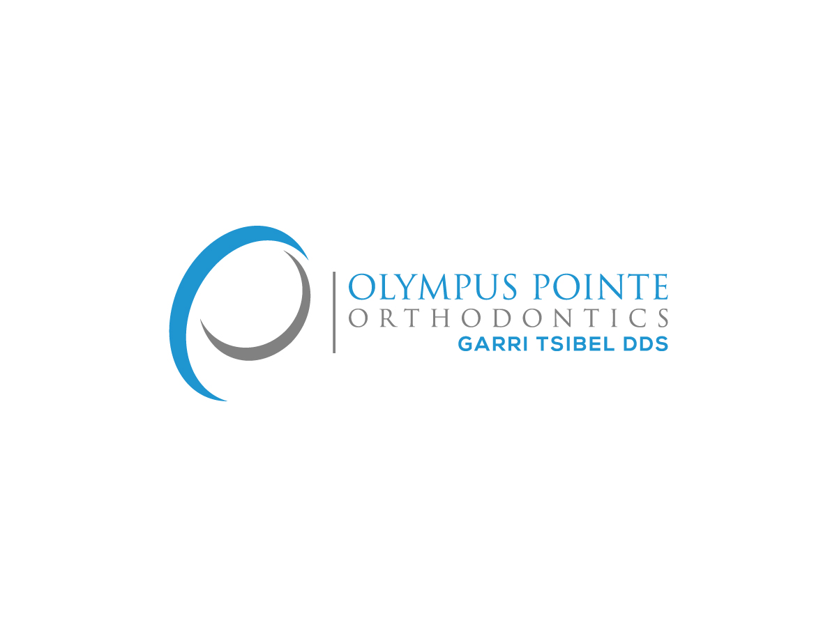
OPO logo design (logo design for an Orthodontic office/practice)
¿Quieres ganar un trabajo como este?
Este cliente recibió 105 diseños de logo de 13 diseñadores. Eligieron este diseño de logo de uandbdeziner como el diseño ganador.
Únete gratis Encuentra trabajos de diseño- Garantía
-
 US$200
-
 105 diseños
-
 13 diseñadores
Resumen de Diseño de Logo
We are looking to create a new, updated office logo. I like clean-looking, simple, techie-style designs that would resonate with my adolescent and teen patients of braces-wearing age (younger patients), but would also appeal to their parents (that are bringing them to my office for treatment), and to my adult patient population. I have a family-friendly, personalized, high-quality Orthodontic practice/office with a modern, street/urban-style, extreme sports office theme and design to make it more kid/teen friendly and relatable. Just to give you an idea about our office theme - we have skateboards and snowboards hanging on walls in the office and have a skatepark-like interior design with a mini skateboarding half-pipe, large graffiti wall, etc.. (I attached photos of our office below). We are located in a nice, family-oriented, middle-to-upper class suburban town in Northern California, our office website is www.GetYourBraces.com, for your reference.I would like to see a design that uses light/sky-blue and grey color schemes. In addition, I would like my final design to be clean/simple and communicate the following attributes: youth-teen hip/cool, friendliness, and fun.I would like to have two text lines included in my logo, the practice name - Olympus Pointe Orthodontics, and my name - Garri Tsibel DDSThanks
Objetivo del mercado(s)
Families - this logo design should resonate with my adolescent and teen patients of braces-wearing age (younger patients), but would also appeal to their parents (that are bringing them to my office for care/treatment), and to my adult patient population
Tipo de industria / entidad
Office
Texto del logo
2 text lines: 1)Olympus Pointe Orthodontics 2)Garri Tsibel DDS
Estilos de logo de interés
Logo pictórico / combinado
Un objeto del mundo real (texto opcional)
Estilos de fuente para usar
Colores
Colores seleccionados por el cliente para ser utilizados en el diseño del logotipo:
Mira y siente
Cada control deslizante ilustra las características de la marca del cliente y el estilo que debe comunicar el diseño de tu logotipo.
Elegante
Atrevido
Juguetón
Serio
Tradicional
Moderno
Atractivo
Profesional
Femenino
Masculino
Vistoso
Conservador
Económico
De Alta Gama
Requisitos
Debes tener
- - I would like to see a design that uses light/sky-blue and grey color schemes
- - In addition, I would like my final design to be clean/simple and communicate the following attributes: youth-teen hip/cool, friendliness, and fun!