Website Home Page Re-Design for a Media Company producing Catholic Bible studies on CD/DVD/MP3
¿Quieres ganar un trabajo como este?
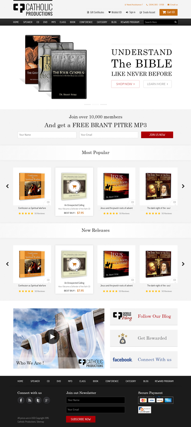
Este cliente recibió 98 diseños web de 15 diseñadores. Eligieron este diseño web de HnA Design Studio como el diseño ganador.
Únete gratis Encuentra trabajos de diseño- Garantía
-
 US$250
-
 98 diseños
-
 15 diseñadores
Resumen de Diseño Web
UPDATED BRIEF AS OF 12/28/15:
I have been in touch our rep at DesignCrowd and we are going to extend this design starting on January 9. There were a couple of designs that came out ok -- I could do the tweaking on my end with the body and footer in psd -- but for every single layout the hero section is lacking. So, I guess the main thing that would create a winner is can you create an amazing hero section. I updated the brief once already truncating the focus of design elements -- I am truncating it again here to have you focus on just 1 design element -- who can create the best hero section. Something better has to be possible. I greatly appreciate your attention to this element.
UPDATED BRIEF AS OF 12/21/15:
Ladies and Gentlemen,
Thus far none of the submitted layouts fit the bill (issues being a combination of layouts, design elements, and a lot of samples with too many competing vibrant colors, etc.). So, I just finished putting together an updated template on my own (attached as updated-template.png). I am hoping that now that the layout and color scheme are firmed up (with the exceptions mentioned below), your more focused attention on the following elements will bring about a better result. For, now you are playing/manipulating just elements and not also an overall layout. Please use the bones of this updated template and focus your attention on the following while not adjusting anything not mentioned below:
Starting from the top down:
(1) I'm open to the top section with the logo/need assistance/cart icon/ etc. being manipulated around to make the Sign in and Create account links more noticeable whilst not looking crowded or forced. Not sure if things can go on different lines/different colors implemented, etc. -- that's for you to tinker with if you so choose. Keep the colors of the "Need Assistance" that turquoise blue and the phone and email icons that same orange.
(2) Still open to a better hero section. Found this to be the most disappointing part of the templates submitted thus far. I think rather than slapping images up there on a background that looks like a circus, if some real intricate time was put on making some of the CD's look very nice would help -- how to assemble them and incorporate the tag line is up to you.
(3) For the "Most Popular" and "New Releases" section, if something jumps out at you as far as how to layout the CD images that will populate this section better, I'm open. For instance, would a lighter gray background box work well behind the CD images? Would eliminating the thinly outlined rectangles around the cd images look better? Would assembling them not just in one row horizontally look better, etc.? Keep the titles and those horizontal lines on either sides of the category section the same -- but the layout of the cd images that will populate these sections are open to be modified. Keep in mind NOT TO CROWD THIS AREA -- some templates submitted just looked a mess with not enough white space, making it look very crammed and lacking distinct sections for the eye to be drawn to -- having the effect of "where do I look"?
(4) I need 3 well-designed iconic images for the Blog, Rewards Program, and Facebook links in the gray rectangular box near the bottom. From top to bottom, the three icons combined (in total height) should be the height of the entire still frame that is situated to the left. Keep in mind, once again, space between them -- they should not looked crammed. FYI, the "Catholic Productions Blog" logo as you see on our blog (catholicproductionsblog.com) should be a part of whatever icon you end up using.
Thank you.
INITIAL BRIEF:
1 PAGE ONLY
I am looking for a re-design of our home page at store.catholicproductions.com -- you can see our current layout there. Our e-commerce store is hosted on BigCommerce.com.
I am uploading a screen shot here of what CONTENT I would like to see on our home page, but obviously it needs to be laid out with a much more professional and polished look to -- not using the layout I currently have -- want someone who really knows what they're doing to create a really polished presentation of the CONTENT. Please pay close attention to the following considerations:
(1) As far as colors, it needs to flow well with the other pages of the website, as those will not be changes (i.e., the category pages and the product pages).
(2) I've laid out the elements in the attached design in somewhat order of importance:
(A) Visitors should see the Catch title of "Understand the Bible Like Never Before" (though this is subject to modify -- wording may be different) at the top somewhere as an eye catcher (would probably be wise to have some type of graphic like our cd covers as I have them in the screen shot, but this is definitely where your artistic talents of placement and manipulation if graphics must take over). I like the look of the cd sets in the top banner in the attached screen shot inasmuch as they look like they're stepping out of the rectangle/hero section-- obviously you can use whatever image(s) you deem appropriate and can include or exclude this design aspect -- just throwing that out there, but don't think it's mandatory if it doesn't work with the overall design.
(B) Then our most popular Bible studies section which will be populated by automated settings on the back end of bigcommerce.
(C) Then our Join our email list option
(C.i.) I don't have it in the attached screen shot but we MIGHT end up doing a "Who Are We Video?" I do not know if it is possible to create the page layout such that there is room to add the image of the video still frame at some point in the future. If not just assume no video at this point.
(D) The Latest Releases is beneath the join our email list section merely because I thought there needed to be a break between having two rows of CD's merely differentiated by the title of each row (Most Popular Bible Studies vs. Latest Releases).
(E) Next is something graphically eye catching for our Blog, Facebook and Rewards Program. Again, I just threw those images together -- not very polished or, in my estimation, very attractive -- your abilities must reign here again.
(F) Then there are what I'd call "secondary" links in the bottom horizontal black bar in the attached screen shot that are currently right beneath the bottom black bar on our current store page (e.g., Home, Services, About Us and so on). Those should be present, but obviously can be laid out in whatever design layout you envision.
(G) The Geotrust, Payment Options, and "All Prices..." need to be present at the bottom too.
(H) Just noticed this -- the Search Bar obviously needs to be present as well in a noticeable way near the "Primary" links.
Again, these are just in order of importance for the most part -- they don't have to go in a perfectly lined up vertical order from top to bottom, but the eye should be drawn to the elements in roughly that order.
(2) We are looking for a clean, "elegant" home page that incorporates the elements in the attached screen shot mentioned above and doesn't look cluttered or busy.
I like the black gradient of the horizontal bars across the top and bottom in conjunction with the flesh-like gradient color of the top rectangle box/hero image -- that contrast, along with a good bit of white space works well, though I'm certainly not opposed to other color schemes -- but it has to be consonant with the other category and product pages on the website pages -- if you re-create the top section and bottom section such that the other category and product pages top and bottom sections need to be modified, that is fine if it means a much better designed home page. Not looking for a super tall page either, but it obviously will need to be taller than it currently stands at store.catholicproductions.com given what we're adding to it.
(3) I don't know if there is a way to make the "Sign In" and "Create Account" more prominent at the top (or elsewhere in the design) - different fonts or fonts + icons, etc.? I think, most probably, Sign in and Create Account need to go first when read from left to right if it stayed in its current position. But, having said that, I'm not opposed to modifying the entire top section either (where our logo and the cart button currently is) if that works better with a winning design.
(4) Obviously we are eliminating the carousel of images -- only one "hero" image.
(5) Any Fonts should be clean and easy to read.
Other comments about our company:
(6) Our target audience is 25-80 year old people (yes, a broad spectrum, but I can at least say our primary audience is not teenage).
(7) Our company is dedicated to providing Catholic Bible studies on CD, DVD, and MP3.
(8) The reason why we are trying to change up the design is to try to make it more explicit what we have to offer in the first 5 seconds for those who land on our home page and do not know much about us. Trying to make it very focused on the products we offer with more image/iconic based sections of content -- e.g., as opposed to just having the text link for cd's, the blog, or the join our email list in the bottom black horizontal bar, we are dedicating a small iconic section to each of those categories.
Objetivo del mercado(s)
25-80 year olds male and female
Tipo de industria / entidad
It Company
Número de páginas requeridas
1 page
Mira y siente
Cada control deslizante ilustra las características de la marca del cliente y el estilo que debe comunicar el diseño de tu logotipo.
Elegante
Atrevido
Juguetón
Serio
Tradicional
Moderno
Atractivo
Profesional
Femenino
Masculino
Vistoso
Conservador
Económico
De Alta Gama
Requisitos
Debes tener
- Attached is our logo in a png format with both white background and transparent as well as in black and white and in color. You can use the text "Catholic Productions" in the logo as found in the png's attached below or shifted over to the right as found at Store.catholicproductions.com.
Agradable de tener
- I've attached some layouts here that I like -- obviously would want some distinct layouts, but this hopefully relays the design-type, keeping in mind the comments I've made above in the project description.