dippity do gels packaging redesign contest
¿Quieres ganar un trabajo como este?
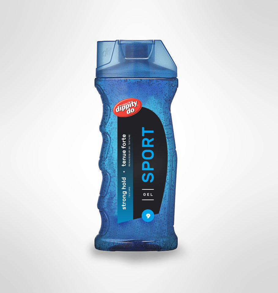
Este cliente recibió 18 diseños de empaque de 7 diseñadores. Eligieron este diseño de empaque de el_pollo como el diseño ganador.
Únete gratis Encuentra trabajos de diseño-
 C$240
C$240
-
 18 diseños
-
 7 diseñadores
Resumen de Diseño de Empaque
Objective:
To redesign the product packaging for an iconic hair gel brand "dippity do". Broad base of users, but primarily targeted to males.
Considerations:
Numbering System: dippity do gels follow a numbering system from Level 7-10 + to define gel hold levels. This is important to users.
Product Names : brand uses product names like : Sport, Sport Unscented, Wired, Power, Mega and Extra which are also used in purchase decision. Note: SPORT and SPORT Unscented should be distinguishable.
These numbers and names are both packaging elements we would keep for the consumer to maintain the purchasing cues.
Bottle/Cap : Ideally retain blue bottles and caps, but prepared to accept new ideas. We ask that one color is used for the bottle and cap across the line.
Labels: The creativity would best be served focusing on improving the label design that would appeal to the target group.
Labels must allow for 2 languages English and French without looking too cluttered.
Visit our site www.dippity-do.ca
Actualizaciones
Project Deadline Extended Reason: Due to holiday season, we are extending the deadline for submissions. Added Monday, January 4, 2016
Objetivo del mercado(s)
Primarily male, but spans across multiple demographics. Family gel brand see design brief for additional information.
Tipo de industria / entidad
Hair
Estilos de fuente para usar
Gustan otros estilos de fuente:
- leave to designers
Mira y siente
Cada control deslizante ilustra las características de la marca del cliente y el estilo que debe comunicar el diseño de tu logotipo.
Elegante
Atrevido
Juguetón
Serio
Tradicional
Moderno
Atractivo
Profesional
Femenino
Masculino
Vistoso
Conservador
Económico
De Alta Gama
Requisitos
Debes tener
- Bottle/Cap : Ideally retain blue bottles and caps, but prepared to accept new ideas. We ask that one color is used for the bottle and cap across the line.
- Labels: The creativity would best be served focusing on improving the label design that would appeal to the target group.
- Labels must allow for 2 languages English and French without looking too cluttered.
Agradable de tener
- New bottle and cap designs using PET plastic bottles. Use translucent colors.
No debería tener
- Do not change the dippity do red oval logo .