Matso's Broome Brewery - Lychee Beer
¿Quieres ganar un trabajo como este?
Este cliente recibió 29 diseños de logo de 17 diseñadores. Eligieron este diseño de logo de REDcrackers.com como el diseño ganador.
Únete gratis Encuentra trabajos de diseño- Garantía
-
 A$400
A$400
-
 29 diseños
-
 17 diseñadores
Resumen de Diseño de Logo
The new Logo:
The Lychee beer is currently on tap with the attached logo 'Lychee decal 80x80mm' and is selling extremely well, so much so we have decided to add it to our packaged craft beer range. However looking at our current branding and logo designs see 'current-designs.jpg' we feel the logo doesnt have the WOW factor our other product have. As such we would love some fresh creative direction from the Design Crowd Community.
Please read on about the existing Matso's logo and business history below to get a better idea of where we have come from 2000 to now.
Look forward to receiving your designs.
Cheers and beers
The Matso's Team
The Matso's logo –
At the inception of building the foundation architecture of the new Matso's beer brand we inherited the existing White/Red Japanese symbol logo when we purchased the business back in 2000. The logo itself is a simple Japanese calligraphic character done in the traditional "Sumi' style & translates into a form of the western word "Raw" Matso's uses fresh ingredients to brew beer, "Live", live life to the full to enjoy yourself "Storage" in terms of lagering beer where the Germans will store beer in the Winter & bring out the beer for Oktoberfest. The logo had been developed by the previous owners to represent the historical connection the brewery shared through the building being (built back in 1910 as Broome's First National Bank), among other things The Matsumoto General Store (Phillip Matsumoto & his wife ran Matso's Store from 1976 – 1985) and pays homage to the classic Japanese/Broome iconic fusion created during the peak days of the Pearling industry & it's subsequent colour and legend. The logo itself is quite eye catching & the staff/family get a lot of positive feedback from consumers saying what a great logo we have, obviously from day 1 this logo remained a key component for all future logo designs.
Matso's Broome Brewery the business -
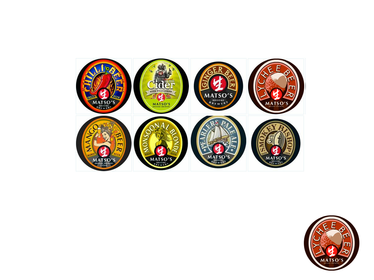
Matso's is a family owned pub brewery based in the North West of Western Australia. It is the most remote brewery in Australia and located in a very busy tourist town called Broome. We produce a range of beer & cider on premise and also contract brew our products in Perth where we now have 7 bottled products available. The bottled range includes a very tasty Ginger Beer 3.5% alc/vol, Australia's only Mango Beer 4.5% alc/vol, an easy drinking Australian Pearlers pale ale 4.5% alc/vol, a dark lager called Smokey Bishop 4.7%, a super hot Chilli Beer 4.2% alc/vol, a desert lime & ginger cider 4% alc/vol and a desert lime & mango cider 4% alc/vol. A lot of our products have a connection to Broome (we grow mangoes in Broome so mango beer was a given, Pearlers pale ale was a tribute to the pearl divers of Broome) or the Kimberley (The 2 flavoured ciders have real desert limes & mangoes in them so there's a connection to both of these fruits being grown on the edge of the desert in the Kimberley) or a character (The smokey bishop is named after Broome's local Catholic Bishop, I was out for dinner with the brewer one night in Broome & we saw the Bishop with a bottomless glass of red wine and he was chain smoking the whole night – after a few drinks ourselves we thought of a great name for our dark lager!).
Tipo de industria / entidad
Architecture
Texto del logo
Lychee Beer
Estilos de logo de interés
Logo con emblema
Logo contenido dentro una forma / figura
Mira y siente
Cada control deslizante ilustra las características de la marca del cliente y el estilo que debe comunicar el diseño de tu logotipo.
Elegante
Atrevido
Juguetón
Serio
Tradicional
Moderno
Atractivo
Profesional
Femenino
Masculino
Vistoso
Conservador
Económico
De Alta Gama
Requisitos
Debes tener
- Must follow our current design Suite
Must utilize our current Matso's Logo (attached)
Agradable de tener
- Lychee's or perhaps something pertaining to the Lychee fruit or its history. Keep in mind this is a Broome business, located int he northwest of Australia. (this may help with your creative direction) This logo will potentially go on a can, bottle and external packaging so it needs to be bold and have customer appeal.
No debería tener
- A look that doesn't fit in withe the other branding family.