Storefront Carnival Cutout Sign
¿Quieres ganar un trabajo como este?
Este cliente recibió 62 diseños gráficos de 6 diseñadores. Eligieron este diseño gráfico de tinajay como el diseño ganador.
Únete gratis Encuentra trabajos de diseño- Garantía
-
 US$240
-
 62 diseños
-
 6 diseñadores
Resumen de Diseño Gráfico
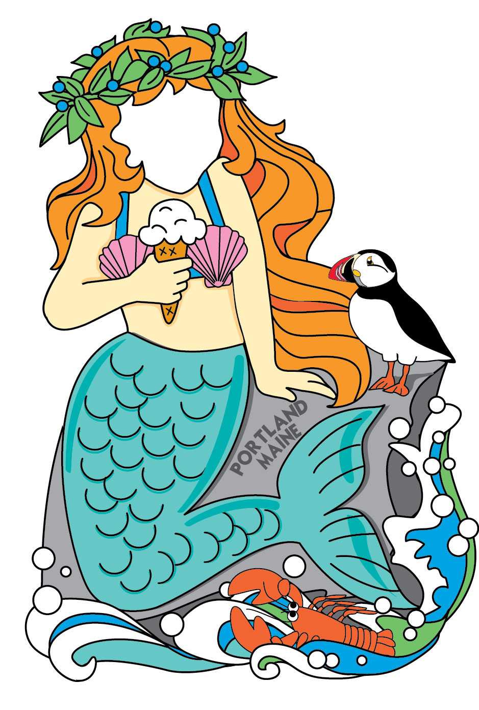
We would like a "cut out" sign where people put their faces in to take photos on vacation. This sign will be in front of our ice cream store in Portland, Maine. The overall height should be about 6 feet, and the sign will be cut so that the base is wider than the top (not just a rectangle).
Over all dimension - 6 feet high, base 4 feet wide, top 2-3 feet wide (a vertical design)
Actualizaciones
Thanks to everyone who submitted for this design. We appreciate all of your hard work and talent. We wish you all the best in your endeavors.
Added Monday, August 12, 2013
Objetivo del mercado(s)
tourists visiting maine who like ice cream
Tipo de industria / entidad
Store
Mira y siente
Cada control deslizante ilustra las características de la marca del cliente y el estilo que debe comunicar el diseño de tu logotipo.
Elegante
Atrevido
Juguetón
Serio
Tradicional
Moderno
Atractivo
Profesional
Femenino
Masculino
Vistoso
Conservador
Económico
De Alta Gama
Requisitos
Debes tener
- Must have...
The store name - Captain Sam's Ice Cream
Location - Portland, Maine
A redrawn version of our lobster holding ice cream
plus one or two additional characters - a mermaid, a lobster fisherman or a pirate
We would like to see the "complete" design first before the "cutouts" are made,
So please include faces in your drawings.
Agradable de tener
- Our store colors are red, orange, yellow and teal (and black)
Our go-to font is "Mister Sirloin"
We would love to see these ideas...
1) A lobster holding ice cream cones (one face)
2) A lobster hugging a mermaid (2 faces). the mermaid and/or lobster should be holding ice cream.
3) A mermaid hugging a pirate (holding ice cream) with the lobster at the bottom (2 faces)
4) A lobster fisherman hugging a mermaid (holding ice cream) with the lobster looking on (2 faces)
No debería tener
- We need for the lobster in our logo to be redrawn, not just copied as is.
He should be more vertical than the one shown in the logo
He should still have sunglasses :)