Rapidly expanding building supply company needs a modern logo design
¿Quieres ganar un trabajo como este?
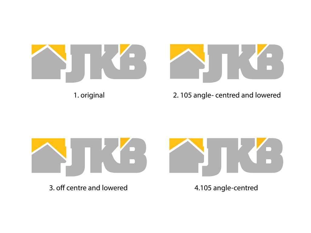
Este cliente recibió 168 diseños de logo de 54 diseñadores. Eligieron este diseño de logo de John-Alexander Design como el diseño ganador.
Únete gratis Encuentra trabajos de diseño- Garantía
-
 US$225
-
 168 diseños
-
 54 diseñadores
Resumen de Diseño de Logo
Jati Kencana Beton (abbreviated JKB) is a vastly growing Indonesian building supply company with vertically integrated operations in Quarry, Stone Crusher, Ready Mix Concrete and Pre-Cast products.
We started as a humble family business in 1980’s, JKB is now ready to embark on next and exciting phase of our Business, with a vision to grow our business on a national and international levels.
We need a logo that reflects our commitment in delivering uncompromising quality product that is strong and withstand the test of time, just like the relationship we have developed with our customers.
Direct Translation of Jati Kencana Beton is Golden Teak Concrete. Since our operations have expanded beyond concrete, we would like abbreviated version of our company name (i.e. JKB) to feature in the logo.
The logo needs to feature font AND a brand image that will become part of our new identity. It needs to portray strength, quality with strong clean lines and symmetry. Preferred colours are Golden Yellow (not metallic) and Gray which will be our corporate colour and feature in our truck fleet
NOTE:
Some general feedbacks are as follows:
1. Character combining - Yep, I am seeing plenty of J/K or K/B combos, most looks great but few are executed well. Main pit fall is losing clarity and susceptible to be misread as something else (JK3, JCB, JB etc). I would like to see JKB as very very legible, please I beg you.
2. Image - needs to convey strength in simple, modern, and yet stylish way. Ideally the image needs to have relevance or inspired from building supply industry. It's tough I know ... I am sure there is a creative genius out there that can pull it off. Please don't just slab an image just because it looks good. There needs to be a reason behind it
3. One format/application per design - receiving multiple applications/formats of the same design is a personal pet hate of mine :D. I can appreciate creative ideas without seeing it in different applications. This way I can provide a more detailed feedback.
keep 'em coming folks. Please blow my mind with your creative designs!!
many thanks
Arief
Objetivo del mercado(s)
Building contractors and developers, B2B, home builder
Tipo de industria / entidad
Concrete
Texto del logo
JKB
Estilos de logo de interés
Logo con emblema
Logo contenido dentro una forma / figura
Logo pictórico / combinado
Un objeto del mundo real (texto opcional)
Logo con siglas
Acrónimo o logo tipográfico (solo texto)
Colores
Colores seleccionados por el cliente para ser utilizados en el diseño del logotipo:
Mira y siente
Cada control deslizante ilustra las características de la marca del cliente y el estilo que debe comunicar el diseño de tu logotipo.
Elegante
Atrevido
Juguetón
Serio
Tradicional
Moderno
Atractivo
Profesional
Femenino
Masculino
Vistoso
Conservador
Económico
De Alta Gama
Requisitos
Debes tener
- Incorporating JKB fonts in strong clean lines and symmetry which portray uncompromising quality and strength.
- The logo can be either in Emblem, Lettermark, or Combination (Pic and Font) type
Agradable de tener
- incorporating business brand image either as an emblem or Pic/Font Combination.
No debería tener
- overly complicated and with excessive fine details.