New Logo for an IT Sales and Services Company
¿Quieres ganar un trabajo como este?
Este cliente recibió 100 diseños de logo de 32 diseñadores. Eligieron este diseño de logo de carlomagno como el diseño ganador.
Únete gratis Encuentra trabajos de diseño- Garantía
-
 £300
£300
-
 100 diseños
-
 32 diseñadores
Resumen de Diseño de Logo
PNLTools is an IT software reseller and consultancy based in the UK. We sell IT solutions (mainly software but on occasion hardware) and supporting services (consultancy, training, installation) to businesses.
The name PNLTools comes from our former parent company, Professional Networks Limited. We were spun off from them around 10 years ago and we inherited their software business website - www.pnltools.com and this also became our business name. Tools was used to refer to software tools, perhaps a slightly old fashioned reference now, but we're stuck with it!
We are in the process of planning a new website and have decided our logo (which we've never completely liked), needs replacing. The biggest issue we have with the current logo is that it does not scale well. See existing logo at http://www.pnltools.com
Whilst we'd like to change our company name as well (it's a mouthful), it's not an option at this time, however it would be good to be able to swap out the old company name with a new one in any new logo, i.e. we'd need to have access (be able to buy) any font used in our logo.
We're looking for a modern, simple design consisting of a graphical identity and text. My preference is for everything to fit in a rectangle, i.e. graphic on the left and text on the right, and be scalable. It would be good if we could use the logo in a graphic above, text below format too. It would be nice if we could keep our existing corporate colour which seems to be Pantone 382 U ?? or #CAD400, but change isn't a bad thing. Incorporating complimentary colours with the existing colour might be an idea. I'm quite keen to have a bold and unique sans serif font supporting the logo, rather than something plain. I think the text looks better in lower case, but I'll leave that to the designer.
I don't think the logo has to be totally representative of what we do. Other logos we've had in the past have been representative of computer networks and such like, and I feel this is a tired analogy.
I hope this is enough to get you started!
Objetivo del mercado(s)
IT professionals in Businesses across all verticals
Tipo de industria / entidad
Software
Texto del logo
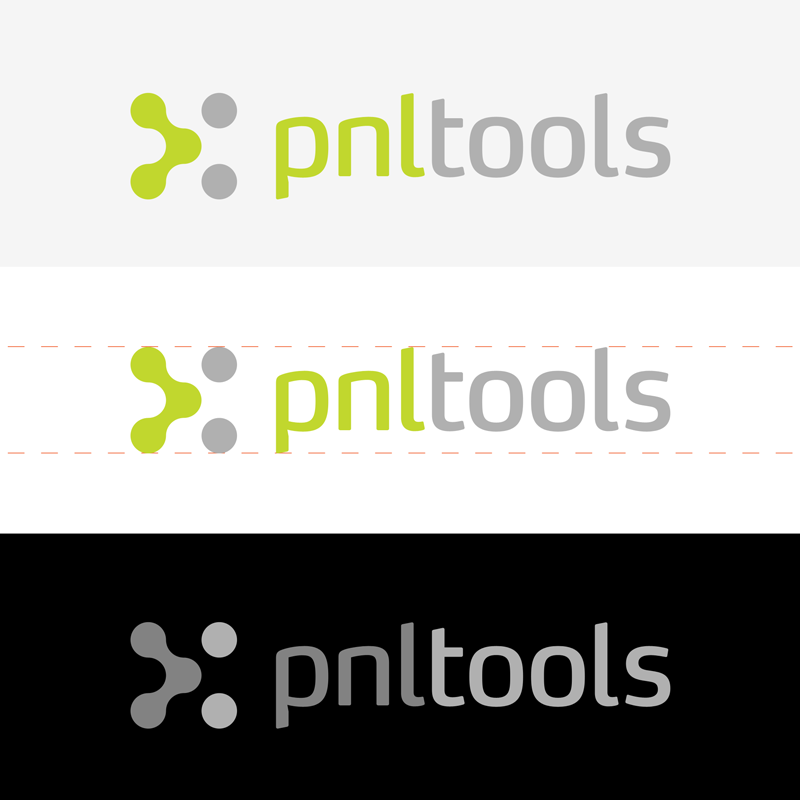
pnltools
Estilos de logo de interés
Logo pictórico / combinado
Un objeto del mundo real (texto opcional)
Logo abstracto
Conceptual / simbólico (texto opcional)
Mira y siente
Cada control deslizante ilustra las características de la marca del cliente y el estilo que debe comunicar el diseño de tu logotipo.
Elegante
Atrevido
Juguetón
Serio
Tradicional
Moderno
Atractivo
Profesional
Femenino
Masculino
Vistoso
Conservador
Económico
De Alta Gama
Requisitos
Debes tener
- Graphic on the left, text on the right in a format that scales well and is in proportion.
No debería tener
- The design should not be derivative of the old design, i.e. infinity symbol.