Website Redesign (Medical Aesthetic Field)
¿Quieres ganar un trabajo como este?
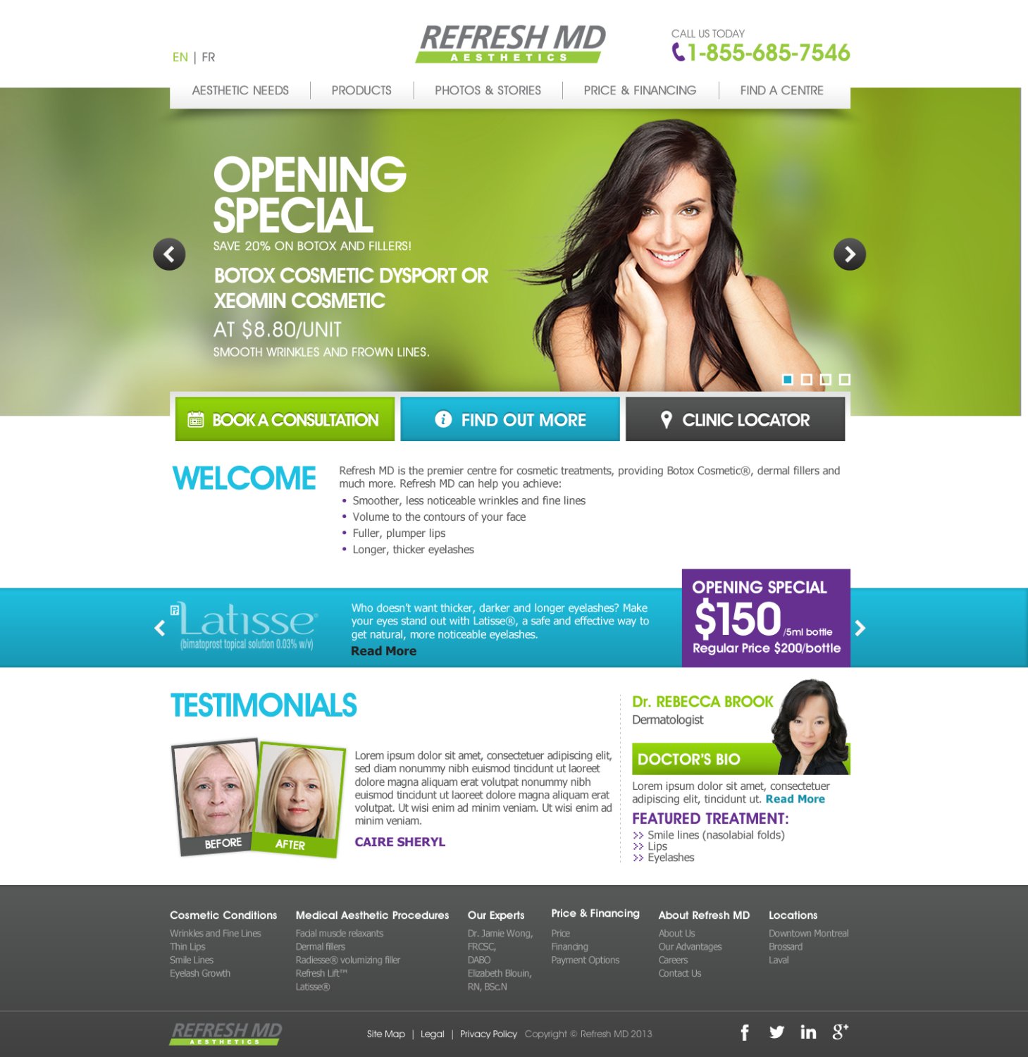
Este cliente recibió 48 diseños web de 8 diseñadores. Eligieron este diseño web de TechWise como el diseño ganador.
Únete gratis Encuentra trabajos de diseño- Garantía
-
 US$700
-
 48 diseños
-
 8 diseñadores
Resumen de Diseño Web
PLEASE READ CAREFULLY THE DIFFERENT POINTS OF THIS BRIEF.
We need a 6-page website design with accompanying PSD files.
1. Home Page – includes a “French / English” language switcher and a “select your nearest centre” overlay box as shown on example 2 below (bell.ca).
2. Aesthetic needs: each aesthetic need we can treat will have its dedicated page. See the tree structure for more details on content. Interior page (for about us, pricing, treatments pages, etc.).
3. Products: each product we offer will have its dedicated page. See tree structure for more info on content.
4. Photos & Stories: highlight our treatments’ effectiveness by showing before/after photos and featuring past patients’ testimonials.
5. Generic interior page layout: will fit non-specific pages, such as the Price & financing, and About Refresh MD ones.
6. Find a Centre: each Refresh MD centre will have its dedicated page with the following information on it: contact info (address, phone number, and interactive map), Opening hours, and available aesthetic treatments.
See attached file for the detailed structure and menus.
The site being redesigned is http://www.refreshmd.com.
- We want a clear design that will drive users to convert with one of the following CTAs:
a. Book a consultation form (will send an email to a specific email address)
b. Call us (top right corner)
c. Find out more form - Get a client care representatives to contact you. (will send an email to a specific email address).
- The current website is not clear enough: we don’t like the 3-column layout and the font size is too small. You can’t find the most important information right away when you land on the home page as there are too many elements that distract our visitors and not enough emphasize on the calls-to-action.
- We want a web 2.0 design. See examples below.
- It needs to be responsive design-friendly; we need to approve the content conversion matrix.
- Also see the list of requirements at the end of this brief.
We will provide the following: Refresh MD Logo, short brand guide with our style and colour codes, current Refresh MD girl (you are welcome to suggest other images), new structure (tree)
Actualizaciones
Payment is now guaranteed.
Added Wednesday, July 31, 2013
New files have been updated: Photo of the main girl (you may suggest other photos), Refresh MD logo and Brand Guidelines.
Added Thursday, August 01, 2013
We have received nice designs. However, the lead gen form on the home page could not be an opened form right away. We need to replace the form of the home page to a section with clickable buttons for each of our three main call-to-actions. You can see a live example of this on www.lasikmd.com, in the header section you have BOOK ONLINE, REQUEST FREE INFO KIT, and CLINIC LOCATOR.
Added Monday, August 05, 2013
Here is a general feedback of designs we have received so far:
Added Friday, August 09, 2013
Tipo de industria / entidad
Medical
Mira y siente
Cada control deslizante ilustra las características de la marca del cliente y el estilo que debe comunicar el diseño de tu logotipo.
Elegante
Atrevido
Juguetón
Serio
Tradicional
Moderno
Atractivo
Profesional
Femenino
Masculino
Vistoso
Conservador
Económico
De Alta Gama
Requisitos
Debes tener
- Responsive design friendly (a must)
- Conversion-oriented (3 calls-to-action: Phone number, Book a consultation, and Find out more)
- Clean, neat, Web 2,0 and professional look - see the below examples.
- Slider with big images on the homepage, like on the examples.
- Language switcher and choose your nearest centre overlay box on the home page, with the link always accessible via the top menu (like on the 2nd example).
- Compliance with our brand guidelines (keep the Refresh MD girl, colours, tone).
Examples of websites we like and features we would like to have:
1. http://www.kinglasik.com/
a. This website does a very good job driving visitors to submit their information: big phone number, LASIK INFO KIT form and Schedule and appointment button.
b. At launch, we need to have the following 3 calls-to-action on our website:
1- Phone number
• Top right corner, highly visible (only numbers, no letters) and needs to be clickable on mobile devices.
2- Book a consultation online
• This will send an email to us with this information: First name, last name, Postal Code/Zip, Email Address, and Contact Number. All fields are required, field titles should be set as default values and disappear on click like on http://www.kinglasik.com/contact-laser-eye-correction/.
3- Find out more
• “Have a client care representative to contact you”
• This will send an email to us with this information: First name, last name, Postal Code/Zip, Email Address, Contact Number, and How can we help you?. All fields are required, field titles should be set as default values and disappear on click like on http://www.kinglasik.com/contact-laser-eye-correction/.
o We also like the use of big images in the slider on the homepage.
2. www.bell.ca
a. We like their “select a language and region” box. We’d like the same system on our new website.
b. When users pick a language/clinic, the content has to switch the proper language and we need to be able to easily change pages content (both images and text) to reflect clinic-specific information; e.g. pricing, financing options, available procedures, etc. We may need a plugin to easily add and edit clinic-specific content via the CMS.
3. www.vervelaser.com/
a. We like the look and feel of this website. Calls to actions are clearly visible and it’s easy to find the right information.
b. This website is in the same field as Refresh MD.
4. www.sigfig.com/
a. Even if it’s a more product-oriented website, we like the use of big images and salient call-to-actions.
b. We also like the interior pages design: simple and effective. The font size is not too small, and all information is presented clearly. We could use the same system as them for our FAQ section (see sigfig.com/security).
5. www.rdio.com
Again, a clear layout with big images, big tagline and readable text.
6. http://www.lescoursmedical.ca/
We like how this site has a "shop by brand" section with brands' logos. People who are loyal to a given brand (Botox, Latisse, etc) can see at a glance all the brands offered and learn more about the procedures that make use of them.
7. http://www.marinaplasticsurgery.com/
This is a really well-designed site. It sells an image rather than product. We particularly like the way they've designed their drop down menu with sections, headings and photos.
8. http://armanibeauty.com/Experience.aspx
Armani has an interesting gallery idea with dates...We could see us having a similar page with before & after photos, which by the way are a big focus of most cosmetic surgery websites.
9. http://www.thebodyshop.com/index.aspx
We like how they highlight their most popular products.
10. http://www.drbohley.com/
Pros: Big phone and email CTAs on this one
Cons: contact form is too far down, rest of page layout not that great, too many things in sidebar, etc.
11. http://www.delawarebreast.com/
Pros: Big visible phone # up top; big background image; pink box to highlight text in image carousel. (Note: although this is certainly not stellar web design by any stretch, there’s still something about the colors and textures and magazine-type images that I think would make this site more appealing to women – the main audience for us as well – than the more clean but rather dull, medical looking sites)
Cons: a lot of this is cheesy, especially the script font :P
12. http://www.stcharlesplasticsurgery.com/
Pros: Like the idea of client testimonials on home page (bottom right near footer) – have seen this on many similar sites; warm colors are appealing; like the inclusion of a separate page for “options for men”; contact form easily visible on interior pages
Cons: Nav way too busy, design-wise just ok
13. http://www.mychicagoplasticsurgeons.com/
Interesting idea to have the form integrated into the main image like that, with “specials” and pricing in simple text below it; rest of contact info up top is too cramped and busy-looking though
14. http://www.centerformedicalweightloss.com/
A bit busy but could work with our particular content (imagine specials in banner below image carousel, and contact form where the “how much weight can I lose” box is
15. http://www.benedetticosmeticsurgery.com/
The pop-up tabs are kind of interesting, certainly a way to have more content but keep the home page looking clean, though I’m not sure if it’s obvious enough and also not sure how it would affect SEO…
16. http://www.theplasticdoc.com
This one has more visual appeal than many of them, which again I think will be more eye-catching for the target audience; they also have their share icons nice and high up the page and an interesting search feature (only useful if you have an extensive enough before/after photo gallery db though)
17. http://www.breastaugmentationnewyork.com/
Prominent but ‘elegant’ contact form, image, phone CTA, specials and testimonial quote
18. http://www.scottgreenbergmd.com/
Contact form made more personal by adding the doctor ;)
No debería tener
- NO opened lead-gen form on the home page. We need to have a 3-button call-to-action area somewhere at the top of the page instead. See my last update about this.