Logo design for our new online company.
¿Quieres ganar un trabajo como este?
Este cliente recibió 67 diseños de logo de 28 diseñadores. Eligieron este diseño de logo de Nuts Creative como el diseño ganador.
Únete gratis Encuentra trabajos de diseño- Garantía
-
 A$300
A$300
-
 67 diseños
-
 28 diseñadores
Resumen de Diseño de Logo
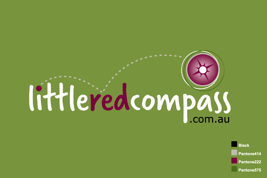
Little Red Compass is an online directory of businesses, organizations and institutions catering to children from infants to teens.
The web site is currently being developed and I have attached a sample of the website header in MS- Word for your information (this is to be used as reference in relation to how the logo would fit it).
The logo should be…
- simple and clean (not busy looking)
- contemporary (not tacky)
- fresh
- fun (indicates website has to do with kids)
- lively
The logo will be used on the website, business cards, corporate merchandise and gift packs.
Objetivo del mercado(s)
Audience/Users
• Primary users are parents with kids ranging from new born to late teens
• Parents-to-be
• Anyone looking for goods and services for kids and parents (e.g. gifts for nephew or baby shower present)
• Teenage kids
Customers
• Our customers will be businesses providing kids related products and services
• Organizations catering to kids and parents
Tipo de industria / entidad
It Company
Texto del logo
little red compass .com.au
Estilos de logo de interés
Logo pictórico / combinado
Un objeto del mundo real (texto opcional)
Logo abstracto
Conceptual / simbólico (texto opcional)
Logo de marca de nombre
Logotipo basado en palabra o nombre (solo texto)
Logo con siglas
Acrónimo o logo tipográfico (solo texto)
Requisitos
Debes tener
- • The following colours may be used for the logo (olive green, dark/blood red, tan, black, grey, white, off-white). It is important that the colours selected must compliment with the overall look and feel of the website.
• Allow a space for a tag line which may be added in future
• Incorporate a sketch / illustration of a compass in abstract form in the logo (must be simple and modern but nothing too outrageous or tacky).
• Must be adaptable / flexible as the logo should look good in either a dark background (e.g. dark shade of olive green, black) or a lighter background (e.g. white, light shade of olive green)
No debería tener
- Logo must not be…
• Tacky
• Busy looking
• Too outrageous