Logo Design for a new Residential Development
¿Quieres ganar un trabajo como este?
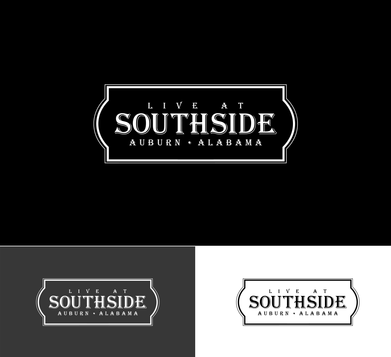
Este cliente recibió 101 diseños de logo de 40 diseñadores. Eligieron este diseño de logo de Mr.Designer como el diseño ganador.
Únete gratis Encuentra trabajos de diseño- Garantía
-
 US$160
-
 101 diseños
-
 40 diseñadores
Resumen de Diseño de Logo
I'm in need of a cool logo for a new 'southern' residential development based on southern living - cozy, easy, porches, siding, etc. For the logo I'm envisioning 'live at' in smaller font with 'southside' being the focus with that instant recognizable southern twist in font form. I've seen a lot of chalk board art that has the cool edgy down home style that doesn't feel like ma and pa kettle. More southern hipster meets money kind of style. I'm using the logo to add to my architectural designs - the marketing material (renderings and plans, Website and will most likely be the entry sign
Objetivo del mercado(s)
Home buyers looking for a new home with historic character. expecting young families to young retirees returning to be near their alma mater
Tipo de industria / entidad
Real Estate Development
Texto del logo
Live at Southside - may also include EST. 2016 or Auburn, Alabama (or AL)
Estilos de logo de interés
Logo de marca de nombre
Logotipo basado en palabra o nombre (solo texto)
Colores
Colores seleccionados por el cliente para ser utilizados en el diseño del logotipo:
Mira y siente
Cada control deslizante ilustra las características de la marca del cliente y el estilo que debe comunicar el diseño de tu logotipo.
Elegante
Atrevido
Juguetón
Serio
Tradicional
Moderno
Atractivo
Profesional
Femenino
Masculino
Vistoso
Conservador
Económico
De Alta Gama
Requisitos
Debes tener
- Must be It can be in black letters or white letters on a charcoal background, but open to 1 color add. Simple and classic. needs to be scalable from print to signage.
Agradable de tener
- See uploaded image examples but not white on black unless it is in its own box or frame. I love the look of the first uploaded (Robert Jon/Wreck) logo - either the top half or bottom half could work. And the font is great-could be simplified a touch.
No debería tener
- air brushy features or be corporate looking. no character elements.