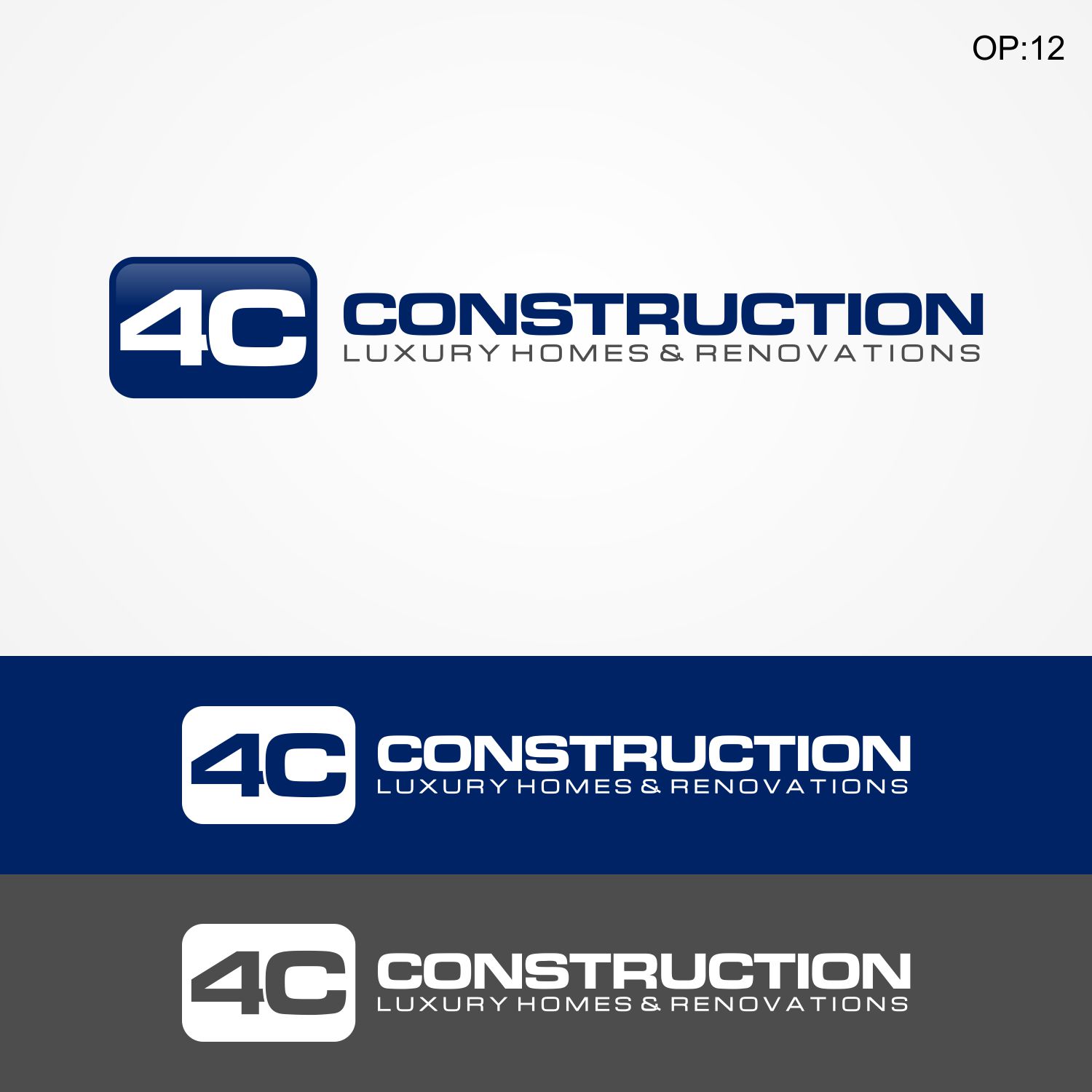
New Logo Design for the Luxury Home Builders 4C Construction

¿Quieres ganar un trabajo como este?
Este cliente recibió 88 diseños de logo de 32 diseñadores. Eligieron este diseño de logo de Liyana como el diseño ganador.
Únete gratis Encuentra trabajos de diseñoResumen de Diseño de Logo
Hello, We need a new logo for our company.
The existing Logo is out dated.
A more "up to date" look to suite the latest web based logo styles would be nice.
The 4C Construction CURRENT Logo is an OLD look. (See files attached)
The Main Font of the Wording Looks Good but it can change if needed.
But the LOGO shape to me is too sharp and pointed - its looks like I'd cut myself on it if it was something i could touch. I would like the new logo to be more like an icon. More user / people friendly.
The 4C means to Think Ahead / to Foresee the Future.
We are a building company that designs and builds ... the current LOGO has high rise building and the curvature of the earth. But we don't build high rise - we build Luxury Homes & Renovations. So the OLD LOGO is way wrong.
Our website is:
www.4cconstruction.com.au
You can see what we do if you like.
Thanks
Claus
Objetivo del mercado(s)
Women aged 45 - 65 who want to build a New Luxury Home or Renovate their existing home.
Tipo de industria / entidad
Building
Texto del logo
4C Construction Luxury Homes & Renovations
Estilos de logo de interés
Logo abstracto
Conceptual / simbólico (texto opcional)
Logo con siglas
Acrónimo o logo tipográfico (solo texto)
Estilos de fuente para usar
Colores
Colores seleccionados por el cliente para ser utilizados en el diseño del logotipo:
Mira y siente
Cada control deslizante ilustra las características de la marca del cliente y el estilo que debe comunicar el diseño de tu logotipo.
Elegante
Atrevido
Juguetón
Serio
Tradicional
Moderno
Atractivo
Profesional
Femenino
Masculino
Vistoso
Conservador
Económico
De Alta Gama
Requisitos
Debes tener
- The New 4C Logo - make the very 4C plain & easy to read.
- It should look more like an icon or button you would click onto on the computer.
- More rounded edges (As the current Logo is way too Sharp & Pointed looking)
- Please make the "4C" plain and easy to Read. No need to stylize the 4C.
- Make it look more like an Icon or Button like, Colourful
- Balanced and Conservative is what we want to convey, a professional look, a brand you can trust to build your home.