Swiss dairy needs a label design for its new Top-Cup yogurt
¿Quieres ganar un trabajo como este?
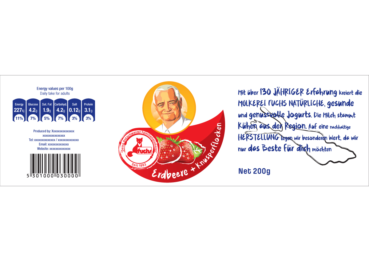
Este cliente recibió 48 diseños de viñeta de 6 diseñadores. Eligieron este diseño de etiqueta de ID como el diseño ganador.
Únete gratis Encuentra trabajos de diseño-
 €240
€240
-
 48 diseños
-
 6 diseñadores
Resumen de Diseño de Etiqueta
Company description:
The dairy Fuchs is a traditional family owned company located in Rorschach in the east of Switzerland. They use milk from local farmers and as many local products as they can. They have over 130 years of history in producing dairy products like butter, yogurt or quark (For more information visit: www.fuchsmilch.ch).
Description Top-Cup Yogurt
The company is planning to launch a new so called Top-Cup yogurt. Top-Cup yogurts have usually the following components (See picture):
1. Base yogurt
2. Fruit compote
3. Dry component
Ingredients Top-Cup Yogurt:
There is the plan to launch 3 Top-Cup Yogurts with different ingredients:
1. Base yogurt: Plain with quark (Natur mit Quark)
Fruit compote: None
Dry component: Dried Aroniaberries, Arroniaberry powder and spelt flakes (Aroniabeeren, Aroniabeerenpulver, Dinkelflocken)
2. Base yogurt: Strawberry (Erdbeere)
Fruit compote: None
Dry component: Crunchy flakes (Knusperflocken)
3. Base yogurt: Plain (Nature)
Fruit compote: Raspberries (Himbeere)
Dry components: Dried Rasberries (getrocknete Himbeeren)
The main ingredients (German in brackets) should be integrated as text in the design.
Package Type:
On the base of a customer survey we have defined the shape of the cup and the top. You can find the measurements attached. It is really important to us, that the cup and the top are made of transparent plastic. Two similar designs for the cup and for the top are needed.
Overall impression:
The main things that should pointed out through the design are:
- Premium Quality
- Local touch
- Natural ingredients
Thank you in advance. For further information please contact:
Fabienne.Meyer@student.unisg.ch
Fabio.Mosimann@student.unisg.ch
Actualizaciones
Project Deadline Extended Reason: We already received some interesting designs but we would like to have a couple more. Therefore we decided to extend the deadline. Added Thursday, May 26, 2016
Project Deadline Extended Reason: Thank you all for the designs. We extended the deadline to give more designers the chance to participate. Added Tuesday, May 31, 2016
Objetivo del mercado(s)
Our target group are people between the age of 19 and 29. They are part of the workforce or still studying. They have a relatively high income and live in a single household.
Tipo de industria / entidad
It Company
Colores
Colores seleccionados por el cliente para ser utilizados en el diseño del logotipo:
Mira y siente
Cada control deslizante ilustra las características de la marca del cliente y el estilo que debe comunicar el diseño de tu logotipo.
Elegante
Atrevido
Juguetón
Serio
Tradicional
Moderno
Atractivo
Profesional
Femenino
Masculino
Vistoso
Conservador
Económico
De Alta Gama
Requisitos
Debes tener
- - Colours: The base color of the cup is white. The color of the font should be chosen in a way that it matches to the whole yoghurt.
- - Sizes: The cup’s sizes are the following: Height: 55mm, Caliber: 95mm, Content: 175 cm3, the tops Caliber is 75mm, but this is only a guideline.
- - Logo: The Company’s logo is a red fox. The red fox should be placed in the middle of the red stamp. Around the logo should be placed the following sentence: “Deine Ostschweizer Familienmolkerei”. Please create a similar stamp. Then somewhere else the black outline of the “Bodensee” (a Swiss lake) can be placed in any size anywhere on the cup.
- - Storytelling: Somewhere on the cup should be placed the following sentences: “Mit über 130 jähriger Erfahrung kreiert die Molkerei Fuchs natürliche, gesunde und genussvolle Jogurts. Die Milch stammt Kühen aus der Region. Auf eine nachhaltige Herstellung legen wir besonderen Wert, da wir nur das Beste für dich möchten”
- - Writing: The writing should be like handwriting, as if a kid would have written the sentences on the whole cup.
- - Berries: The first jogurt design should have a raspberry, the second a strawberry and the third an aronia berry on the cup. Ideally the three fruits should look as if the fruits were painted, but this is not necessary.
- Further requirements:
- - Space for EAN Code
- - Space for list of ingredients and nutrition facts
- - Address of the producer
- - Weight of the Product (200g)