Eclipse Hair Design - Logo/Brand Refresh
¿Quieres ganar un trabajo como este?
Este cliente recibió 160 diseños de logo de 54 diseñadores. Eligieron este diseño de logo de Liyana como el diseño ganador.
Únete gratis Encuentra trabajos de diseño-
 £120
£120
-
 160 diseños
-
 54 diseñadores
Resumen de Diseño de Logo
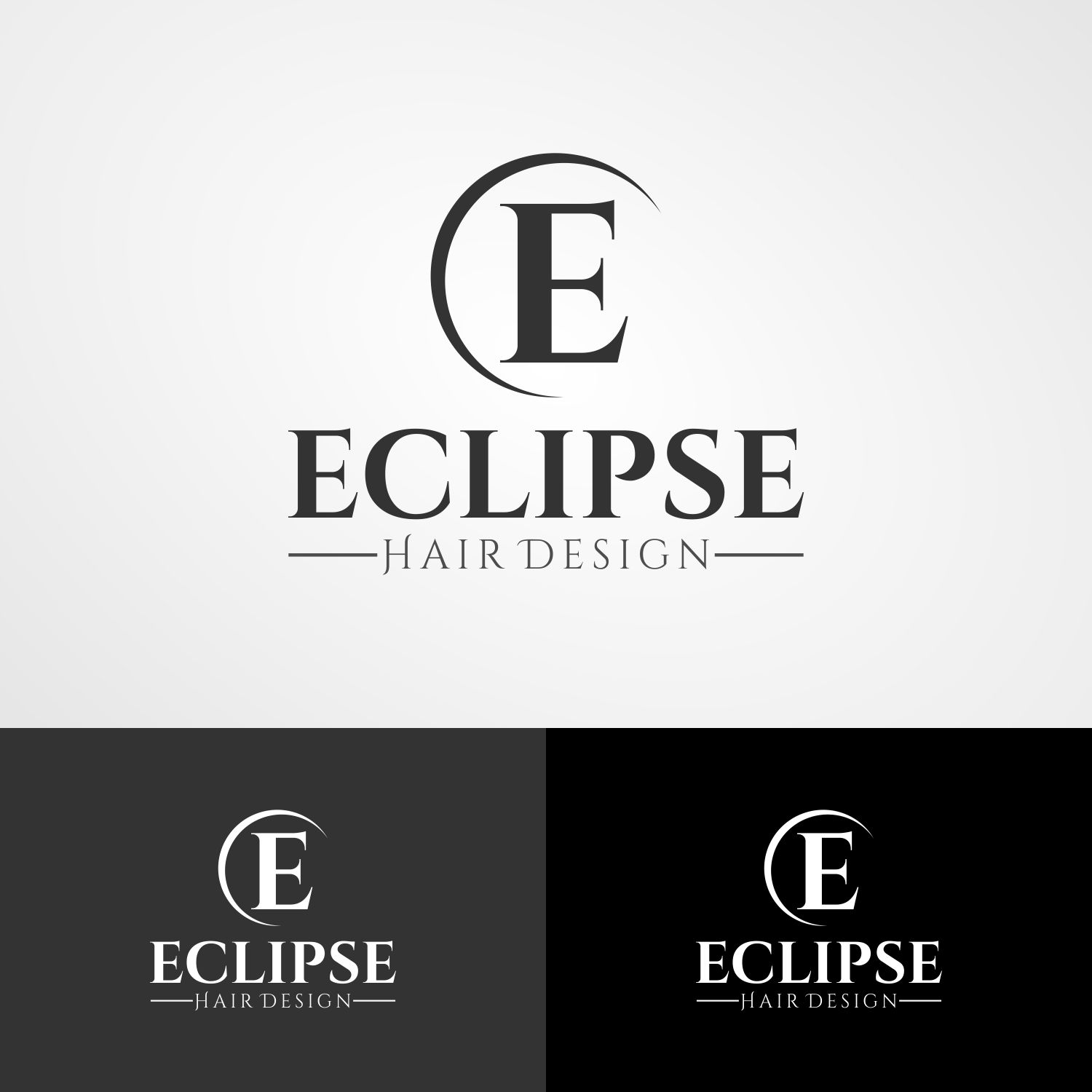
Eclipse Hair Design is a small boutique hair salon based in Jersey in the Channel Islands. Eclipse is entering the digital world and to support the long-term digital goals of the business, a brand refresh is required.
A brand refresh is required for Eclipse Hair Design. Eclipse has a brand that has been used across print (business cards, brochures) and the shopfront but there is no continuity or consistency in how the brand is being used. The brand refresh project should bring what they have into a new digital age.
Objetivo del mercado(s)
Eclipse has historically targeted the grey market (an older, ageing demographic), but as they now look to increase activity across key digital channels inc Facebook they would like to extend their reach to a younger demographic and use the logo fresh to reposition and re-educate the local market about what the salon has to offer.
Tipo de industria / entidad
Hair And Beauty
Texto del logo
Eclipse (primary) Hair Design (secondary)
Estilos de logo de interés
Logo abstracto
Conceptual / simbólico (texto opcional)
Logo de marca de nombre
Logotipo basado en palabra o nombre (solo texto)
Estilos de fuente para usar
Mira y siente
Cada control deslizante ilustra las características de la marca del cliente y el estilo que debe comunicar el diseño de tu logotipo.
Elegante
Atrevido
Juguetón
Serio
Tradicional
Moderno
Atractivo
Profesional
Femenino
Masculino
Vistoso
Conservador
Económico
De Alta Gama
Requisitos
Debes tener
- The logo must be flexible enough to work well on mobile and as a small thumbnail across social channels, so we are open to introducing some form of a supporting emblem that can be used for such purposes. The logo must work well on all neutral background colours - primarily white but also grey as the current owner has silver business cards which she likes and does not want to lose but have explained that silver is not possible.
Agradable de tener
- The brand refresh should be based on a concept similar to what Eclipse currently have (attached) e.g. ‘Eclipse’ should continue to be the primary component of the logo with ‘Hair Design’ appearing as a secondary component. Unfortunately, the original logo files are no longer available but hopefully the attached give some indication of how the logo is currently being used and illustrate the need for a refresh for the logo to work on the web.
No debería tener
- Please do not use any gradient or anything 'gimicky' and avoid any script fonts that are too difficult to read on a mobile - the brand must be elegant, professional, yet appealing to a wide ranging demographic.