Smart, intuitive SaaS software dashboard design
¿Quieres ganar un trabajo como este?
Este cliente recibió 113 diseños web de 13 diseñadores. Eligieron este diseño web de Xclusive Designers como el diseño ganador.
Únete gratis Encuentra trabajos de diseño- Garantía
-
 US$560
-
 113 diseños
-
 13 diseñadores
Resumen de Diseño Web
ContractZen is an innovative modern SaaS (software as a service) solution for contract and meeting management.
What we are looking for is fresh ideas for our dashboard. We do not need web coding or actionable wireframes now – but purely great design ideas from where to continue forward.
How should a modern web software dashboard look like? Fresh, intuitive, easy-to-use, and adaptable for responsive mobile designs. We hope that when the user logs into the service and sees the dashboard, he/she gets a good big picture of the current status of the most important documents of his/hers company.
To get to know the service and see the components, we kindly ask you to register to our service at www.contractzen.com and to utilize the free trial (30 days) so you can see the existing dashboard live. And also try out how it works. Might help you to get ideas how to improve it.
(The designer we will choose might be offered later on to design some other pages as well (contract view and edit pages, meeting page etc).)
You’ll find additional information in the attachment.
You’ll find more information of the company and the service also at www.contractzen.com
Actualizaciones
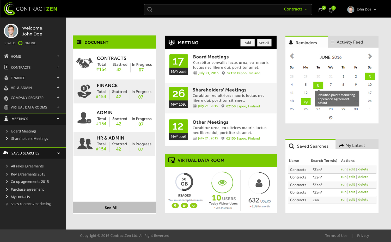
UPDATE:Users should see most important things with one glance. Therefore we would like to see AT LEAST these items mentioned below on the first page. NOTE: if all these things are visible on the dashboard, the menu list is maybe not needed on the left. (And there might be some icons on the top header with needed settings/inbox features anyway.)NOTE2: as explained earlier, the design should be responsive i.e. work without modifications in PC, iPad and mobile (the areas/boxes would just rearrange themselves on top of each other.)-First area should be Documents, which would include different document categories: Contracts, Finance & Admin and HR-All different types of Meetings could be the next area (upcoming ones clearly visible with date and maybe description, time and location visible also). -Reminders and Activity Feed (they might also be together in top of each other, so that Reminder is visible first and Activity feed can be chosen from the tab.)-Virtual Datarooms (maybe 1-3 different ones with some analytics for each visible e.g. like usage/visits per day)-Saved searches in very important list as users can save their most important searches. There are typically many of these, so at least 5 should be visible and then see all button (maybe even more could be visible if they fit on your design)-My Latest is also important. (As explained, Action Required area is NOT needed anymore). Added Sunday, June 26, 2016
Objetivo del mercado(s)
Global
Tipo de industria / entidad
Business Management
Número de páginas requeridas
1 page
Estilos de fuente para usar
Mira y siente
Cada control deslizante ilustra las características de la marca del cliente y el estilo que debe comunicar el diseño de tu logotipo.
Elegante
Atrevido
Juguetón
Serio
Tradicional
Moderno
Atractivo
Profesional
Femenino
Masculino
Vistoso
Conservador
Económico
De Alta Gama
Requisitos
Debes tener
- 1) Clear design idea for us to iterate from, 2) Modern look and feel - elegant & bold at the same time - still with credibility in our target group. And 3) Suitable for dashboard usage - it should it a clear big picture for the user.
- UPDATE:
- Users should see most important things with one glance. Therefore we would like to see AT LEAST these items mentioned below on the first page.
- NOTE: if all these things are visible on the dashboard, the menu list is maybe not needed on the left. (And there might be some icons on the top header with needed settings/inbox features anyway.)
- NOTE2: as explained earlier, the design should be responsive i.e. work without modifications in PC, iPad and mobile (the areas/boxes would just rearrange themselves on top of each other.)
- -First area should be Documents, which would include different document categories: Contracts, Finance & Admin and HR
- -All different types of Meetings could be the next area (upcoming ones clearly visible with date and maybe description, time and location visible also).
- -Reminders and Activity Feed (they might also be together in top of each other, so that Reminder is visible first and Activity feed can be chosen from the tab.)
- -Virtual Datarooms (maybe 1-3 different ones with some analytics for each visible e.g. like usage/visits per day)
- Saved searches in very important list as users can save their most important searches. There are typically many of these, so at least 5 should be visible and then see all button (maybe even more could be visible if they fit on your design)
- My Latest is also important.
- (As explained, Action Required area is NOT needed anymore).
Agradable de tener
- Surprise us!
No debería tener
- Please avoid the boring traditional legacy stuff and the common report dashboards.
- You do not need design a 100% mockup for the techie to continue with. The ideas count.